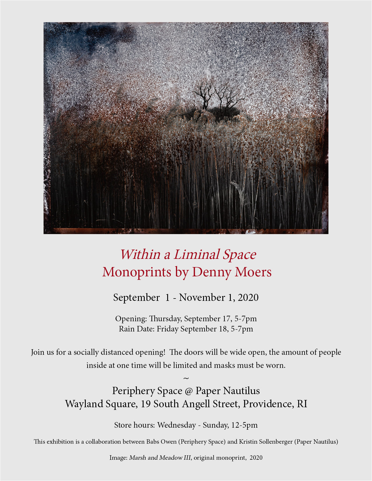
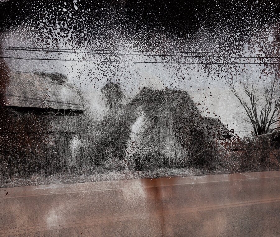
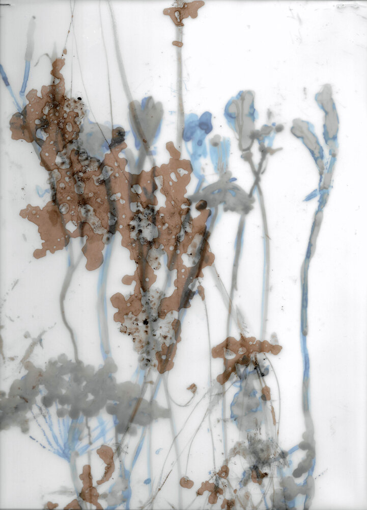
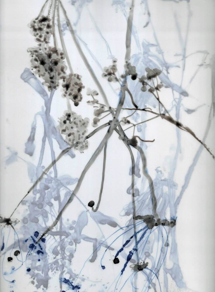
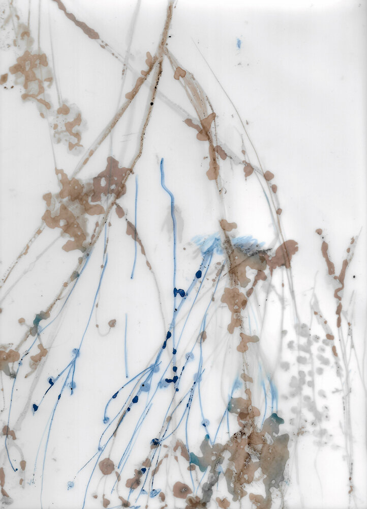
Denny Moers | Within a Liminal Space
Original Monoprints
September 1 - November 1, 2020
Within a Liminal Space explores the tension between the known and the unknown. From the Latin root limen, meaning threshold, liminal is a transitional place separating the familiar from the unrecognizable. This area can be uncomfortable for many, but it is an area that artists know intimately. Whereas some photographers might anxiously move the paper in the chemical bath, anticipating the images they think will appear, Moers thrives in this space, embracing the process, accepting the uncertainty.
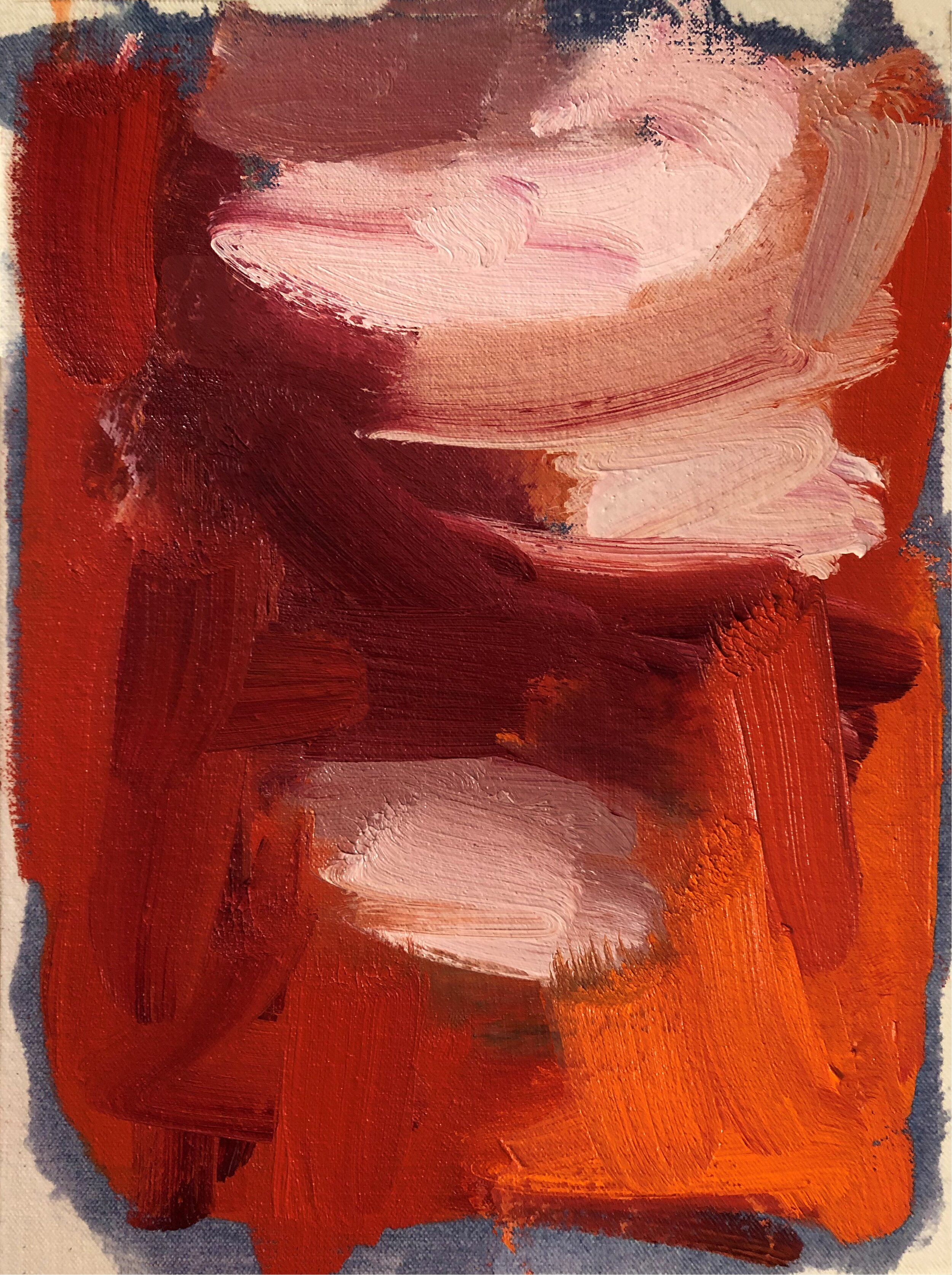
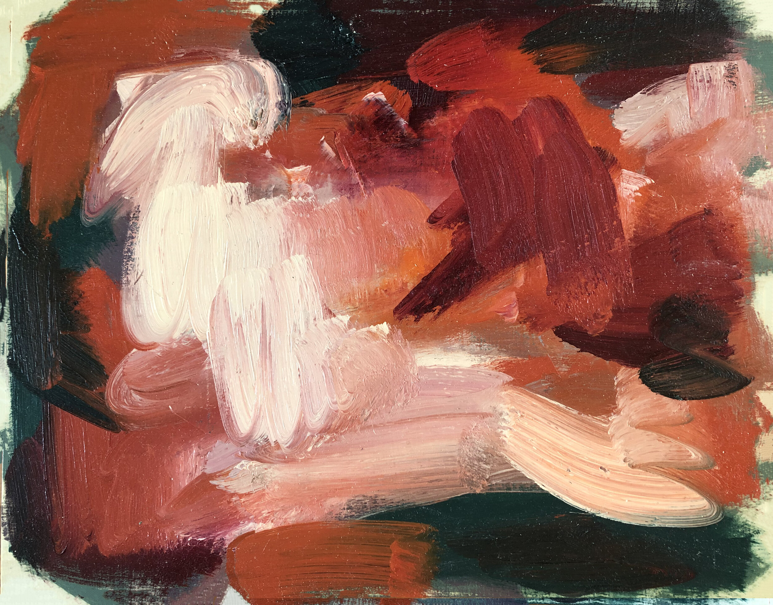
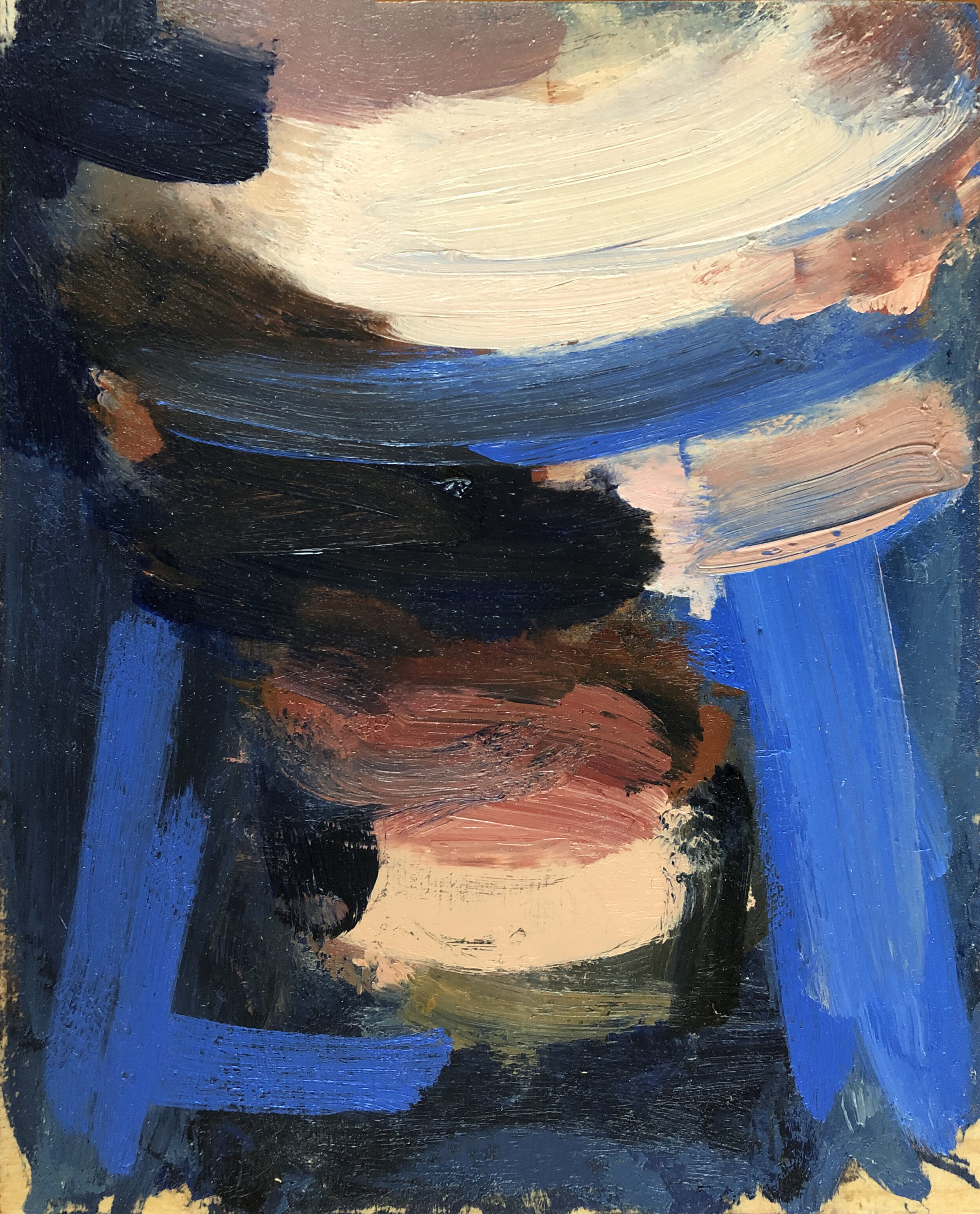
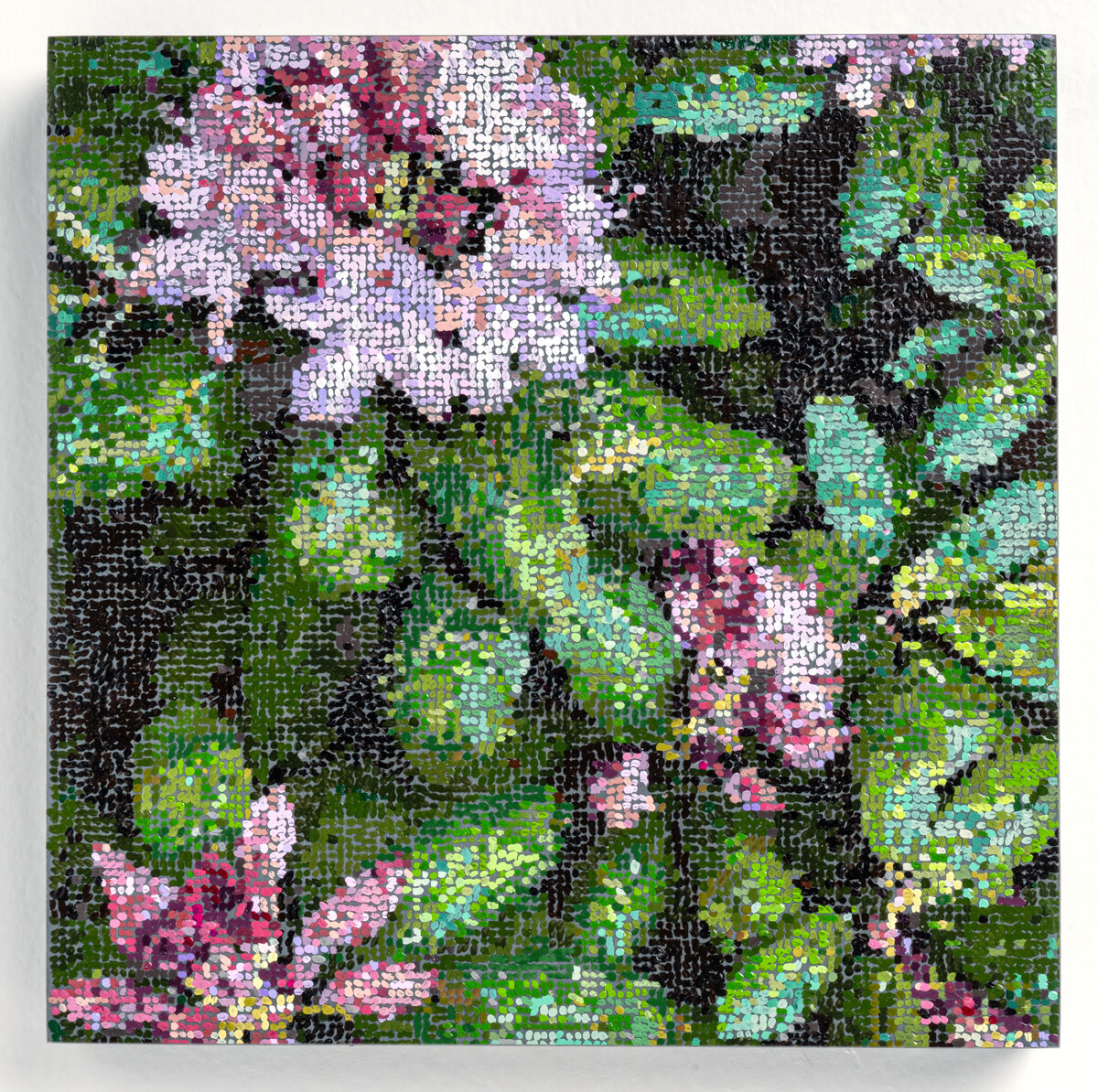
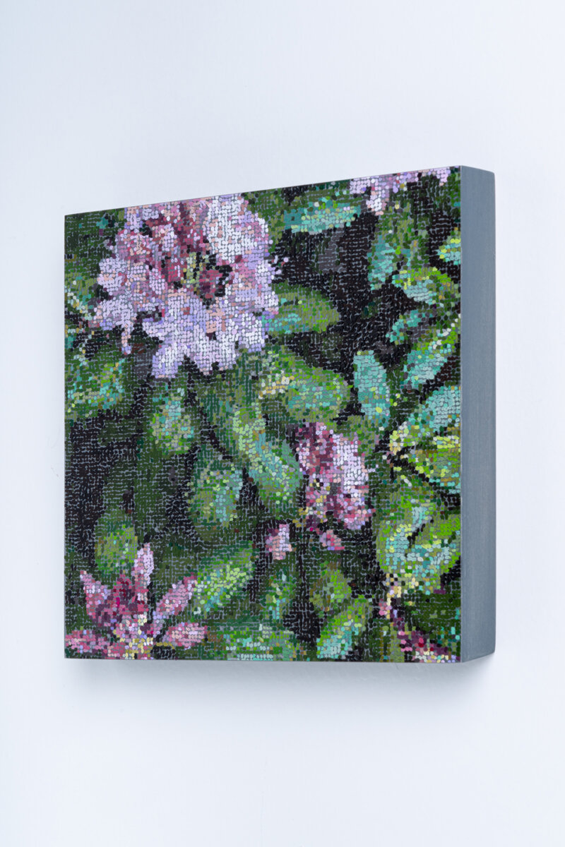
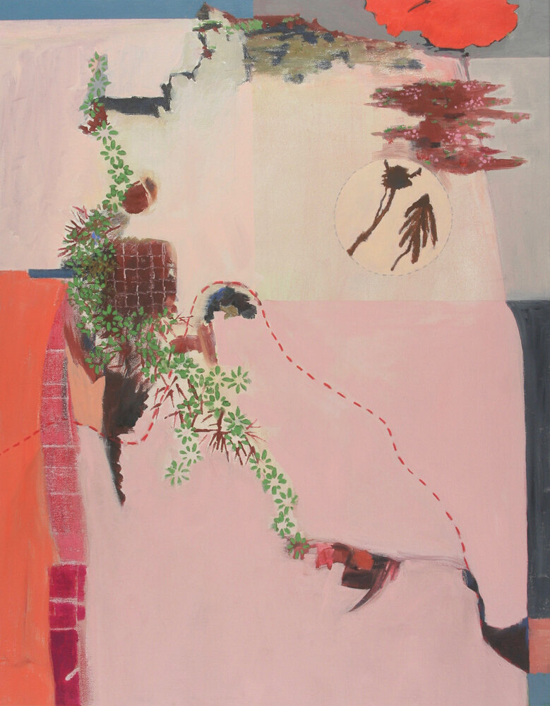
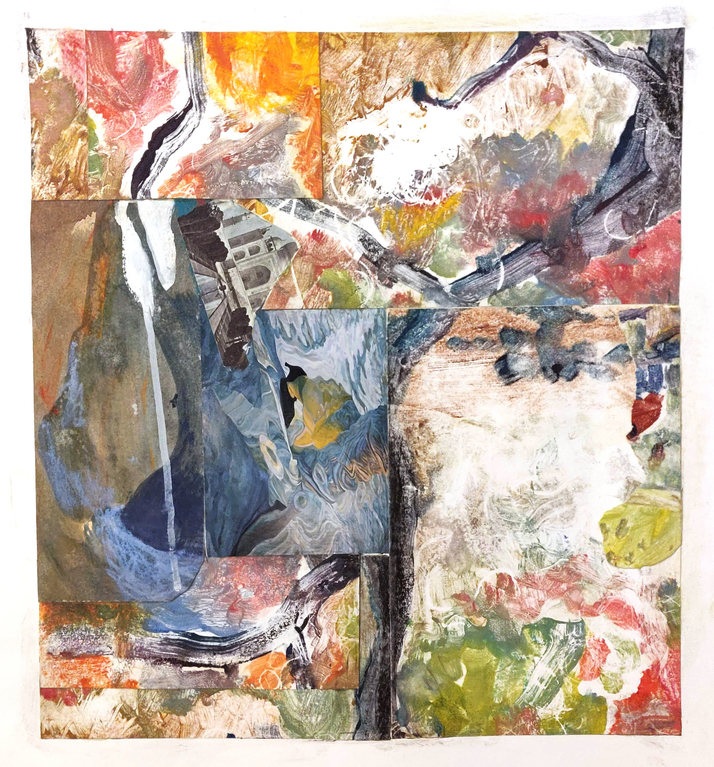
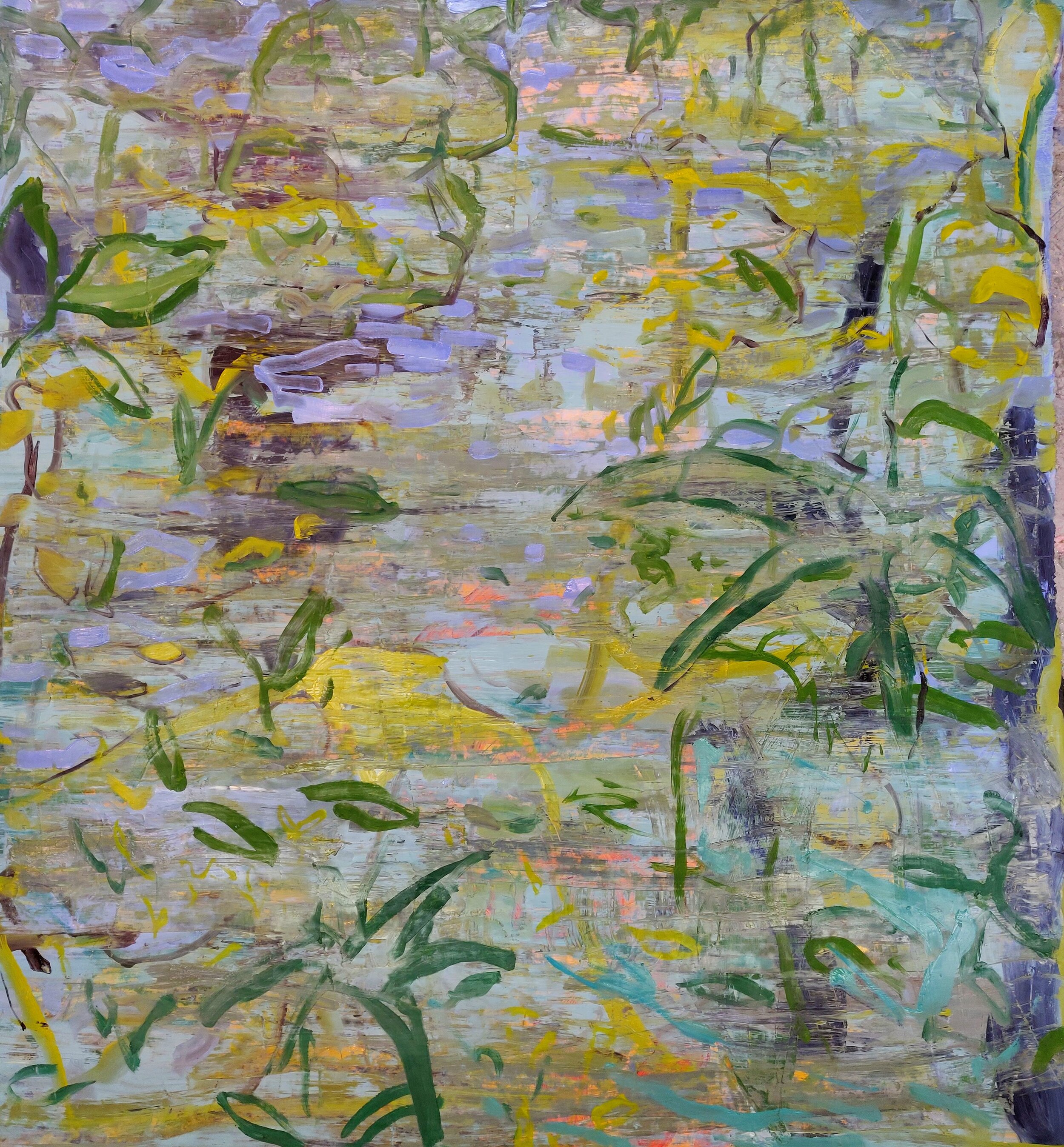
Looking at Moers's photographs as liminality, another word comes to mind – simultaneity. The hazy, mirage-like images in contrast with a hard edge of color, remind one of a past that can't quite come into focus while a future is sharply taking shape. Such as in Consumed Structure with Roadway III, Moers shows us a road that shines slick with color in the foreground while the trees and barn in the background blur in black and white as nature envelopes them. These images are intriguing and mysterious, full of meaning, waiting to be understood.
Biography
Denny Moers received his MFA from the Visual Studies Workshop. During the 1980’s he worked as Aaron Siskind’s first assistant and printer. He is currently on the faculty of Roger Williams University. He received a RI Pell Award for Excellence in the Arts and recipient of Rhode Island Council on the Arts Fellowship in Photography 4 times.
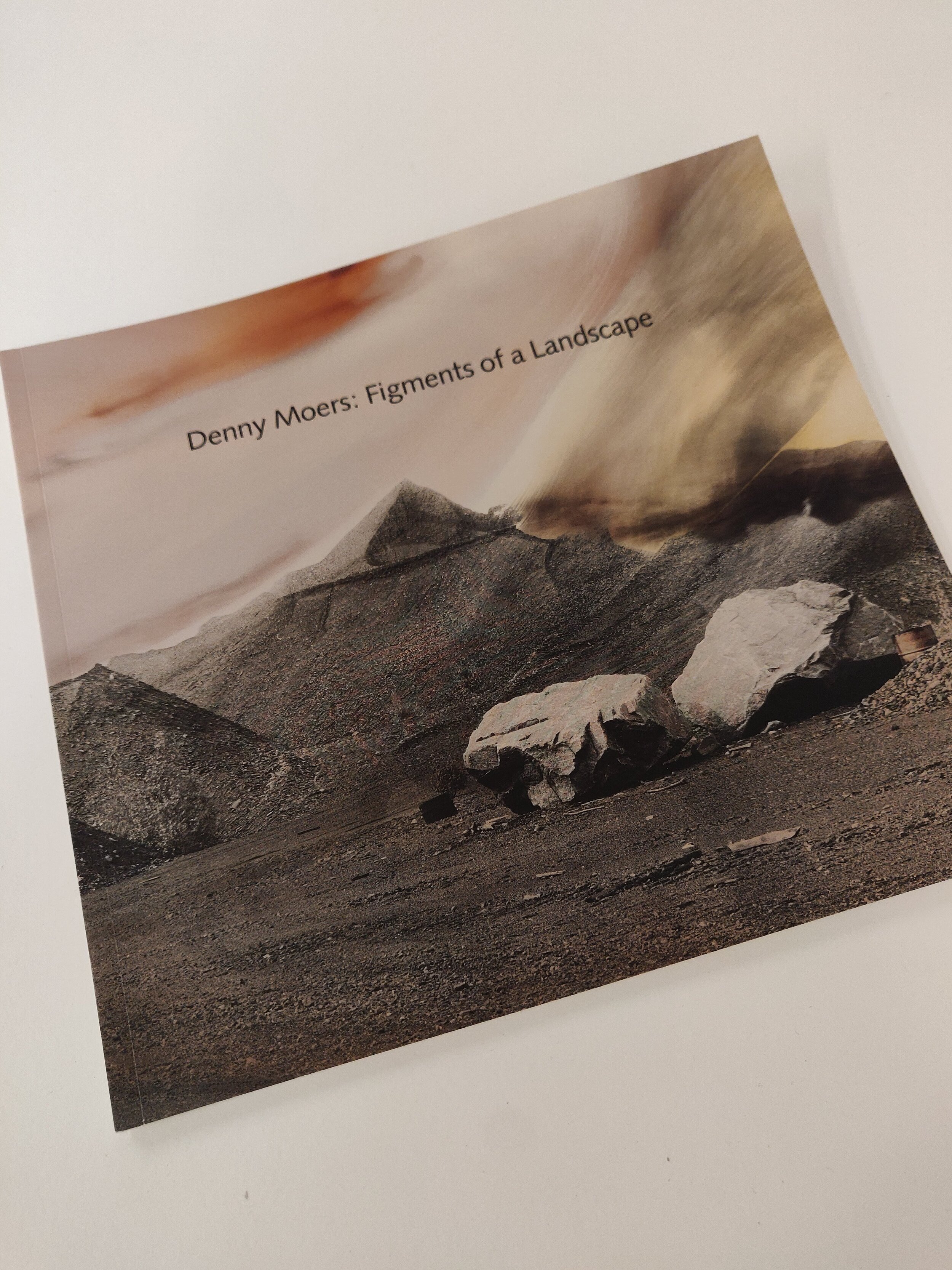
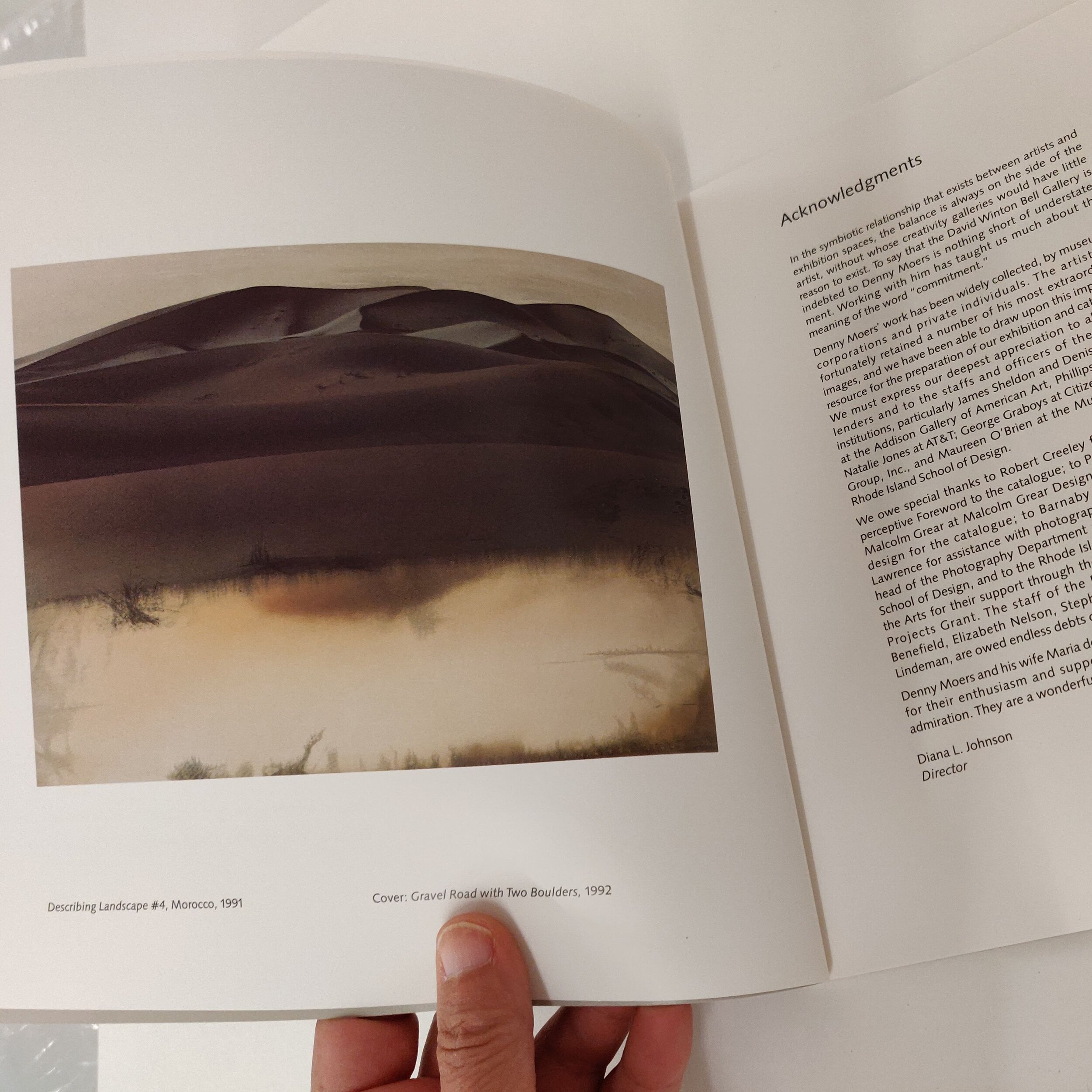
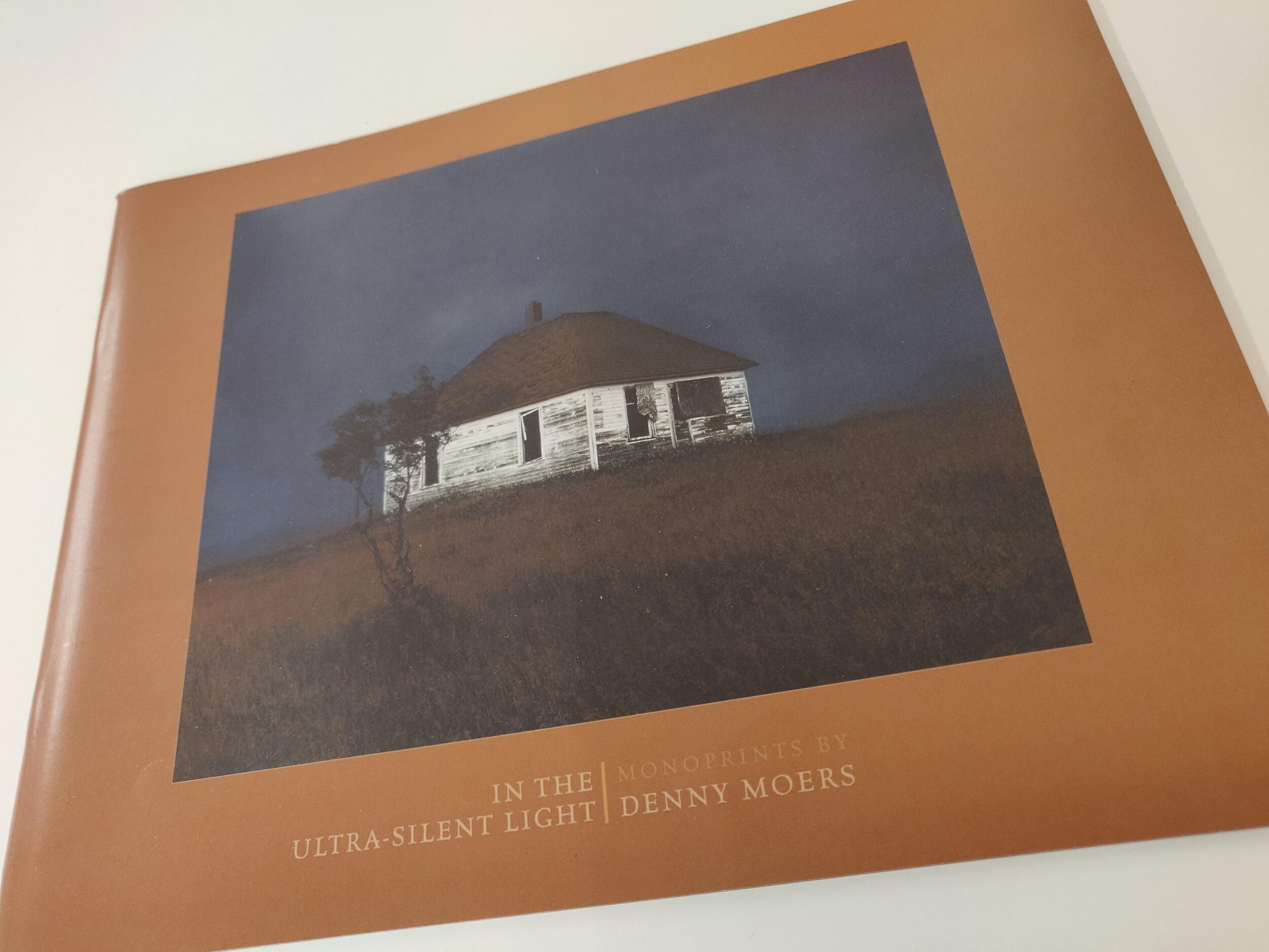
Publications include the portfolio: Between Now & Then- a selection of book covers, with a foreword by CD Wright published in 2006, In the Ultra- Silent Light, Monoprints by Denny Moers published by University of Buffalo, Anderson Gallery, 2003 and Denny Moers: Figments of a Landscape, published by Brown University, List Art Center in 1993.
His photographic monoprints are included in over 30 public collections throughout the world including the Los Angeles County Museum of Art, San Francisco Museum of Modern Art, Brooklyn Museum of Art, Baltimore Museum of Art, Huston Museum of Art, Bibliotheque Nationale, Paris, Museum of Fine Arts, Boston, Israel Museum in Jerusalem, High Museum of Art in Atlanta, and the Museo Rufino Tamayo, Mexico City.
For information about the artist and his work visit: www.dennymoers.com
~
…where we are betwixt and between the familiar in the completely unknown. There alone is our old world left behind, well we are not yet sure of the new existence. That’s a good space where genuine newness can begin. Get there often and stay as long as you can by whatever means possible… This is the secret space where the old world is able to fall apart, and a bigger world is revealed. If we don’t encounter liminal space in our lives, we start idealizing normalcy.
-Fr. Richard Rohr, OFM Author & Franciscan Friar
~
Excerpt from an interview between Barbara Owen and Denny Moers via email October 1, 2020
Barbara Owen: The title of your show “Within a Liminal Space” was influenced by your reading of the author and Franciscan Friar Richard Rohr, an excerpt of which you include in your writing at the show. Can you tell me why this excerpt was so important – what is it about the liminal that inspires you?
Denny Moers: I came upon the term when I was completing this new body of work through a website/blog I subscribe to written by Alan Seale, (Center for Transformational Presence.org). This quote below is his take on it which completely capsulized my feelings of the state all of us are currently in and crystalized the feelings of the pictures I was making.
“We’re living in a liminal space – a space where nothing is clearly defined, everything feels fluid, and the ground is constantly shifting. It’s a waiting space because we don’t know what else to do. There is a feeling of powerlessness. It can be very unsettling. And it’s not just a U.S. issue. Many countries have their own version of this story.
Choosing where we put our focus, whether as individuals, families, companies, or countries, is perhaps the most powerful choice we make. That choice determines everything else. Manifesting the resources, we need at just the right moment. These are valuable skills – skills that stretch our capacities for creativity, innovation, courage, and resilience. When we engage those capacities, we find our way forward.”
The concept of liminality was first developed in the early twentieth century by folklorist Arnold van Gennep. More recently, usage of the term has broadened to describe political and cultural change as well as rites.[5] During liminal periods of all kinds, social hierarchies may be reversed or temporarily dissolved, continuity of tradition may become uncertain, and future outcomes once taken for granted may be thrown into doubt.[6] The dissolution of order during liminality creates a fluid, malleable situation that enables new institutions and customs to become established. (From Wikipedia).
BO: The ten monoprints were created over the summer – however, some of the photographs were taken at an earlier time. Can you tell me a little bit about why you chose these photographs to manipulate in the darkroom for this show?
DM: My artwork is process-driven though the subject matter is central and always interior in nature. My prints are developed in stages due to different chemical configurations. That means that earlier prints that are achieved through light fogging, developer, and fixer applications need to be ‘finalized’ through a toning process which can occur months or even years later. Until that occurs, the monoprints are not finished and results are unknown. I can’t say exactly why I chose these particular prints for the exhibition except to say it occurred through the editing process which I have great respect for.
BO: Do you feel these images represent in any way the home isolation we all experienced and are still experiencing since the beginning of this year?
DM: Yes, completely. I think the state of mind I worked under is summed up through the concept of Liminal Space as described above.
BO: What is your most important artist tool? Is there something you can’t live without in your studio?
DM: Music to make art by. It is a deeply personal, lightless environment- perfect to connect feelings with particular music.
BO: How does your work relate to current social and political issues, if you think it does?
DM: Again, this notion occurs through Liminal thinking: “Various minority groups can be considered liminal. In reality illegal immigrants (present but not "official"), and stateless people, for example, are regarded as liminal because they are "betwixt and between home and host, part of society, but sometimes never fully integrated”. Intersex or transgender people, bisexual people in most contemporary societies, people of mixed ethnicity, and those accused but not yet judged guilty or not guilty, are liminal. Teenagers, being neither children nor adults, are liminal people: indeed, "for young people, liminality of this kind has become a permanent phenomenon...Postmodern liminality". (From Wikipedia citation).
BO: How has your practice changed over time?
DM: Mostly through the relationship with the concept of accident in artmaking being embraced and not feared. The subject matter has evolved in different ways but always with a sense of my photographs coming from a world available to everyone, not contrived or made in a studio.
BO: In your notes on process and techniques, you talk about how you create variations of tone that are inherent in the black and whites by using silver chloride paper. And although the prints may look hand-colored, any colors are created using metal toners such as gold chloride, selenium, and sulfide – you are not wholly in control when you are working. Could it be described as a learned “uncontrol?”
DM: Yes, an embracing of accident over control with a dose of joy in that realization.
original monoprint, 20 x 24 in.

original monoprint, 20 x 24 in.

original monoprint, 20 x 24 in.

original monoprint, 20 x 24 in.

original monoprint, 24 x 20 in.

original monoprint, 20 x 24 in.

original monoprint, 24 x 20 in. SOLD

original monoprint, 20 x 24 in.

original monoprint, 16 x 20 in.

original monoprint, 20 x 24 in.
$20
$20
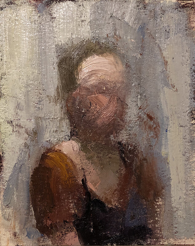
Ashley Pelletier | Reflections
June 8 – August 15, 2020
We are pleased to introduce an exhibit of self-portraits by Ashley Pelletier. While there will not be an opening reception, the store is open to a limited amount of masked visitors at a time. We urge you to go see the work in person as the painterly effects cannot be reproduced by photographs.
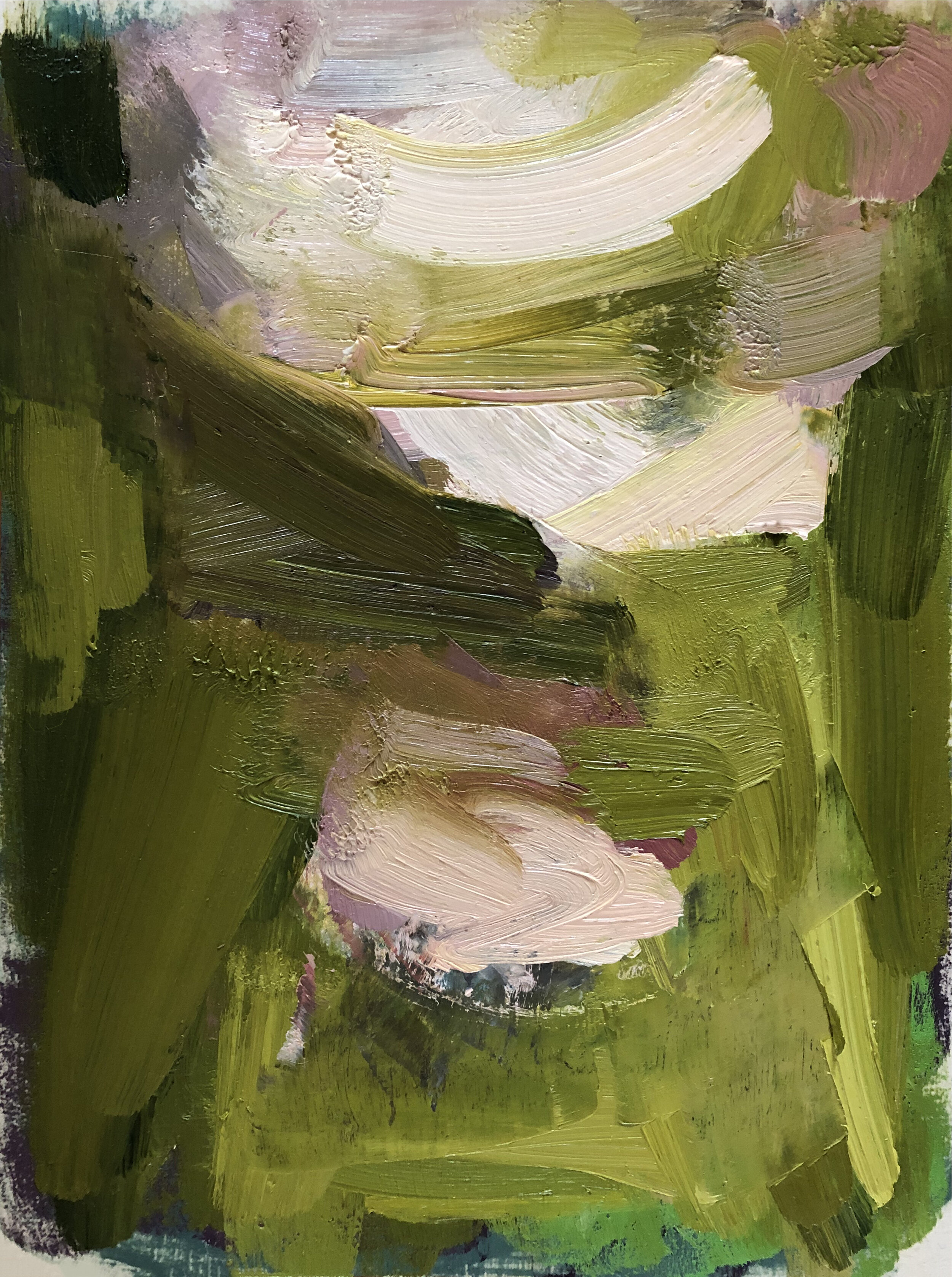
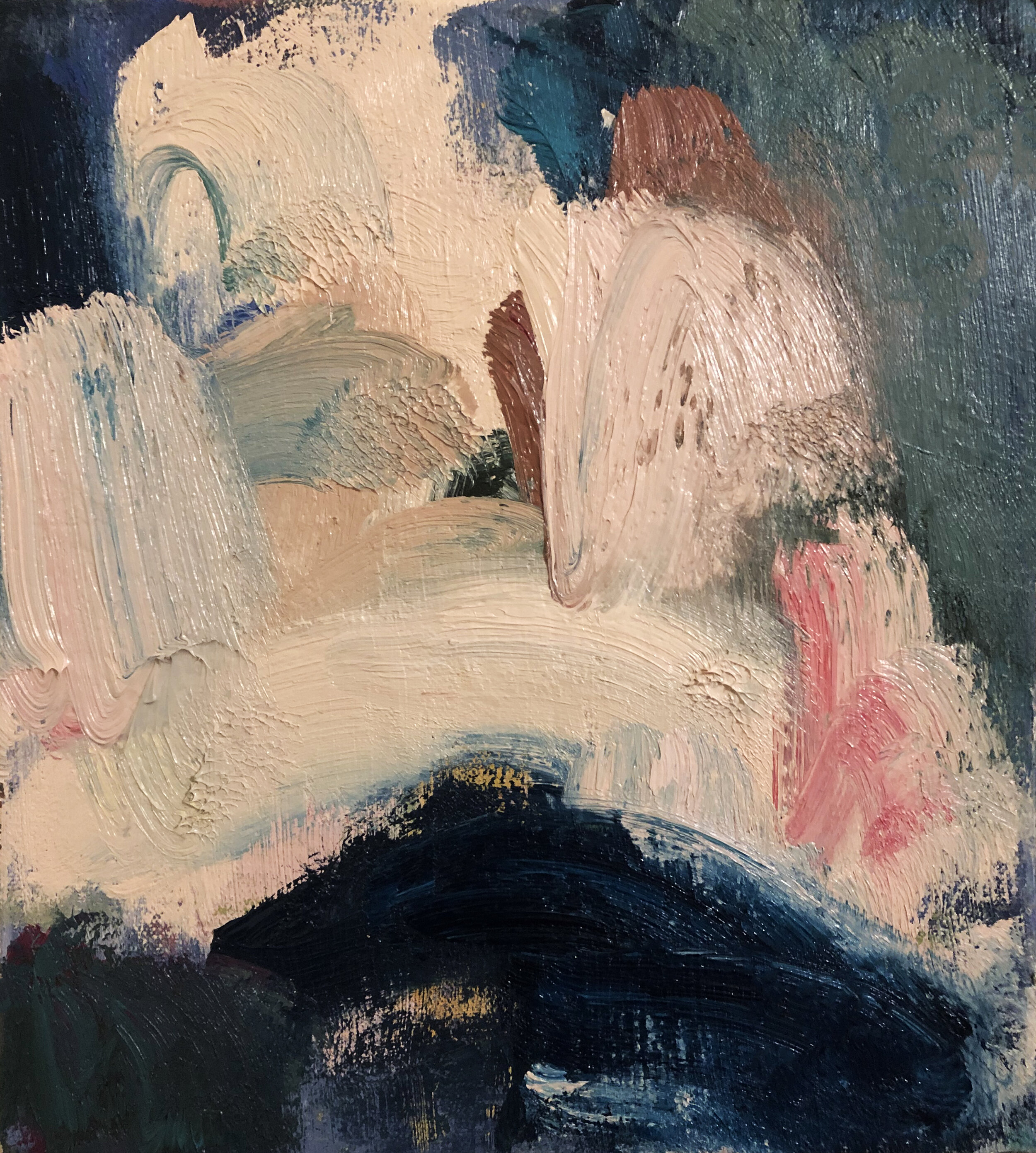
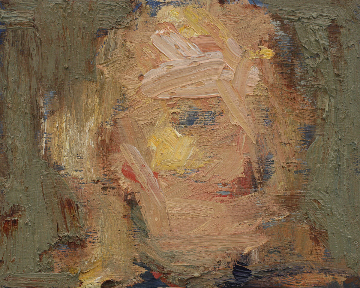
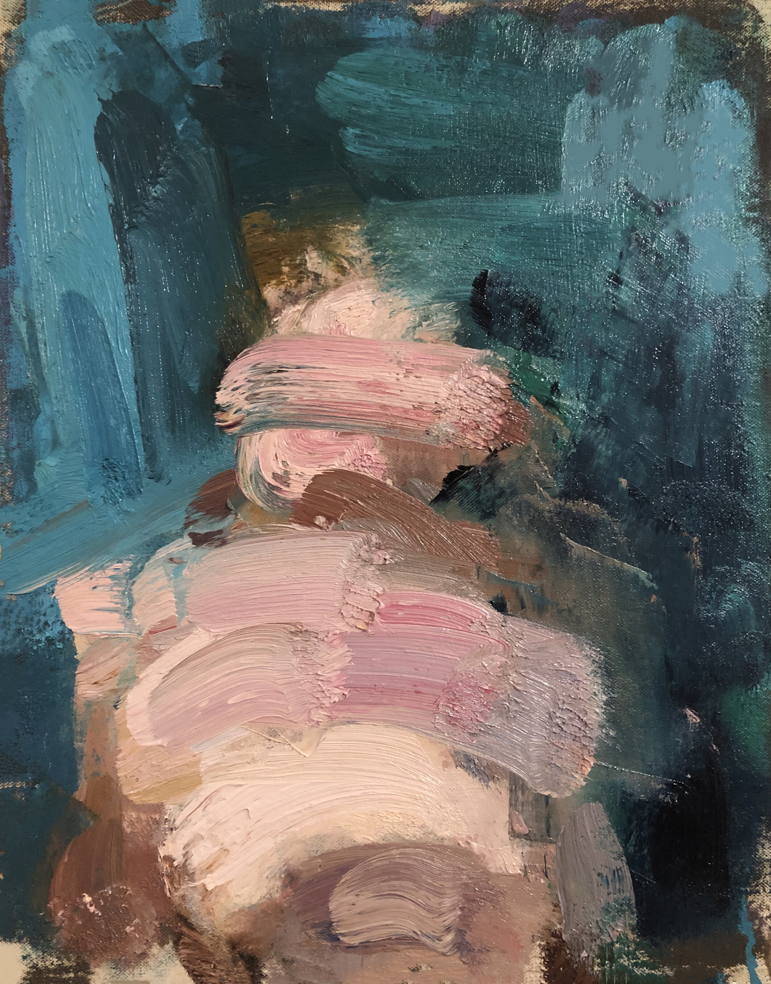
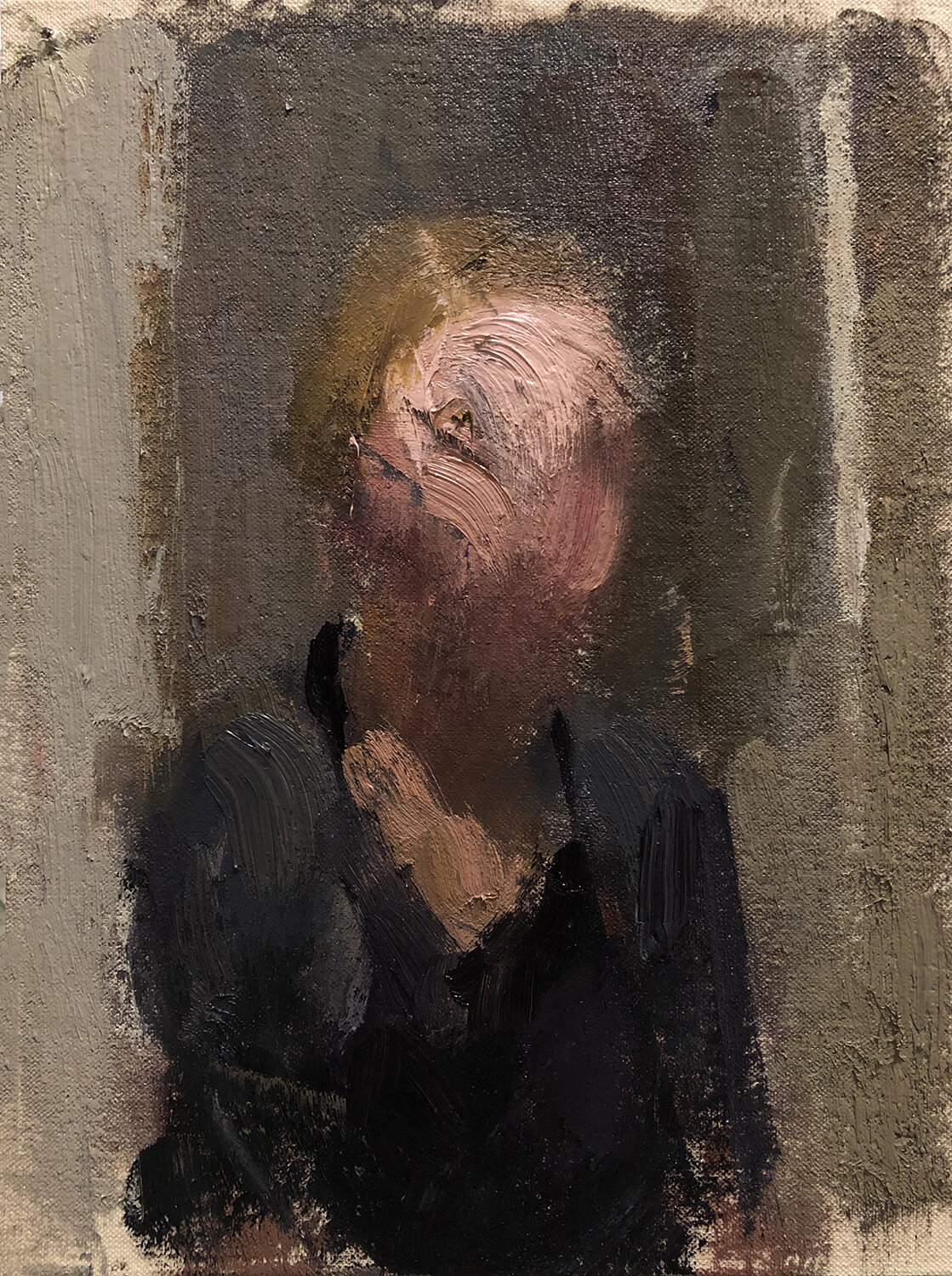
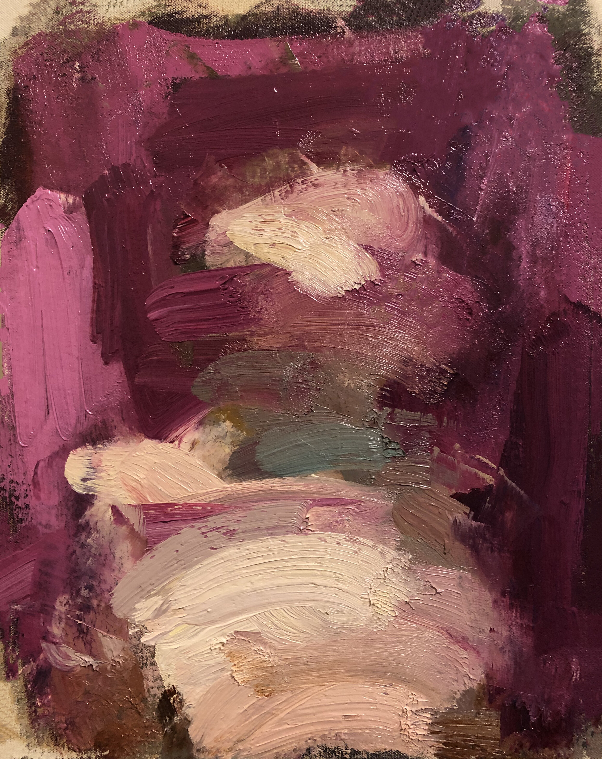
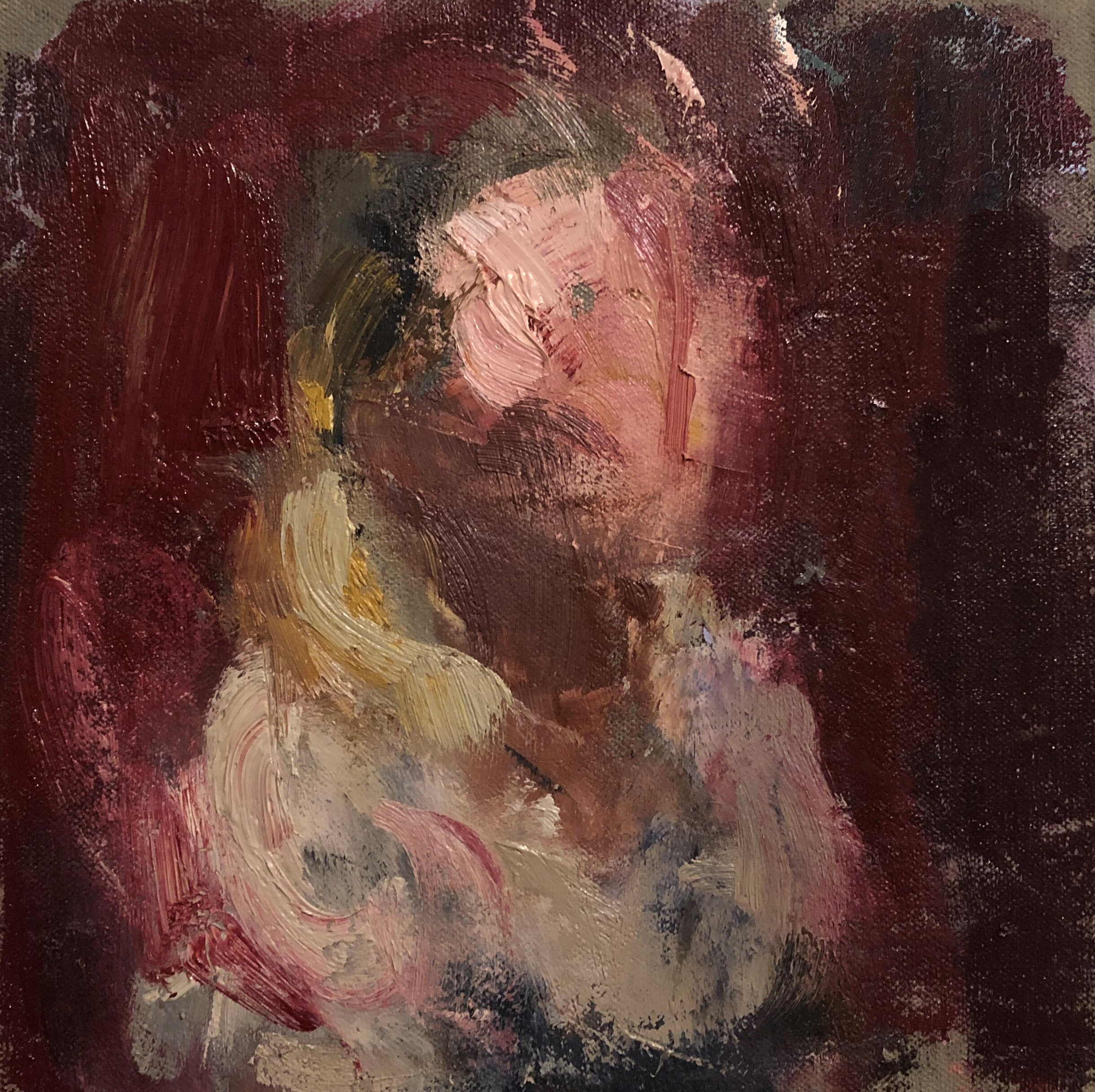
Because of the coronavirus pandemic, we have all had to figure out how to deal with feelings of stress and isolation the pandemic has caused. For many artists, time in the studio has been a way to cope. Ashley Pelletier found that making work during this time expanded her practice of self-portraiture. Fourteen paintings show her process as it starts with the exterior of the body and goes to the interior - from the representational to the abstract.
____________
Artist Statement
My practice places emphasis on being present, paying attention, and reacting. The works in this exhibit serve as visual records of my feelings and experiences and reflect upon what it means for me to be present. Many of these paintings in this exhibit were made during home confinement, and creating the work has been a bright spot during a very stressful time.
I create small, intimate oil paintings using myself as the subject. Although my practice is rooted in observation, my self-portraits are expressive and abstract. I start with my figure and let the painting evolve from there. Sometimes what I paint is more concerned with my outward form; other times, an internal structure is my focus. By working from my reflection, I examine my mental and emotional state. I build my paintings through several layers of scraping and manipulating. My mark-making represents a genuine and intuitive reaction to my subject matter.
Biography
Ashley Pelletier lives in Riverside, Rhode Island. She received her BFA in Painting from Rhode Island College and is an employee of the RISD Museum.
For more information about the artist: www.ashleypelletier.com
*All the works are for sale, email peripheryspace@gmail.com for prices.
~
Featured below is an interview with Pelletier conducted by Suzanne Schireson, an artist that works in drawing, painting, and animation. Schireson is the recipient of the Rhode Island State Council on the Arts Fellowship for Drawing and two Elizabeth Greenshields Foundation Grants. She has an extensive exhibition history both nationally and internationally. She is an Associate Professor in Drawing and Painting at the University of Massachusetts Dartmouth.
Interview via email: June 16-20, 2020
Suzanne Schireson: Can you describe how you landed on the flipped self-portraits?
Ashley Pelletier: When I started to make the flipped paintings, I was painting them with the bottom facing up, but I kept getting too distracted by the figure. By flipping them I found that it took the focus off the figure, and the painting became more about the brushwork and the color. It felt more like a complete painting instead of a picture of a person. It’s interesting because all of the flipped paintings were made during the pandemic. This was not intentional, but flipping the image also feels like a metaphor for our world right now.
SS: Do you work exclusively out of a mirror? What does that enable you to see or capture?
AP: Yes, I work exclusively from a mirror. When I paint, I am very interested in the perception of what I see in front of me and what’s occurring psychologically. The mirror is important because it keeps me present. It enables me to be aware of myself exactly as I am at that given moment. There’s a lot that can be revealed about yourself when you’re staring into a mirror for several hours. As someone who's struggled with identity, making self-portraits and working from a mirror has taught me a lot about myself and allowed me to get to know myself in ways I had not. By examining myself in this way, I’m always learning.
SS: Do you find more “truth” in a self-portrait than painting from a model? (Personally, when I paint myself, I feel this freedom to distort, whereas if I paint another person it can feel as if I am exploiting them in some way.)
AP: Yes, I absolutely do. One of the primary reasons I paint is to find the truth within myself. I find painting from a model to be more an exercise in observation, whereas self-portraiture is about an internal analysis. I agree with what you said completely. When I’m painting self-portraits, I can take more liberties than when I’m painting others. I don’t view others through the same distorted lens in which I view myself. I can accept the unflattering and sometimes harsh ways in which I depict myself, but I can’t do that to others.
SS: What themes do you navigate in your work?
AP: My paintings work with formal themes as well as themes of identity, and themes of gender naturally fold into that. I look at ways I’ve been preconditioned through my personal life and in a broader, global context. In trying to find myself, I’ve learned about the forces that have sculpted me up until this point.
SS: The physicality of your materials (the way you wield a brush) seems to suggest the body as much as your painted description of the figure. Can you discuss the relationship between the two?
AP: Yes! There’s a de Kooning quote that I love, “Flesh was the reason why oil painting was invented.” Oil paint is very important to me because of this connection. The way a material is used says much about an artwork's content and subject. I don’t only want to depict the figure, but I want to feel it in the image. I work in several layers and am constantly scraping and reapplying paint. It's important to me to engage in the physicality of the material just in the way that a human body is so physical.
SS: Can we nerd out painter to painter for a minute? What kind of blue do you use the most (cerulean, ultramarine, cobalt, manganese)?
AP: There are a few blues that I love, but lately, my favorite is Prussian. I love it because it’s really great for mixing dark values while still maintaining chroma. It’s very strong so I have to remember to use it in moderation. I’ve been mixing it into everything lately!
oil on canvas mounted on panel, 14 x 11 in.
oil on canvas mounted on panel, 10 x 8 in.

oil on canvas mounted on panel, 7 x 5 in. SOLD
oil on panel 12 x 9 in.
oil on canvas, 10 x 8 in.
oil on panel 8 x 10 in.
oil on canvas mounted on panel, 14 x 11 in.
oil on canvas mounted on panel, 12 x 9 in.
oil on canvas mounted on panel, 14 x 11 in.
oil on canvas mounted on panel, 8 x 8 in.
oil on canvas mounted on panel 12 x 9 in.
oil on panel, 11 x 14 in.
oil on canvas mounted on panel, 10 x 8 in. NFS
oil on panel, 10 x 8 in.
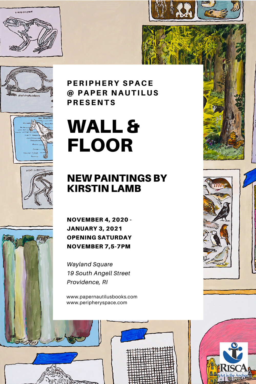
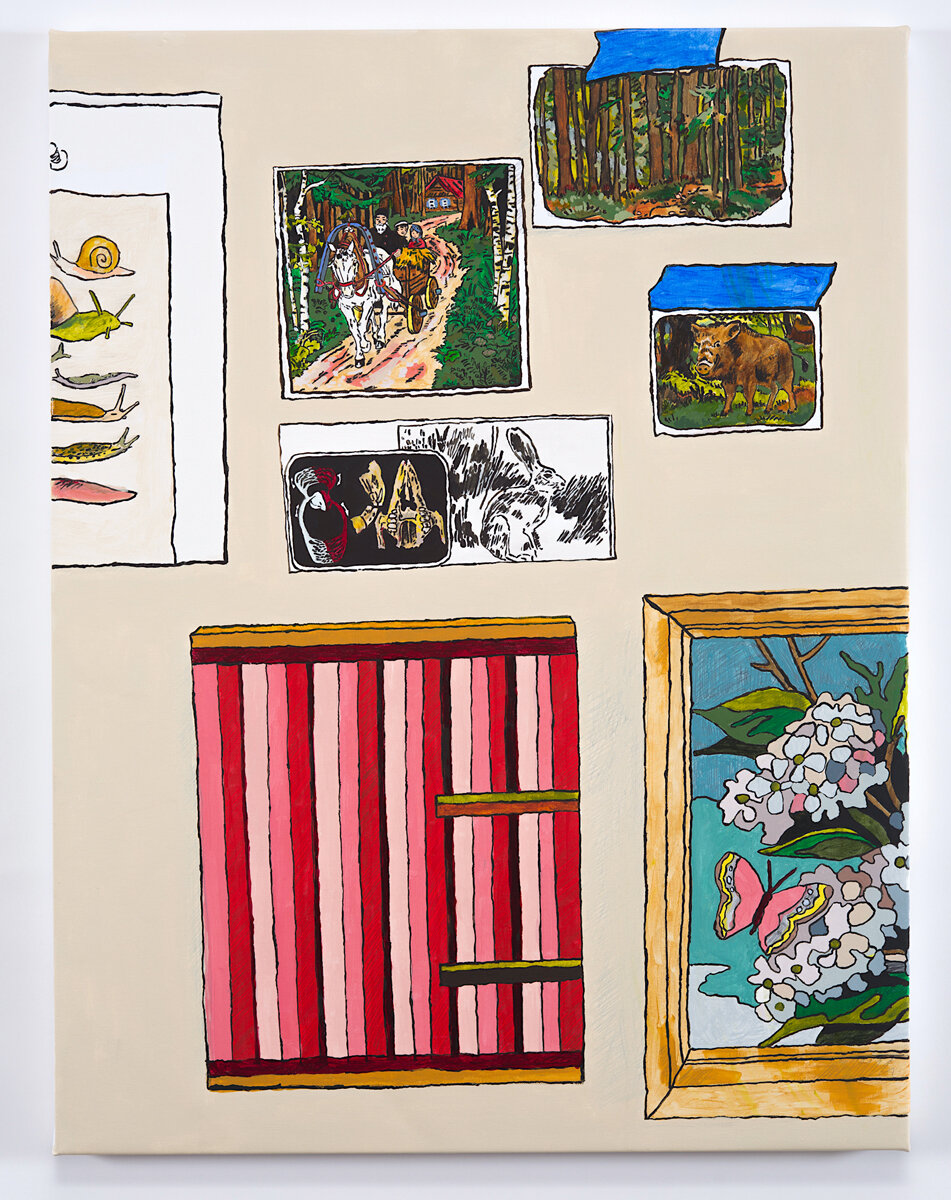
Kirstin Lamb | Wall and Floor
November 4, 2020 - January 3, 2021
Providence, RI - Periphery Space @ Paper Nautilus is pleased to announce an exhibition curated by Barbara Owen featuring the work of Kirstin Lamb opening in the first week of November.
Lamb describes her new work as a "love letter to the studio."
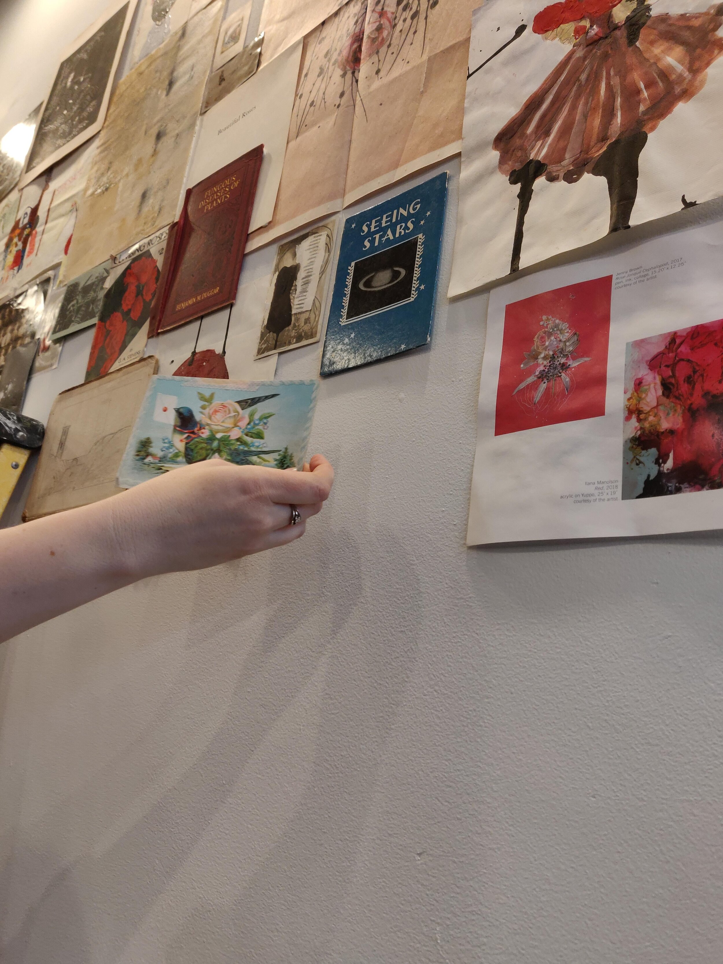
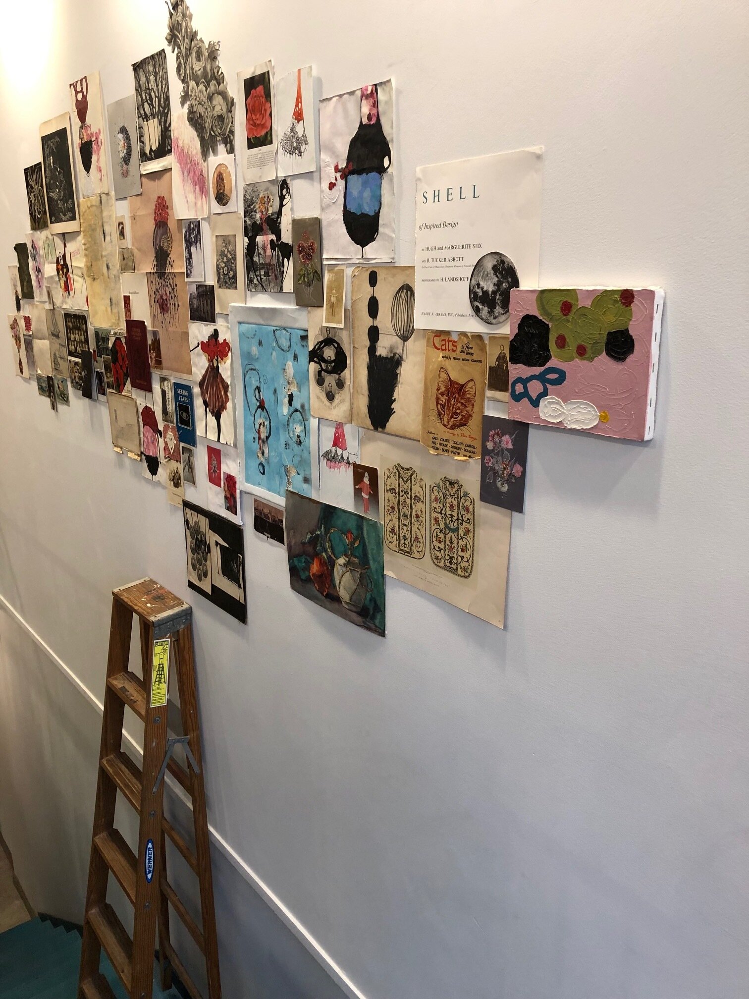
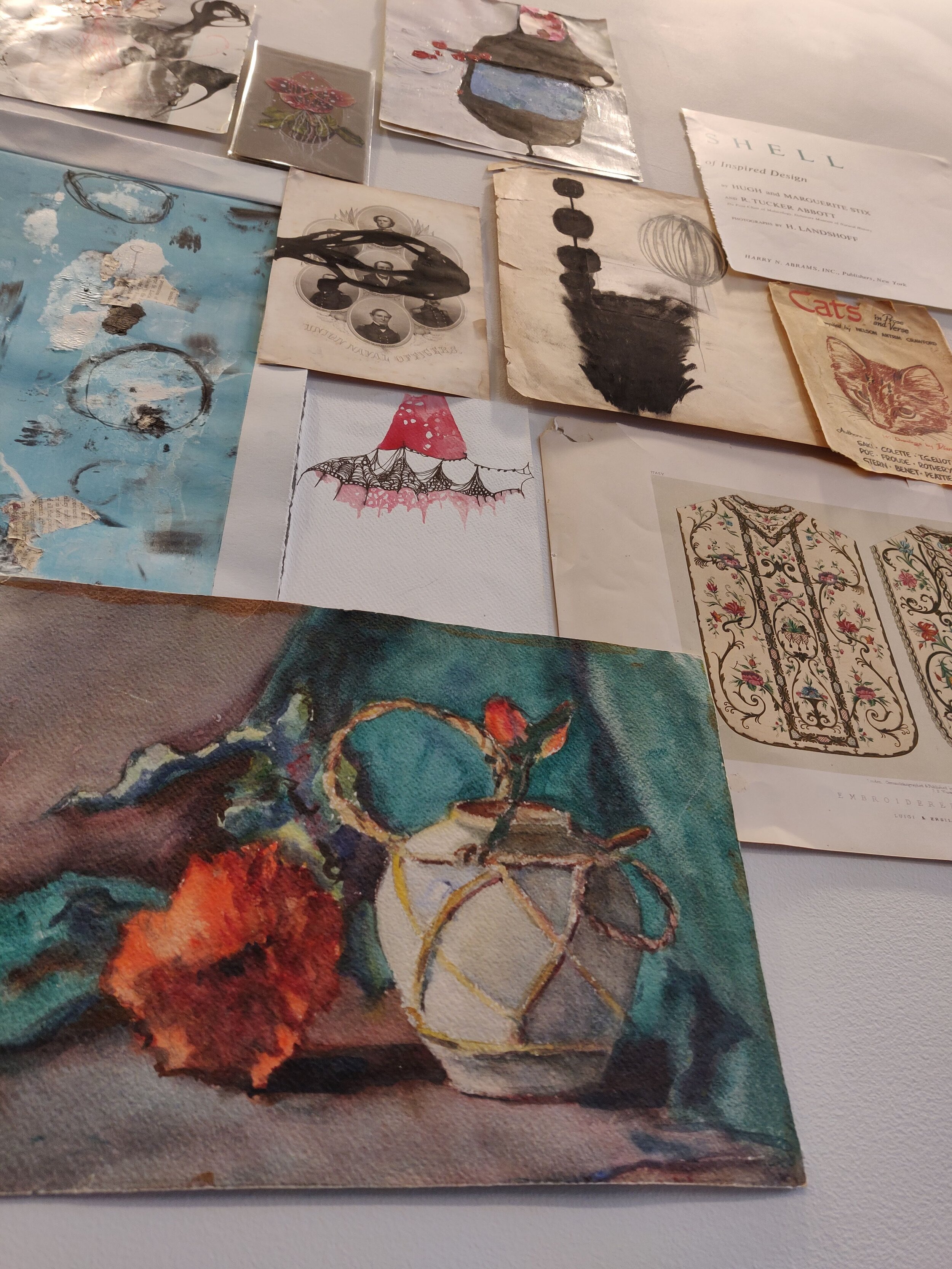
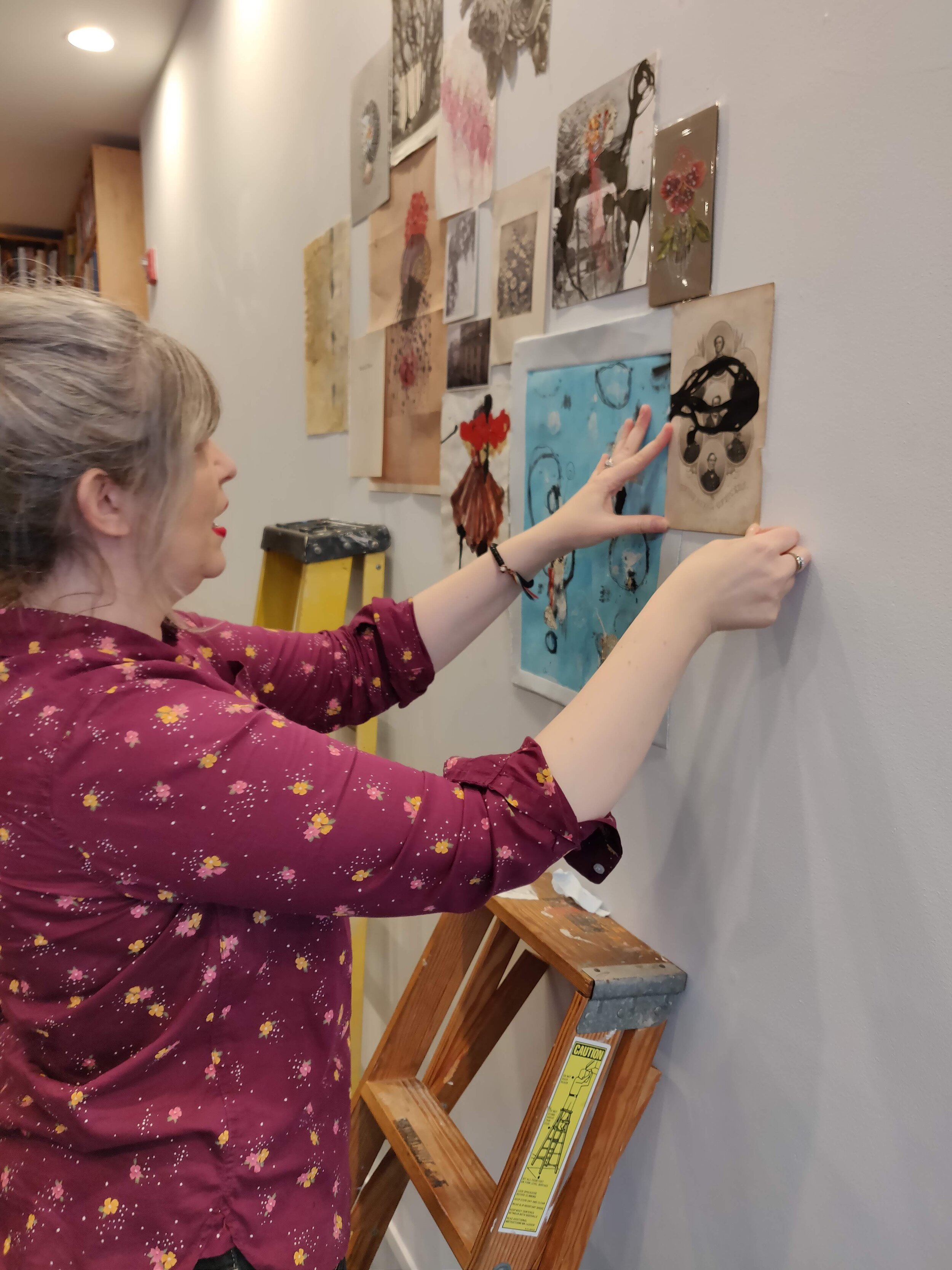
The paintings in this show were made upon a return to the studio after an eight-week separation during Covid lockdown March through May. While she was at home, Kirstin began hanging objects in her home in a way that mirrors her studio's accumulation of papers, images, and books on the wall. She then made linear drawings from these arrangements, including her collection of catalogs, saved postcards, or one of her finished paintings. The final artworks shown here grew out of those initial drawings made in quarantine.
Kirstin creates a still life salon-style using blue tape to temporarily affix and easily arrange images on the wall. In the case of the floor, she layers book illustrations and catalogs open to the page she loves, a print of a landscape by Van Gogh working in Arles, for example, and then stacks it next to a roll of blue tape and a color chart. She considers these to do the "duty of the salon wall without the labor of hanging multiple works." These are charts of influence, love, accumulation, and art-making.
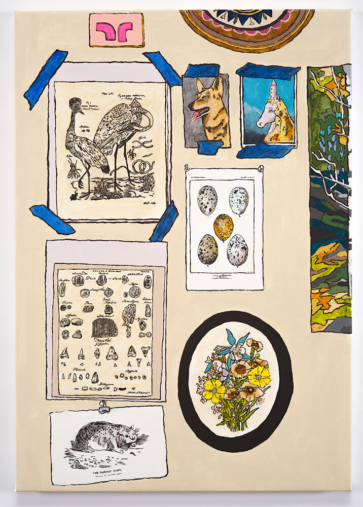
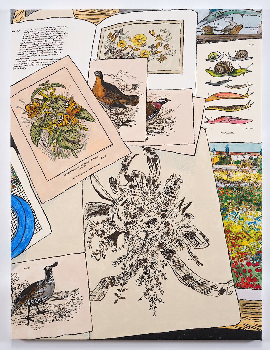
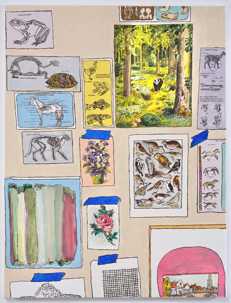
The two large works on canvas and several smaller drawings on canvas are some of the first pieces she created upon her return to her studio - made specifically for this show at Paper Nautilus (Providence, RI.) For Lamb, like other artists in the area, Paper Nautilus is a source of inspiration and material. Aside from books, it has an extensive collection of vintage science, botanical, and natural history illustrations, sorted into categories in wooden drawers -for a few dollars, one can buy these by the page. In Kirstin's studio, they find their way into the still life's she sets up for each piece.
This type of visual design gives a clue into her practice, as she draws from a specific way of working, one that references Trompe-l' œil and the still life of the 1800-1900s. Artists of that genre often depicted the ephemera of every day, including the artist's tools, correspondence, and works in progress, all in one painting. (artists like Jean-François de Le Motte, Trompe l'oeil with Palettes and Miniature, 1635- 1685). In Lamb's take on this genre, she alludes to the artist's role as a collector of images and the illusionistic aspect of the trompe l'oeil. She integrates the objects and display style of her forebears but stops at linear drawing. She does not continue to develop the illusion or falseness of depth; even the color remains flat, unlike in other series, where objects and people are depicted with almost photographically realistic detail. Instead, in this new work (as she writes in her artist statement), she chooses to "cartoon the space, introduce photographic crops that disrupt awkwardly, paint thin layers where there should be thick."
Lamb keeps things flat, straightforward, and truthful despite the intended visual illusion used to trick the eye that Trompe-l' œil seeks to achieve. It's as if she does not want to mislead us or get herself caught up in that deception – at least not now. Kirstin seeks a kind of honesty and straightforwardness in her painting presentation, her intent not to fool the eye but present a kind of chart of the studio, a loving representation of what inspires her in hopes it might inspire someone else. She is "lionizing the project of the artist" in her small way and "sharing her wall so I and others may make in the face of whatever comes next."
_
Biography
Kirstin is a painter living in Providence, Rhode Island and working in Pawtucket, Rhode Island. Kirstin studied painting at the Rhode Island School of Design, graduating with an MFA in 2005. Kirstin’s work has been shown in venues across the country and abroad, recently showing in group shows at the Wassaic Project in Amenia, NY, Co-Worker Gallery in Toledo, Ohio, the Fruitlands Museum in Harvard, MA and Providence College Galleries in Providence, RI, among others. She has attended residencies at the Atlantic Center for the Arts, Vermont Studio Center, Bunker Projects, the Wassaic Project, the Kimmel Harding Nelson Center for the Arts, The Ora Lerman Trust Soaring Gardens Artist Residency, and the Sam and Adele Golden Foundation. Kirstin received a RISCA fellowship in Painting for the 2020 year, a Rhode Island state arts grant, and has been able to create a new body of work to show with Periphery Space @ Paper Nautilus, an art space in Wayland Square, Providence. Kirstin recently completed a two- year contract curator position at The Yard, Williamsburg, a coworking space in Brooklyn that hosts solo and group shows quarterly and has begun planning online and new curatorial projects in Rhode Island.
______________________
Interview
Shana Dumont Garr interviews Kirstin Lamb on the occasion of her show “Wall and Floor” at Periphery Space @ Paper Nautilus.
Shana Dumont Garr is a writer based in Acton, Massachusetts, and the Curator of Fruitlands Museum, a property of the Trustees, in Harvard, MA.
~
Shana Dumont Garr: Kirstin, this first question will have a bit of a preamble to establish our relationship.
When I was first introduced to your work, I was so intrigued and attracted to it because it seemed to me that you were illustrating the very way I was thinking as I got to know the Fruitlands Museum collection. Focused upon the 19th century, it is literally dated, and the contrasts of placing art next to each other felt like a productive means to gain headway on both understanding it and sharing it with others.
Kirstin Lamb: Shana, I’m so excited you feel that way! I love representing the studio wall as a salon wall and curiosity cabinet. I feel like the way I can understand objects, art-making, and day-to-day human relationships are frequently object-oriented comparison and placement. I feel like I speak more through organizing and re-organizing objects than I do through clear speech. There is something about imaging that relationship, analyzing it, that is helping me figure out what I do. I used to re-arrange the furniture to deal with emotions and fear, so I seem to correlate objects with ideas and feelings. I know many objects have complicated political and historical histories, but the role I frequently inhabit as an artist is to react to them emotionally and formally. I relate so closely to what you do inside the museum and how you tell stories with the objects you care for and display. I feel like I’m trying to just make visible my belief in the studio as a kind of bulwark against pessimism and inaction.
SDG: It takes time to draw, to represent, to render- and I like how you mentioned that in this current series, the drawings are not all about precision. My sense is that for you, drawing and painting is about the process, and about the appreciation of the materials you choose to focus upon. I am curious about the relationship to time in your chosen mediums.
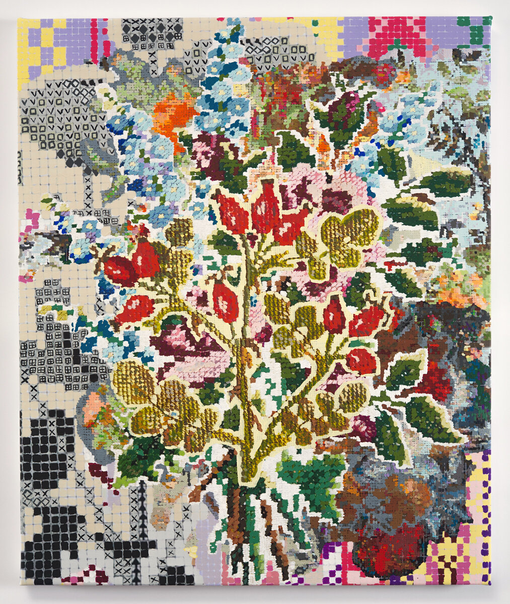
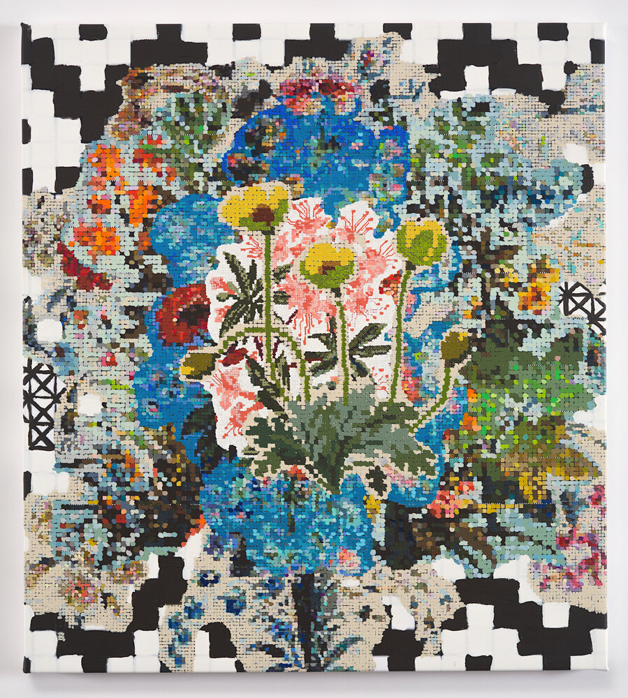
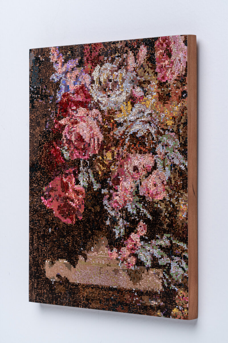
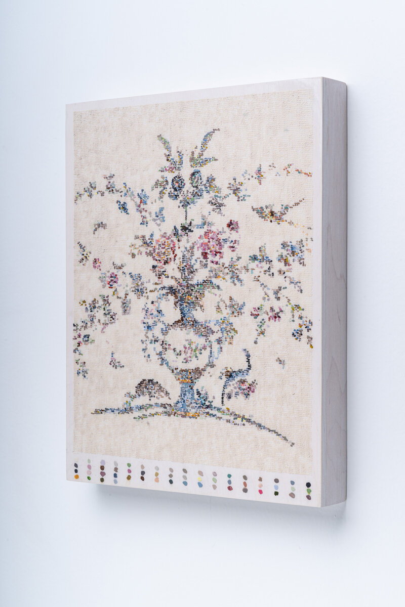
KL: For me, I tend to spend too much time just translating what I’m doing, and I’m trying to just let that be for a while. The obsessiveness of my work can be a trap, but a lovely trap. These new wall and floor pictures are made from drawings that I am blowing up and printing on canvas, so I don’t feel the need to laboriously transfer the original. I feel more freedom to be clumsy with the original, and I feel more freedom to act more simply with the color. Initially, I was interested in obsessive repetition for its effect on my hand, the way it eventually wore down my ability to achieve anything close to facility. But I’ve gotten good at tricking myself into capable repetitive marks, so now, giving myself permission to be free and clumsy is its own reward.
Time for me is part of the meaning of the work, sometimes it is the subject. If I’m not wearing myself down to force my hand to exhaustion, as in my embroidery paintings which involve repeated mark-making in the thousands of marks, I’m trying to do too much to the image to the point of overwhelm. Part of what I actually want to question is what exactly is the value of a work? Is it the time spent with it? Is it the clarity of what it depicts? Does repeating something translate to knowing it better? Does it become less clear? Is that important or redundant? I’m not sure I know the answers, but I lean toward time, labor and accumulation. Those things say something about my identity and the solutions I have gravitated toward, despite modern conveniences and tastes. I want a work that is crowded and awkward, a wobbly salon of particular tastes, overhung and humbly overwrought. I feel I understand things as I examine them and repeat them, and feel that sharing my examinations is my way to share a part of myself. In some ways, my repeated labor is a kind of self-negation just as it is an insistence upon myself and my studio.
SDG: This current series of your paintings focuses more on the natural world than on visual art. However, I’m thinking it is still a blend of images as framed and made by people in many different times and styles. Let’s talk about the relationship between nature and culture, and how styles over time represent changing relationships between people and nature.
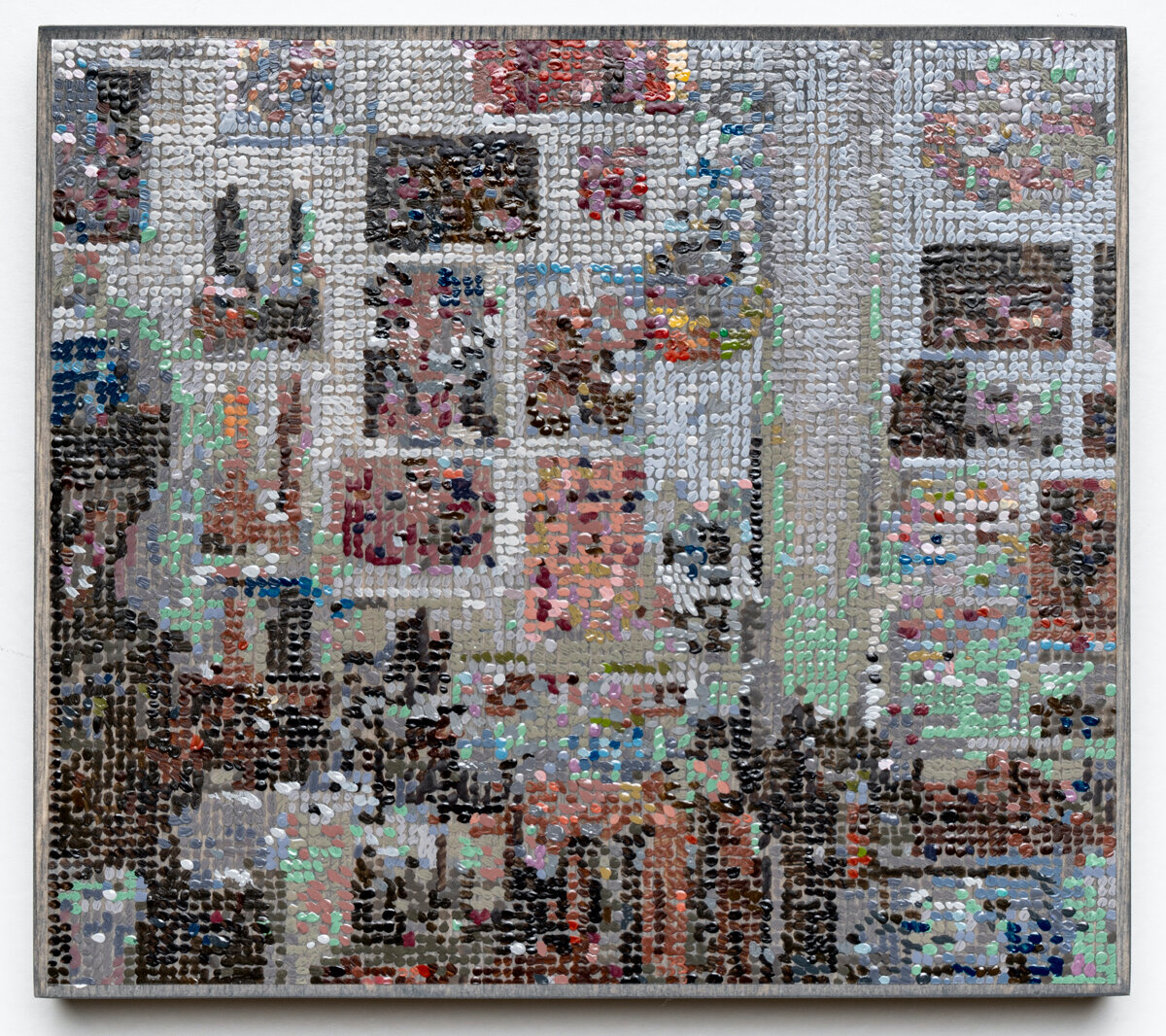
KL: Yes, I guess I have moved to looking at images from nature, with a salon-style lens if you will. I’ve been using diagrammatic imagery but trying to place a textbook image of a horse skeleton or a range of fossils into the format of a still life picture.
I’m not sure how I feel about the relationship between nature and culture, as it is related in my work. I haven’t been asked about that before. I feel I’ve been gravitating toward the natural world as we were shut away during the Covid-19 March and April quarantines. When I returned to my studio I immediately began painting the woods as we were not allowed to hike or be on the trails in my state at that time, so I had no access to wild spaces. I could only walk along city trails, and it felt very limiting. There was something about not having access to a space beyond the city that made the world feel so much smaller, so much less alive. I just started work on a large woods painting (stay tuned it will take about a year) and the paintings in this show came along at that time too, first as drawings, and then in their painted form more recently. I guess I was gathering to me what the outside and wild places or even what outdoors and the woods meant to me? My understanding of the woods is an intersection of these scientific diagrams and charts, fairy tale images and images from the Black Forest and the New England woods. These intersect with the daily reality of the art studio (paintings, graphs, tape) to form a kind of synthetic inside/outside that feels sort of true to my emotional state at the time. I hope the pictures show a kind of longing but also maybe a kind of hopefulness, that one can make due and make positive space for oneself and others in the interim.
SDG: Kirstin, in the interest of realism, I am writing again with a new set of questions two weeks after I was able to see this exhibition in person. We met the day after the presidential election when time was seemingly frozen in tense hopefulness. Let’s talk a bit about how this year, from the pandemic to the intense election cycle, has affected your work and/or your artistic practice.
KL: I am trying to make work that fulfills my own needs for color, outdoors, beauty, repetition, and pleasure. Women have historically been shunted into the role of painting flowers or stitching objects to beautify interiors, and now in a moment of stress and fear I feel I wanted to reexamine that, less as a coerced practice and more as something done for joy and expressive pleasure, despite the loss of options for travel and free movement. I wanted to lionize small handwork projects and found textiles. I like the idea of following the patterns someone else followed to beautify her home 30-70 years ago but coming at it like a painter, abstracting and examining the mark, as well as blowing it up to lionize it.
SDG: I love how you articulate bringing time-honored work to a place where process and content are considered in a contemporary manner. Your work was more overtly political in the past-how does your stance on current issues play a role in your current work?
KL: I like the idea that my audience can meet the work where they are. I don’t feel this work is any less political, it is just not aggressively so. I don’t do so much telling in this work, nor do I always explain its purpose. I don’t think the artwork should always lead with its conceptual purpose, though it might have one. I like for folks to unravel why I use French wallpaper, textiles from certain eras, and why I find it helpful to use digital collage and the paintbrush as a stitch. Sometimes content can be playfully arrived at through contemplative visual play as well as through careful political argument. I particularly use French wallpaper patterns from the pre and post-revolutionary moments as a tie in to what they mean politically, but I stop short of eagerly pointing it out. The visuals usually do their own talking and speak of decadence and decor as political actors in their spaces, but also handmades, things that require resources and human labor. I am trying to tie those visuals to a similar visual high period in American culture, the 1950s-70s era home decor, and using patterns from that time feels like an interesting parallel. The labor of my work itself is kind of absurd, everything must be re-touched or re-made with the brush even if it is digital or printed at first blush, and I embrace that as a part of the content. I spend time thinking through what that means for our contemporary moment as makers and cultural producers.
SDG: A more formal question about Studio Wall with Forest, Charts, Skeletons, Florals, and Birds (2020), Is the biscuity taupe an imagined “heaven-place’ or a wall?
KL: The color describes a wall! It is painted with one of my favorite colors, ‘Unbleached titanium.’ It is also the decorator color of my home office, where I am slowly destroying the nice wall with way too many tacks!
SDG: The setting for your exhibition is the exquisite shop, Paper Nautilus. Near your work are drawers of vintage botanical illustrations, and you have talked about this exhibition as a love story to source materials. How often do you come here for inspiration? Where else do you find images that become a part of your work?
KL: I love the idea of a curiosity cabinet and I would say that a shop like Paper Nautilus is the bookseller’s version of a curiosity cabinet. I can acquire some of the objects and take them home to build my own curio, but many of the curio objects in a bookstore such as this are paper objects, easy to transport, not too expensive and easy to maintain. I enjoy building collections of paper ephemera and find that a collection of paper, carefully curated, creates a world, a curated world that I feel compelled to re-present. I try to come when I can, though I couldn’t put a finger on how often, it is when I happen upon the store on a walk in town. I am so grateful Kristen and her store are here every time I do.
Additionally, I do find images I am looking for by searching or happening upon them when reading. Lately I have been looking specifically for Black Forest imagery and images of artist’s studios, so both of those have been searched for and specifically located and printed, bought, or photocopied. Sometimes, images are acquired because they are the kind of taxonomic thing I am drawn to - I prefer a good dictionary of images.
And finally, I do get the many blessed gifts. Friends of all stripes find me with the most wonderful objects and images, and sometimes artwork. Much of it does migrate to the work, slowly, over time. Some things take years to make it into the work, some never do, but I look at them a ton and try to decide what they mean.
SDG: I love the way you combine images from books and your own works in new composites. Let’s talk about the balance between appropriation and, as you have put it, re-presenting. Perhaps you could mention other artists whose work has influenced you in this regard?
KL: I have a love affair with re-presenting the already made, in my own hand. I spoke with a painter friend recently and decided that my version of authorship involved the brush and paint and the tremors and failures of my hand, not the imagery or anything else depicted. I was really interested in how translating something with my hand, however mechanically, could make it mine. This has set me on a course to maniacally repaint everything in my scope, sometimes with my own authorial revisions, sometimes without. But what is always important is my hand doing the painting. I feel I can appropriate when I re-scale and touch a thing myself with paint or drawing. My hand, my personal clumsiness, my personal misfires on color choices, my mistranslation reads to me as a way to allow for the appropriation of other works I would like to talk about.
When I first started making pictures of paintings and artworks, it was a kind of wish to build installations of leaning paintings, which I did fulfill, thankfully. But in the process, I learned about artists in the Dutch high period who were charged with re-imaging the collections of princes and nobles such as David Teniers. His salon portraits of collectors in front of their entire amassed collections fascinated me. Interestingly, he was also responsible for the first catalog raisonne, a printed copy of an entire collection. He drew each artwork and then engraved and printed a book of the collection to be distributed. A revolution for its time. These copies were advertisements of the collector’s wealth and power, but it was also a form of sharing and talking about the collected artworks.
As much as I understand and wish to critique the power structure this implies, I am also interested in the idea of images of images as re-contextualizing and re-structuring the conversation of objects. Objects can be absent still be talked about. This was revolutionary at that time and is now commonplace with the advent of photography. But hand painting or drawing a thing still has a talismanic power to give an art object a certain special aura of value, I would say the value of human labor. So in translating the objects by hand, there is a special value in repeating them and scaling them, transplanting them.
I have also been very interested in many of the artists from the Pictures Generation of the late 70s, early 80s. I find Louise Lawler specifically influential. Her images of artworks in collections as both photographs and line drawings forced me to look at the way in which a Pollock, say, lived with a 18th-century French soup tureen. I find her critique of the art as decor both influential and inspiring. Perhaps, it has made me hew closer to decor and further from overt critique? Is that fair to say? Can decor share the role of critique?
SDG: Your questions and the time period you last referenced also recall for me the realization Jeff Koons gave me, that kitsch had a role in fine art, and vice versa. It made me think of my grandmother’s living room in an entirely new way! I think your work removes boundaries between genres in all the best ways. Could you please elaborate on the visual syntax you create by painting disparate images into one new scene?
KL: If I want to have a visual sentence about Sherrie Levine in dialogue with a story about Rapunzel, it might be helpful to copy a work of hers adjacent to a story illustration? I find these juxtapositions reveal themselves to me over time, I am truly interested in making combinations and asking different things of them. So I combine artist’s studio imagery, with works from art history, with paper ephemera and illustrations and other visual photographs and objects. I like to look at paintings like Rauschenberg’s “Rebus”, to think about visual storytelling as sentence structure. One image follows another, and you tie them together through inference and making poetic visual-verbal connections. A painting is a kind of poetic puzzle, no?
SDG: Would you consider the art-making process like journaling? Does your personal history come across in the work?
KL: I do sometimes consider painting to be tied to my personal history, but I wouldn’t consider each object imaged to have the talismanic symbolism of an object in a still life. So I may image 3 different pictures of animals and cartoons that come from the Black Forest because I am thinking of my German background and family ties to that area, but the particular animal, say a Boar, doesn’t stand in for any particular person or idea, I was just interested to image a boar and put it next to a storybook image. I think the images in context create a narrative, and perhaps a threat, I am interested in the perceived mystery and threat of the storybook woods and find that the accumulated images should suggest that, but each particular image does not stand-in for a particular idea or person in my life. Boars are quite violent, stories have violent passages, especially early fairy stories, and I have been rereading The Uses of Enchantment, Bruno Bettelheim’s book detailing the dark roots of some of our best-known fairy tales and the implications that have in our re-telling. I am interested to understand what imaging these things together does. I know what the images are, a kind of taxonomy of certain woods that has symbolic and personal meaning to me. Though I feel like one brings particular allusions and ideas to each image. These aren’t quite still life paintings and they aren’t quite mood boards, I prefer painting-as-curation, as it allows for each object to have its own identity and bounce off the other objects in the painting. I am imaging my own personal shows, however off-kilter. My own sentences and sometimes poetic thoughts, sometimes not fully realized, just studio curations that get solidified into paint, an organized record of something ephemeral.
SDG: I like how you speak of meaning not always being the first reason for selecting an image. You mentioned painting-as-curation. In addition to a visual artist, you are a curator and a writer. How do these practices interrelate for you?
KL: The paintings have frequently chased what I have written about them in the past, I used to have this very rich idea and word-led practice. Something switched from words to pictures about 5 years ago, my notebooks were filled with lists and paragraphs and suddenly became all pictorial. I found myself imaging lists of potential paintings, in grids. Instead of making a list of words of paintings I wished to make, I had a list of drawn images. These became what I now call “painting as curation.” I was curating from my own list of images, or taking one image and repeating it in another.
I feel like I have created this artificial boundary between maker and curator which sometimes spurs me to create more, and think more clearly. I have found myself interested in the history of museums and curiosity cabinets, still life, and handicraft all through this strange way of writing/curating/making.
I find that when curating I look for art that deals with concepts I’m learning about or dealing with in my own work. I have organized shows that cover the woods, dots and mark-making, flowers, and interiors. I like to have a sense when curating other artists that they are game for reading into and through the work, allowing for multiple reads, playful reads, dark reads. Someone sees a dot painting, someone else sees painful repetition, someone else sees meditative mark-making, and another viewer still sees the privilege to make something without a political purpose. I find the conversation between these interpretations to be the truth of the work, and try to foster conversations through visual juxtaposition, writing and discussion. I enjoy other artists and their generosity on this front, it is such a pleasure to show my peers and mentors.
acrylic on canvas. 33 x 23 in
acrylic on canvas, 50 x 38 in.
acrylic on canvas, 50 x 38 in.
acrylic on canvas, 33 x 23 in.
acrylic on canvas, 29.5 x 26.5 in.
acrylic on canvas, 29.5 x 26.5 in.

Acrylic and gouache on duralar on panel, 11 x 8 in.
side view
Acrylic and gouache on duralar on panel, 8 x 8 in.
side view

Acrylic and gouache on duralar on panel, 11 x 8.5 in.
side view
Acrylic and gouache on duralar on panel, 7 x 5 in. SOLD
Acrylic and gouache on duralar on panel, 8 x 5 in.
Gouache and acrylic on duralar on panel, 8 x 10 in.
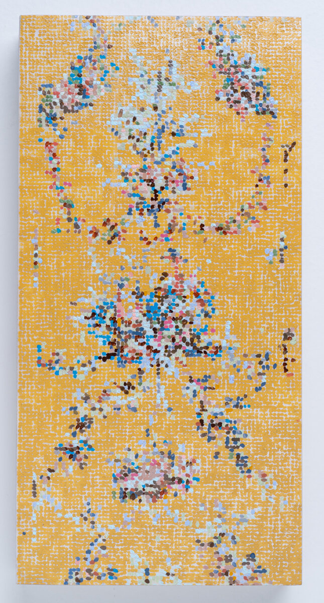
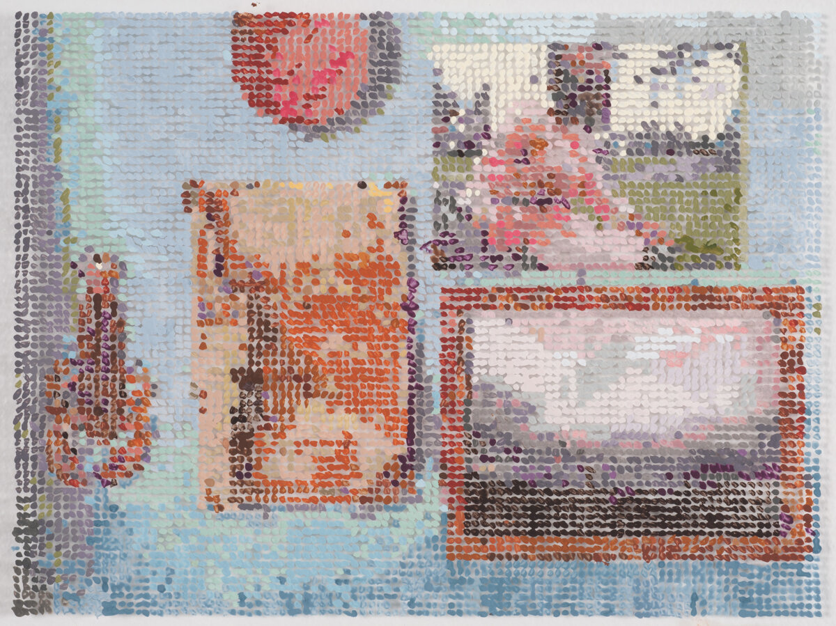
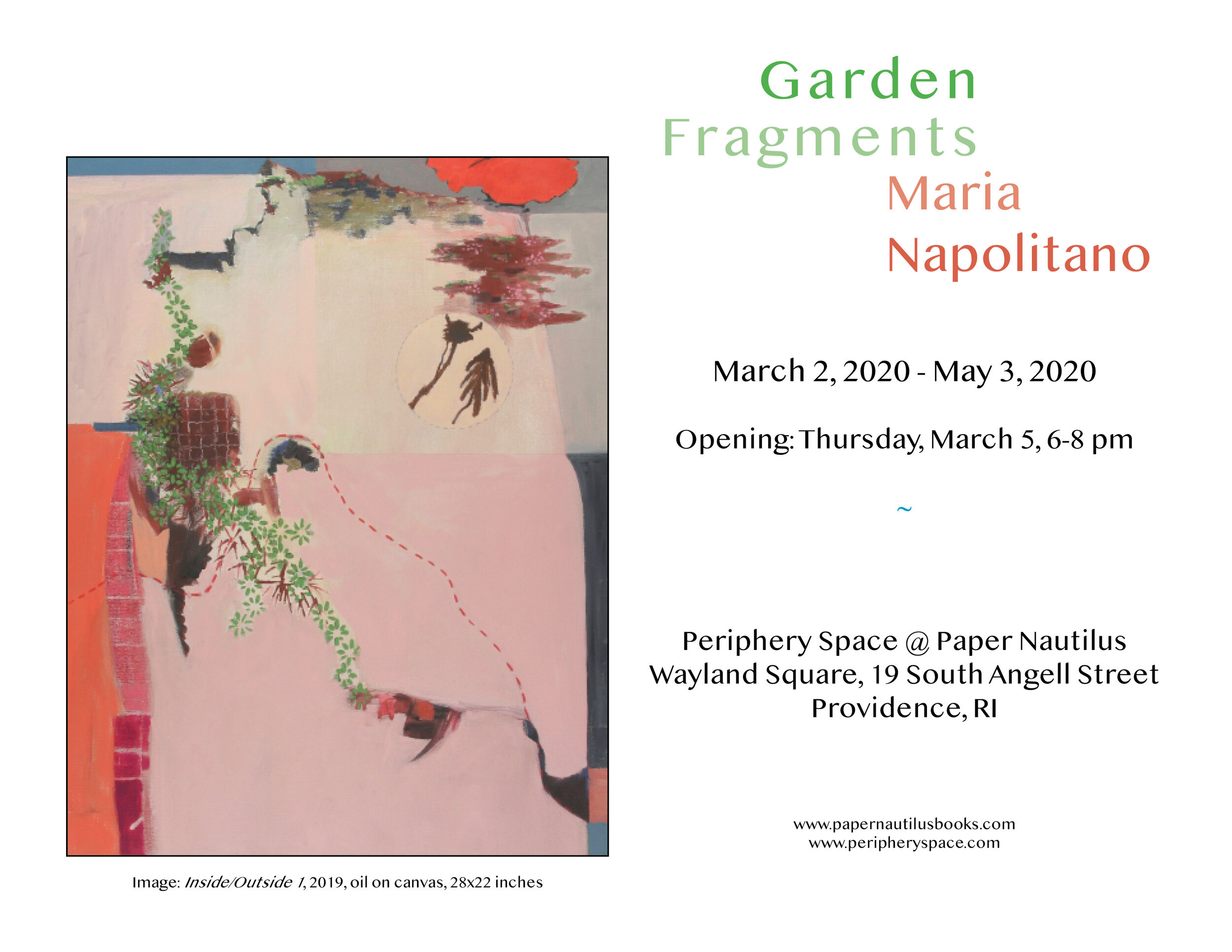
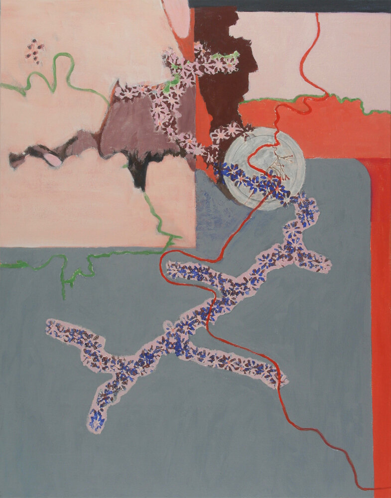
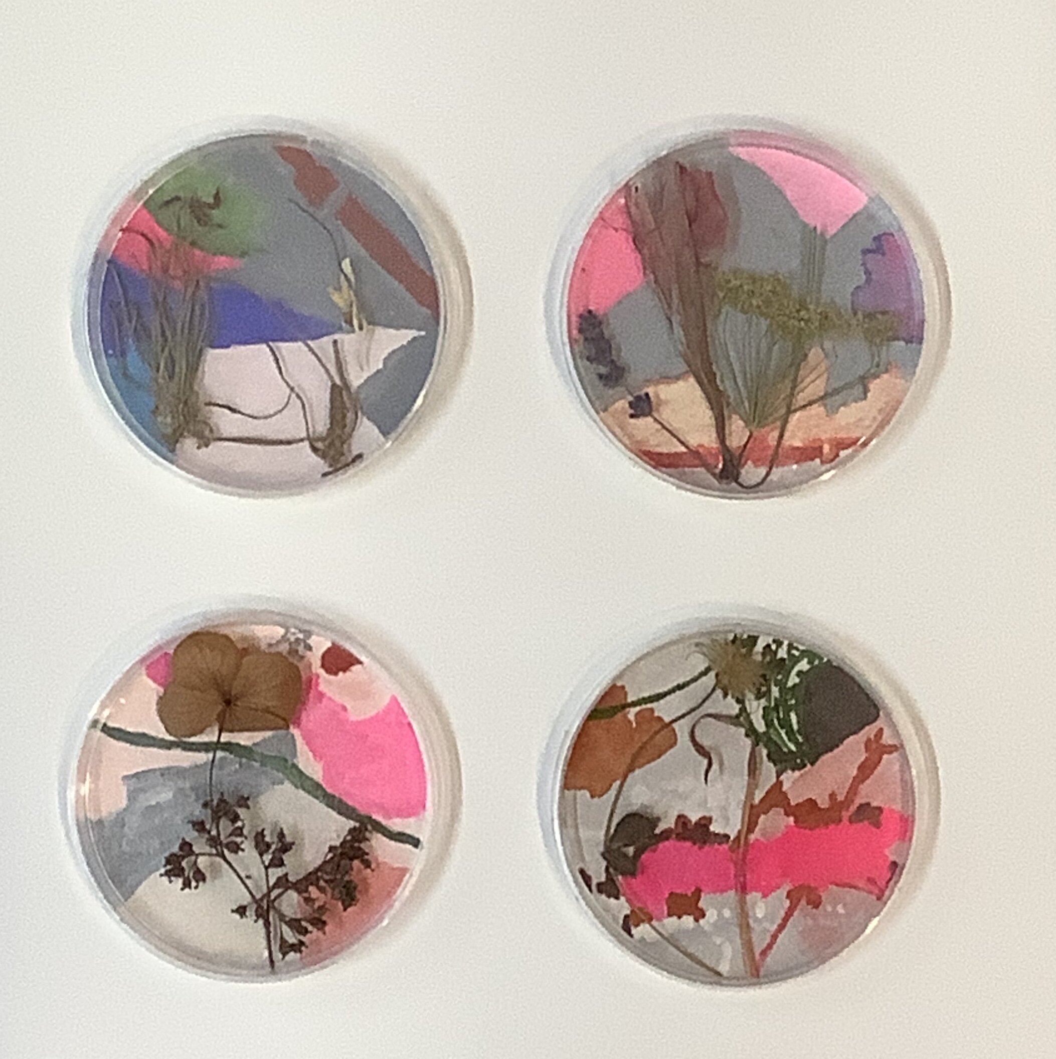
Maria Napolitano | Garden Fragments
March 2, 2020 - May 3, 2020
Garden Fragments features a collection of recent paintings, sculptures, and works on paper.
"Nature will bear the closest inspection. She invites us to lay our eye level with her smallest leaf, and take an insect view of its plain." - Thoreau
The work in this show invites you to stop and take a closer look at the ordinary and non-spectacular fauna that surrounds most of our lives. To do this, I mix up painterly, cartoony, and diagrammatic approaches which I use to draw attention to the fragile relationship we have with our ecosystem. Whether it be based on the dried remnants of last year’s garden or visual memories I collect from a winter walk in the park, I combine observation and imagination to provide an insight into my everyday interaction with nature. -Maria Napolitano
~
The quote by Thoreau that Maria included in her writing is close to how I would describe my experience of looking at Maria's work. From what perspective should one look at nature? Very close up or from a distance? With one's eyes or through a lens of one's own making? What does a plant look like in inked silhouette, seen through layers of translucent paper? How does it appear as an abstracted shape on canvas with paint? Or in the frame of a small petri dish? As she shows us, there are many ways to look and keep us looking. Questions are being asked as she inspects details of nature, and structures them into diagrams, graphs, and illustrations.
~
Biography
Maria Napolitano lives and works in Providence, RI. She received an M.F.A. in Painting from Syracuse University and a B.F.A. in Painting from UMass Dartmouth. In 2013, Maria was the recipient of a painting grant from The Artist Resource Trust of the Berkshire Taconic Community Foundation. In 2012 she received The Lillian Orlowsky and William Freed Grant in Painting from the Provincetown Art Museum. She was awarded the Rhode Island State Council on the Arts Individual Fellowship in Drawing in 2011 and in Painting in 2004 and 1981. Her work is in the permanent collection of the RISD Museum, Fidelity Investments, and numerous private art lovers.
~
For information about the artist and her work visit: www.marianaolitano.com
____________
Interview with Maria Napolitano and Barbara Owen via email March, 2020
Barbara Owen: Can you tell me a little bit about your background? When did you first become aware that you wanted to make art? Did you make art as a child? What is the first thing you made where you realized that it was art?
Maria Napolitano: I was born in Providence to a working-class family of Italian descent. The only exposure I had to any kind of art as a young person was through paintings and statuary I saw at church and the one time I was picked from my grade school class to go on a school trip to the RISD Museum.
I am not sure why I have always been interested in art but I have always been a creative person with a big imagination.
As a child, I was constantly drawing, whether it be my favorite cartoon characters or sketching along with John Nagy and his “learn to draw” tv show.
I think it wasn’t until college that I thought in terms of really making ‘art.’
For me, art has always been a journey of discovery.
BO: What inspires you now?
MN: Walking, reading, gardening and seeing work and shows by other artists.
BO: Who are your biggest influences?
MN: I have had many in the forty years of working. Here is a sampling of the artists who have inspired me: Giotto, Jasper Johns, and Robert Rauschenberg, the feminist art movement of the seventies that broke down the boundaries between high and low art, Philip Guston, Ree Morton, Squeak Carnwath, Amy Sillman, and Thomas Nozkowski.
BO: How do you navigate the art world?
MN: I have always managed to have art shows for most of my career and have been part of galleries at different times.
I see as much contemporary art as I can.
I read about art and artists and I have a circle of artist friends that I try to see regularly.
BO: You started as a painter, and now your work seems to be evolving from 2-dimensional to 3 dimensional. What prompted this evolution and where do you see it going?
MN: Even though I graduated in the painting department, I never believed that art-making should have strict categories. I have always explored the use of different materials in 2d and 3d formats. I have worked in clay, plaster, found objects, both natural and synthetic, collage, and shaped canvases as well as painting and works on paper. I think the seventies art world opened up to work that went beyond the traditional art on canvas and it fit with my sensibility.
BO: How does your work relate to current social and political issues, if you think it does?
MN: Visually it doesn’t. It is more of an antidote to the enormity of socio-political issues that have been part of my experience since the sixties.
BO: What is your most important artist tool? Is there something you can’t live without in your studio?
MN: My dried plant collections, various printing rollers, and the digital radio that lets me listen to classical music from Venice for free.
oil on canvas, 28h x 22w in.
oil on canvas, 28h x 22w in.
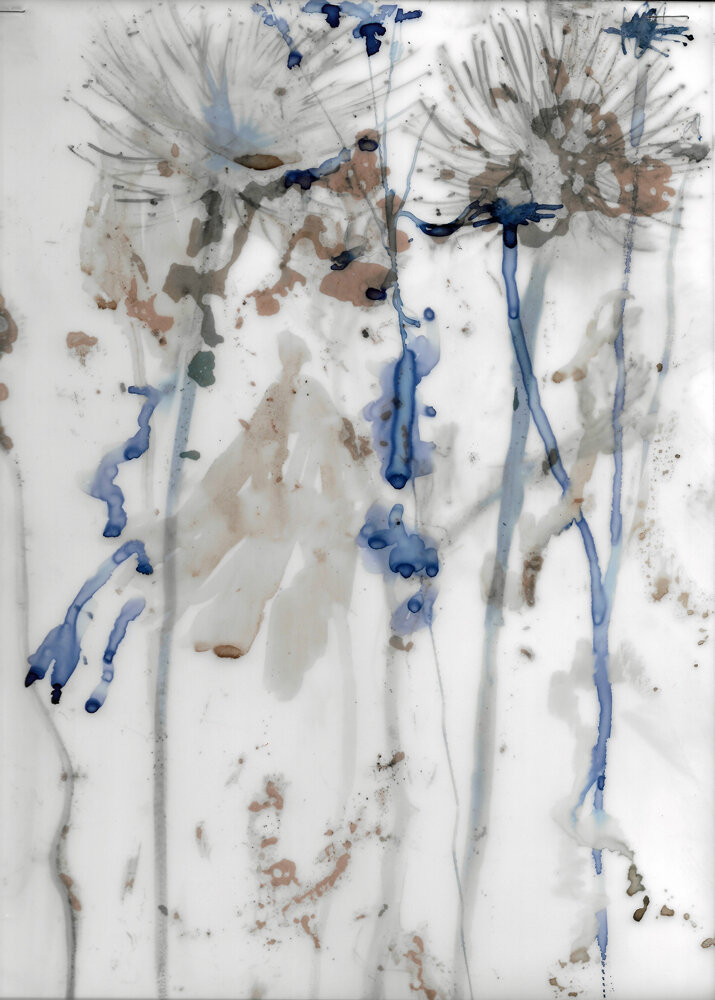
ink and coffee on vellum drafting film, 12 x 9 in.
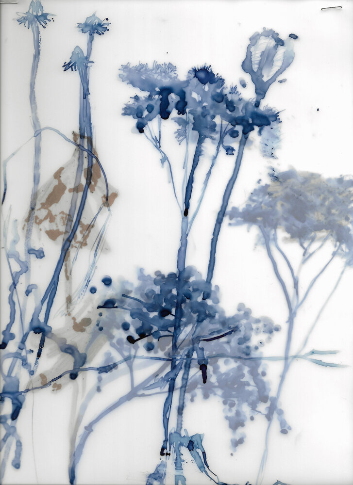
ink and coffee on vellum drafting film, 12 x 9 in.
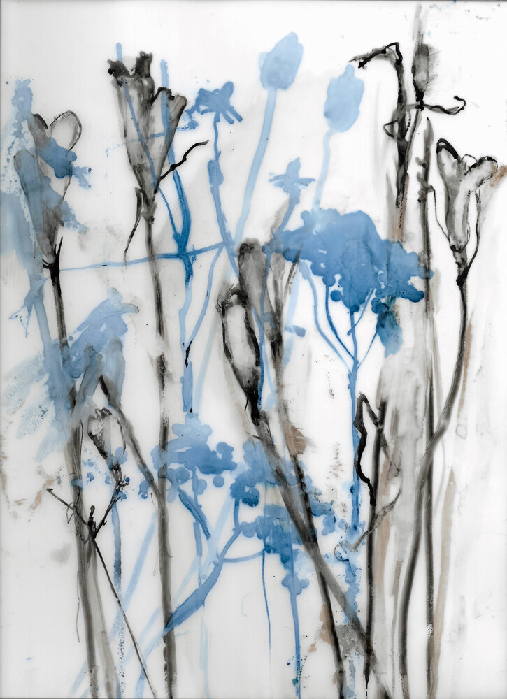
ink and coffee on vellum drafting film, 12 x 9 in.
ink and coffee on vellum drafting film, 12 x 9 in.
ink and coffee on vellum drafting film, 12 x 9 in.
ink and coffee on vellum drafting film, 16 x 12 in.
mixed media with gouache painting on paper plus petri dish.
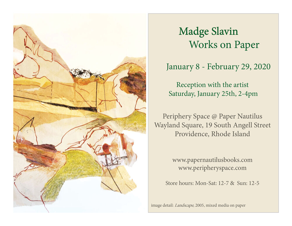
Madge Slavin | Works on Paper
January 8- February 29, 2020
I love to “dig deep” to reveal beautiful and/or interesting images that might otherwise pass unnoticed – a treasure hunt if you will. Very rarely do I start with a preconceived image. Instead, they arise from my imagination, evolving instinctively as I work. This is what excites me – the sense of discovery and innovation as I create. Fantasy forms and faces appear out of nowhere, and the process itself is an uncharted adventure, in the same way that life can be. -Madge Slavin
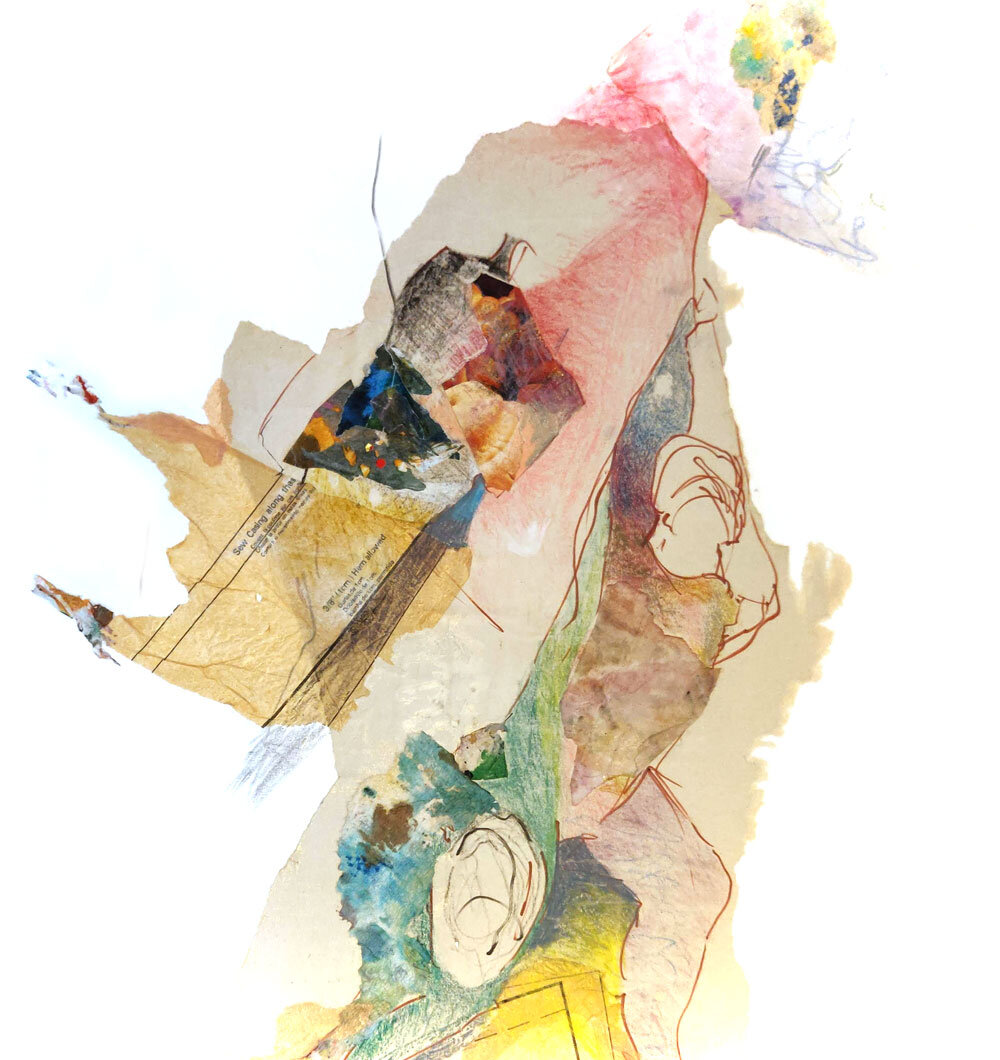
Madge Slavin: Works on Paper feature a selection made over several decades, one that is primarily rooted in collage; a practice she uses to structure, develop, and investigate a visual language with assembled forms. By combining torn drawings, painted fragments, and the occasional photograph one sees the diversity of her thinking and experimentation.
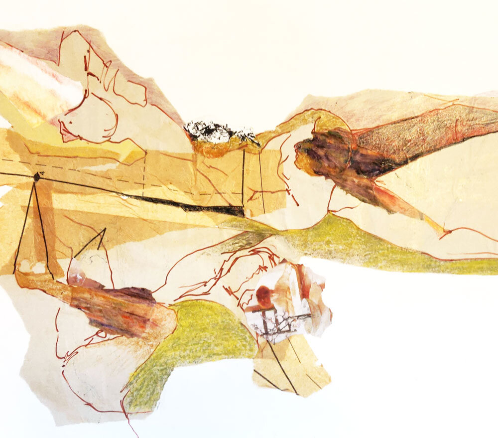
Several pieces from 2005 highlight the most recent development of her collage work. In "Landscape," Madge takes line drawings of the figure, tears or cuts them, and rearranges them into a landscape. The perspective is skewed, deconstructed, yet the shading hints at distance and scale. A line used to describe a hilltop is also a hip, a bent leg. The ink lines from a dress pattern seem to be measuring a torso. A head is substituted by a photo of a woman reading at a table, a plant in the foreground.
Madge has dedicated a life-long practice to drawing and painting, finding the local art community, and taking classes in every city she has lived in, beginning in 1956 at the Montreal School of Art and Design, where she earned an award for "Highest Standing in Design." She's taken Life Drawing at St. Martin's School of Art in London (1958), Life Drawing and Portraiture at The Philadelphia Museum (1959) and MIT's Student Art Association (1976-81), and Advanced Visual Design and Scientific Illustration at The Carpenter Center at Harvard University (1976-81, 1982). In 2002 Slavin completed a 4-year Diploma in Studio Art, a flagship program at The School of the Museum of Fine Arts, Boston.
~
Madge Slavin (b. 1928) was born and raised in London, England. She immigrated to Canada in the early 1950s and lived for several years in Montreal and Ottawa. Her marriage in 1958 brought her to Philadelphia, where her Canadian husband was employed. Over the years, she has lived in Mexico, the Western United States, and several cities in New England, including Cambridge and Rockport, Massachusetts. She presently resides in Providence, Rhode Island.
*for purchase inquires, email peripheryspace@gmail.com
mixed media collage 30 x 22 in. SOLD
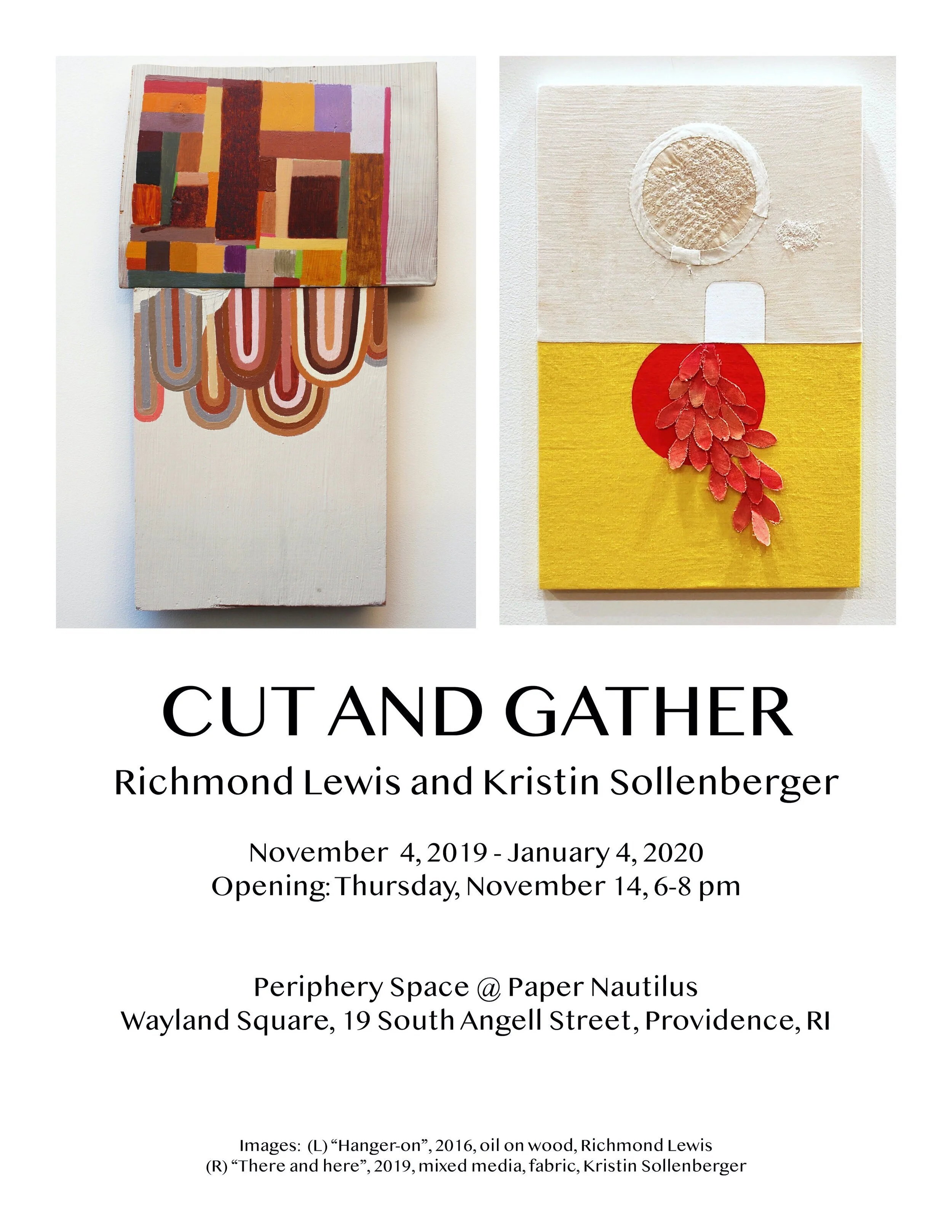
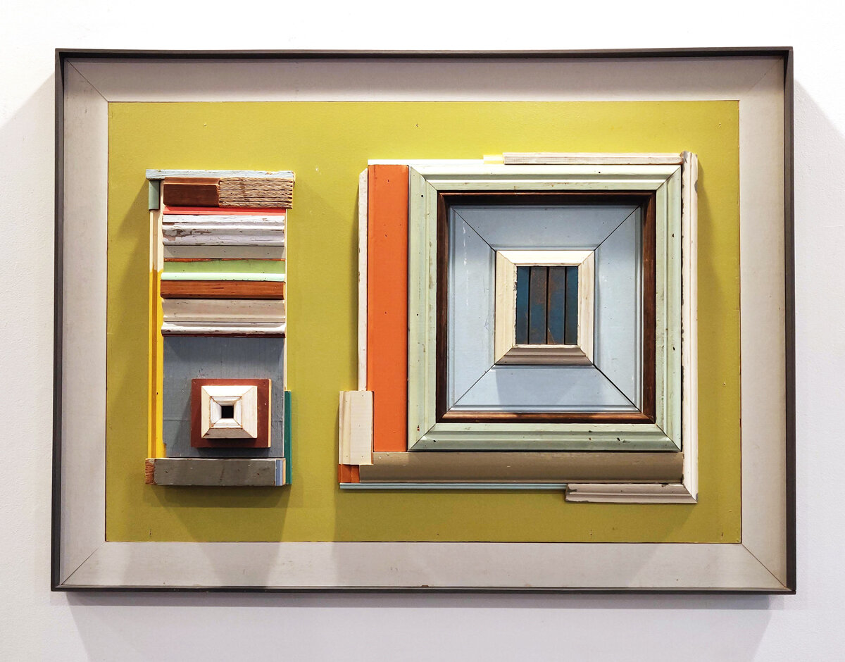
Cut & Gather | Kristin Sollenberger and Richmond Lewis
November 4, 2019 - January 4, 2020
In this collection, one sees the actions of sewing and painting, cutting with scissors or saw, breaking apart, attaching, positioning, repositioning, repetition, and mimicry.
"Cut and Gather" implies an action that results in collecting the pieces of a thing that has been cut. The cutting has occurred first, the gathering comes after. One can imagine the artists sweeping up the pieces from the floor and using as material these deliberate scraps. Gathering is also a way to assemble things, ideas, people, or thoughts. In painting, an artist assembles colors and forms; in sewing, to "gather" is a folding of the cloth to make a pleat.
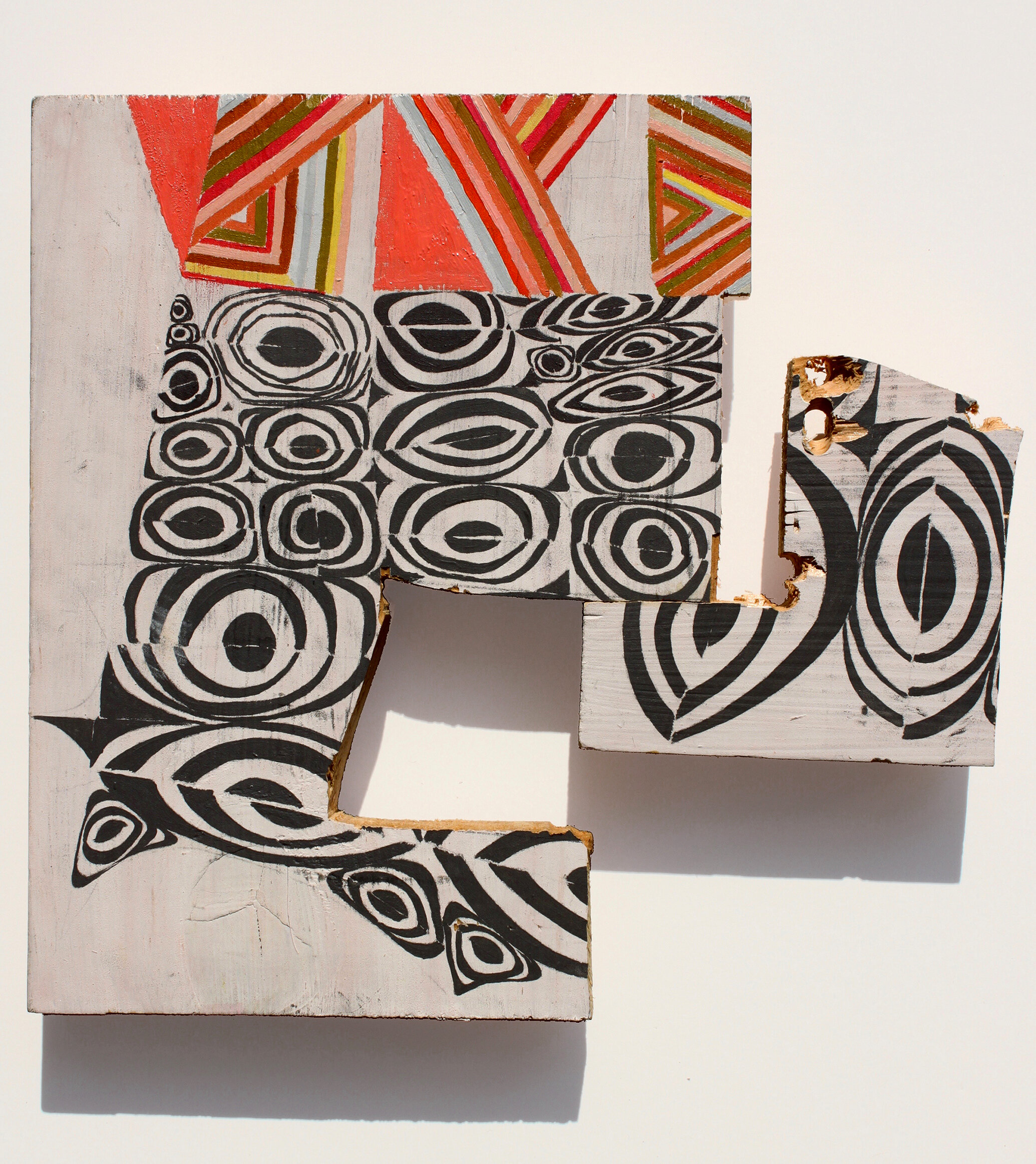
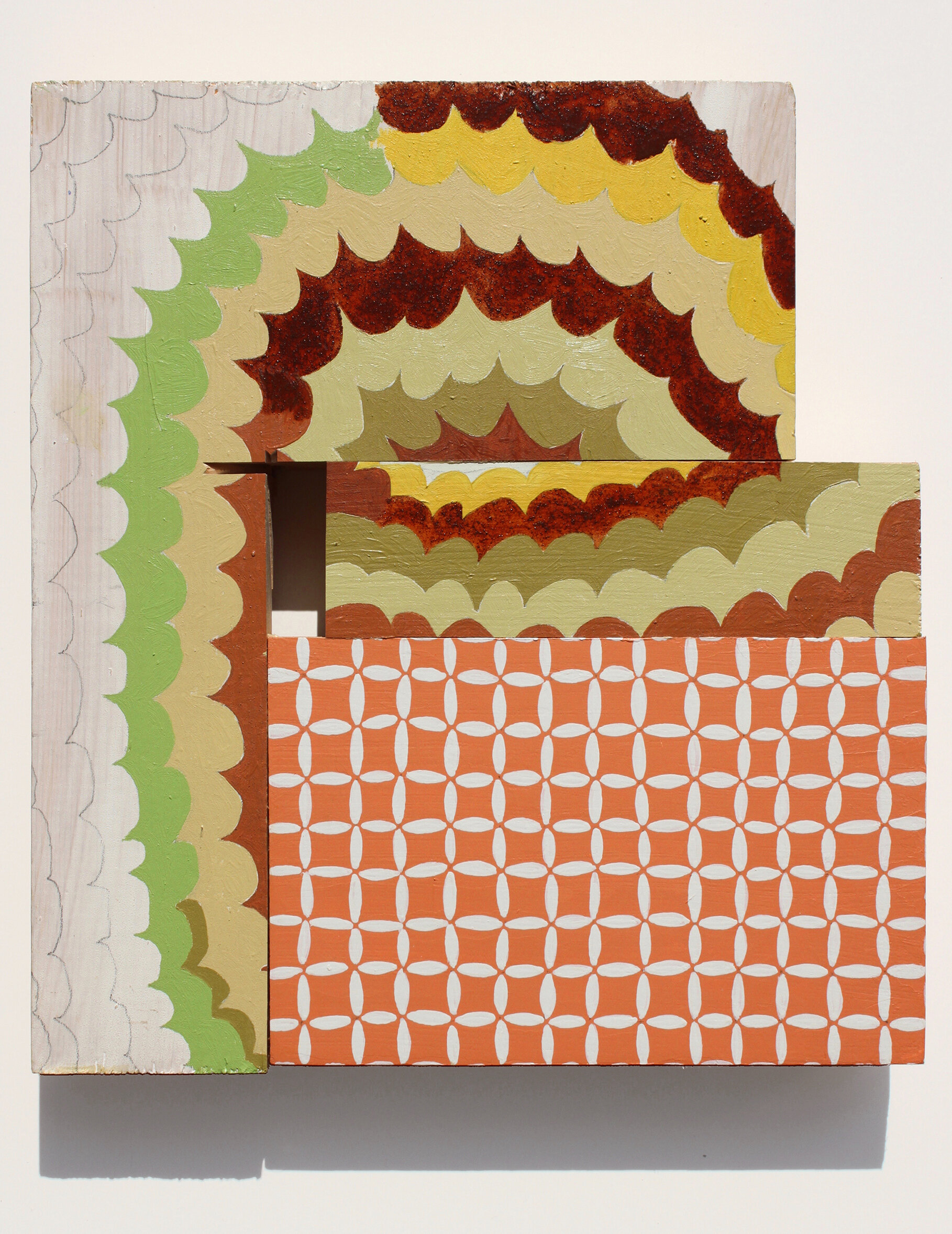
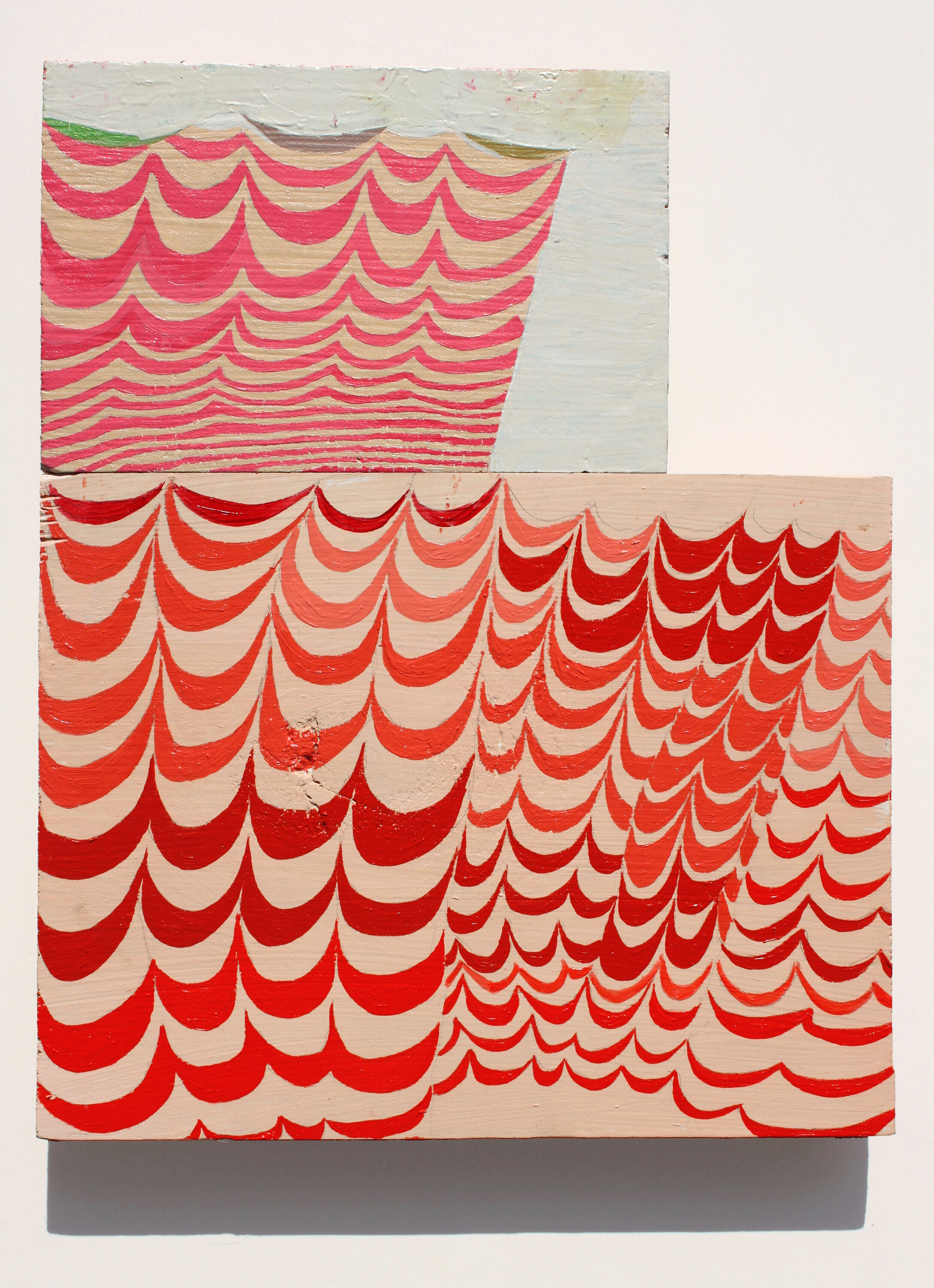
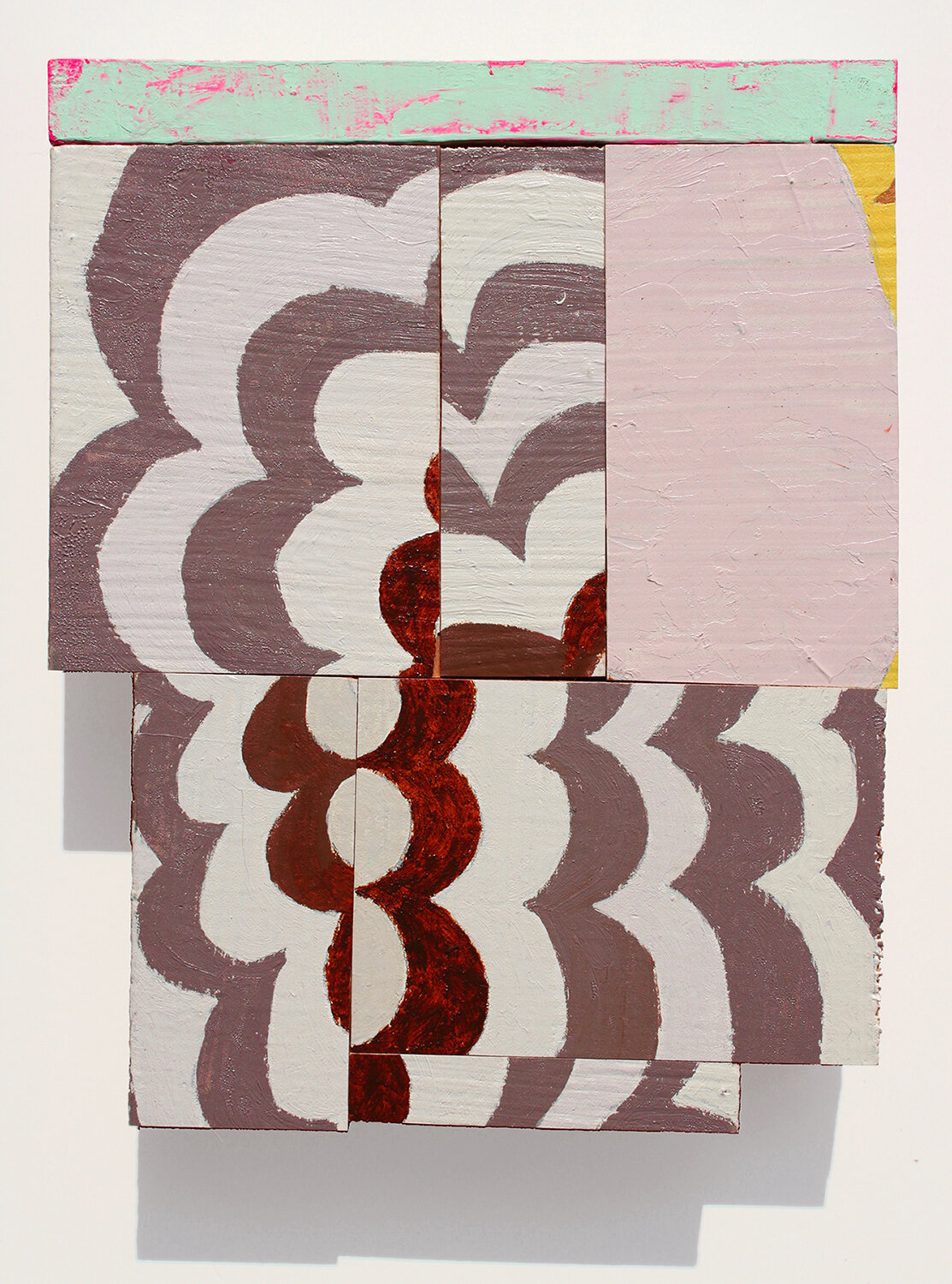
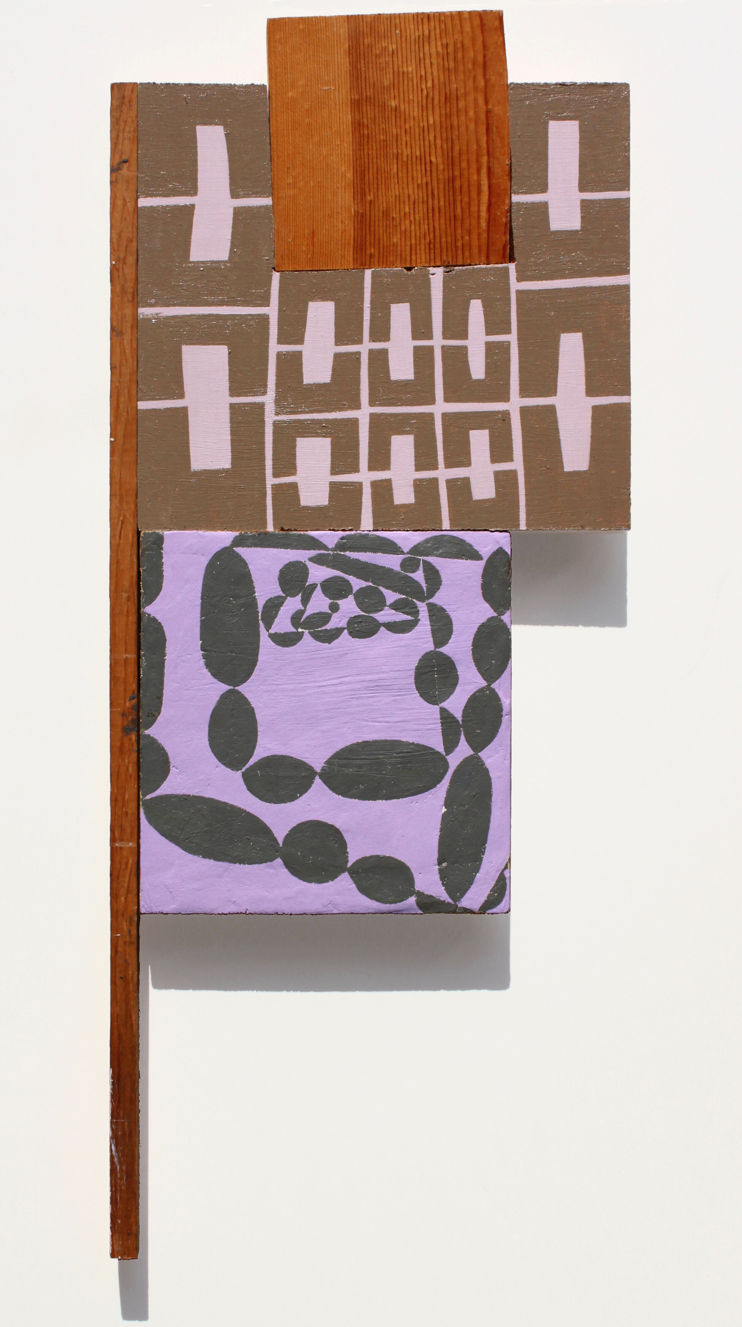
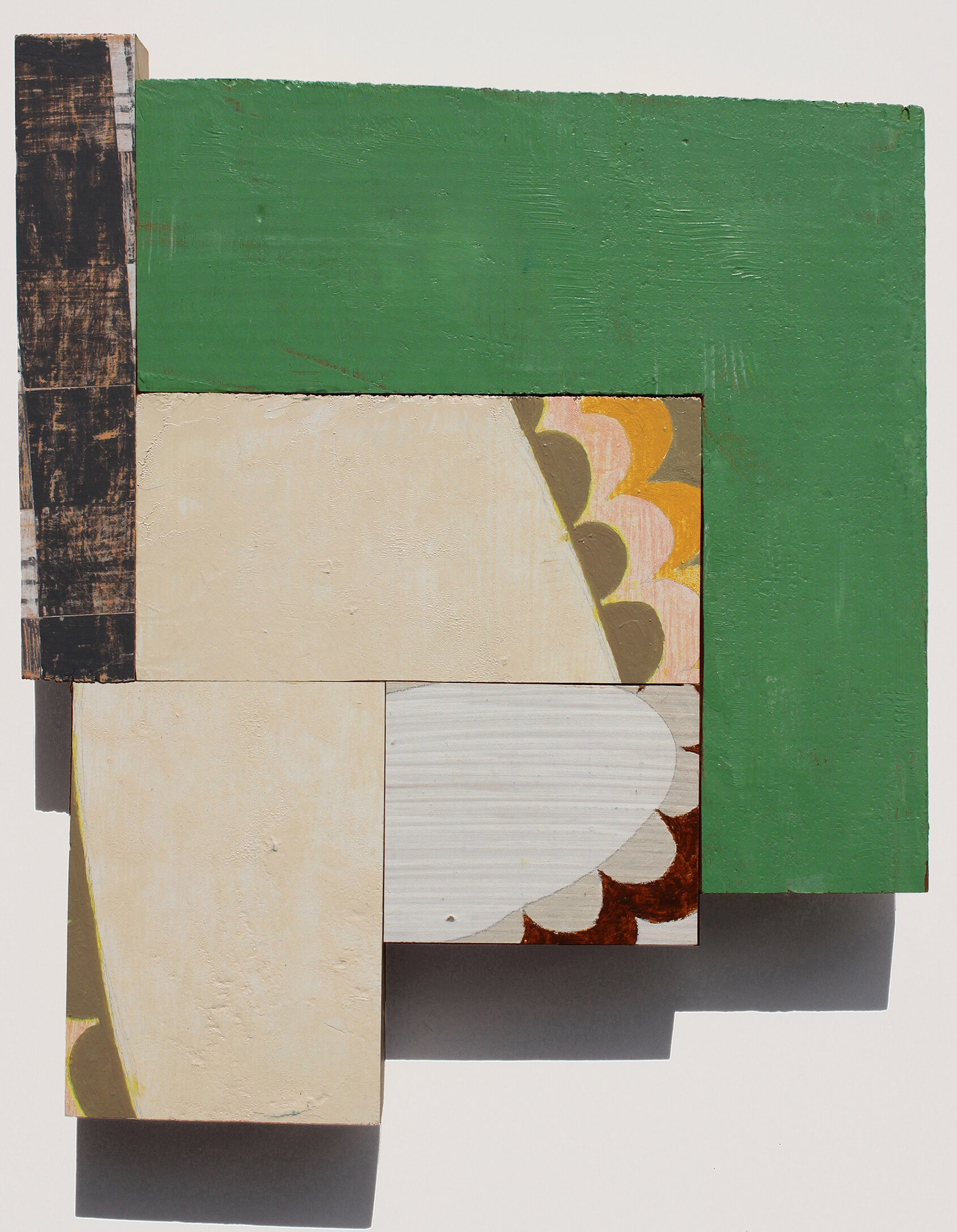
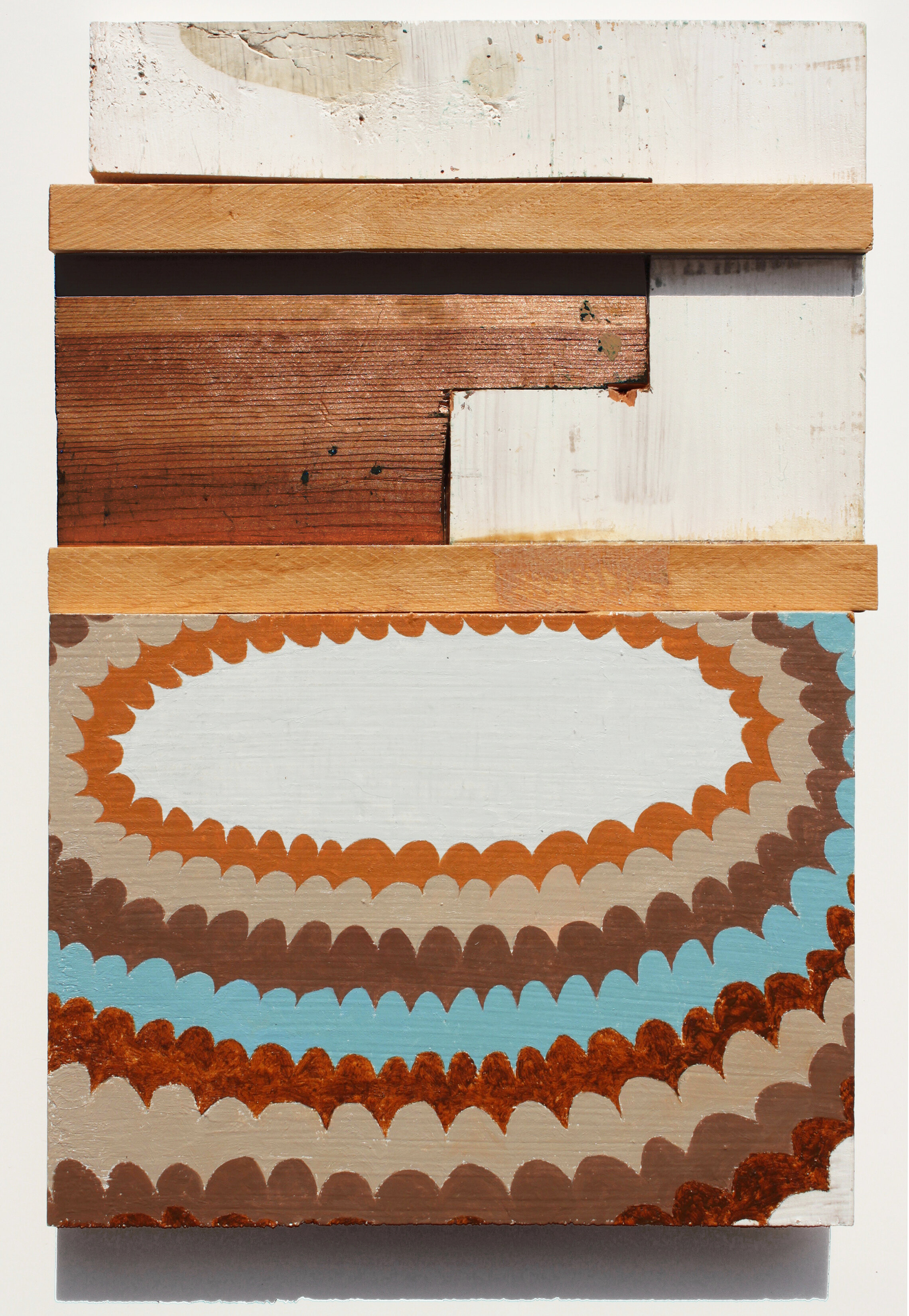
Using textiles or wood, cutting with scissors or saw, both artists employ position and reposition, a process used in creating the work. This way of assembling also has a visual organization reminiscent of crazy quilting; while the work detours the category of craft, it embodies its methods and techniques. Whether incorporating found textiles or meticulously creating their own, the repositioning and repurposing remove the material's historical utility while maintaining its aura.
Sollenberger makes work that reflects her philosophical belief in the value of what we already have. She is the proprietor of this beloved bookstore – Paper Nautilus- that offers new and used books, and some vintage items that one could buy for the home, arranged in ways that value their purposefulness and inherent beauty of the design. In a split panel fabric collage "There and Here," Sollenberger highlights a found textile and its previous owner’s overzealous repair by centering it and making it the point of inspection. She plays off this repairer’s act of repetition with petal-like shapes cut out of cloth in the lower half. Two circles - one bright red opposite an old white, locate these different efforts.
In "Hanger-on," Lewis also shows us two sections, each different sizes of wood, stacked one above the other. A patchwork of squares is painted on one and elongated ovals on the other. The painted ovals in shades of brown are reminiscent of old braided rugs made from repurposed cloth. She shows us the cut wood's messy sides and does not center the designs, giving the impression of being cut out of larger compositions, which she has done in other work. In this case, it intends to appear accidental, which makes this an interesting piece to study. The viewer will not see that there are old paintings on the backsides, or quick sketches in pencil, discarded but repurposed for new ideas on the front.
~
Artist Bios
Richmond Lewis holds a BFA from Rhode Island School of Design. Her awards include the Florence Leif Prize for painting from RISD and a New Jersey State Council on the Arts Fellowship. Her longtime fascination with painting history has led her to study techniques such as traditional oil glaze painting, Tibetan thangka painting, Russian icon painting in egg tempera, and Japanese woodblock printmaking.
Her work has been exhibited at The Drawing Center (NY), Anne Plumb Gallery (NY), Avenue B Gallery (NY), Rutgers University (NJ), Massachusetts College of Art, Adelphi University (NY), and Periphery Space (RI).
Statement:
I made these painted constructions after a decade of working on large- scale egg tempera paintings. The beautiful surface and depth of egg tempera took months to achieve, and the often unforgiving nature of the medium made me want to “relax” and paint in the simplest, most malleable, least precious way I could think of. Scrap wood became my "paper" so I could "draw with paint" in a matter-of-fact, direct way. The physicality of wood and ease of editing through cutting, repositioning, mixing, and matching appealed to me. Throughout the process, a major change could happen with the cut of a saw and a dab of glue.
~
Kristin Sollenberger moved to Providence in 1987 to attend Rhode Island School of Design. She graduated with honors in 1990 from the painting department. During her time at RISD, she became interested in using alternative materials in her work. First attempts attached objects to the canvas. The objects, manipulated from scraps, sometimes painted, however, soon replaced the canvas. Since then Sollenberger's work has been two and three-dimensional, both constructed from found materials. Obsessed with somehow preserving the broken, torn, and obsolete, Sollenberger imagines new purposes and pursues new plans for bridging the gaps. Her means to this end include the stitch, the hammer, several saws, ample whitewash, and memory.
Since 1996 Sollenberger has owned and operated Paper Nautilus (formerly Myopic Books), a secondhand bookshop in Wayland Square on the East Side of Providence. She currently lives with her husband, fellow artist Daniel Stupar, and daughter in South Kingstown, Rhode Island.
Statement:
Senseless scraps gather, nudged into place by invisible tides.
Award ribbons from past successes,
an old umbrella handed down,
faded cloth flowers,
a stained napkin,
ticking from an old pillowcase,
a handkerchief…
Their connections fade. I attempt to bring order to the scraps and in the process, to my thoughts. The ordering is, however, a fiction and only one of many possible outcomes. But in art and life order is a reassuring story and rebuttal of the constancy of ambiguity.

oil on wood, 12 x 7 in. SOLD
fabric, thread and paint stretched on wood. 12 x 6 in.
oil on wood, 14 x 8 in. SOLD
oil & acrylic on wood, 12 x 11 in.
oil & acrylic on wood, 12 x 9 in.
oil & acrylic on wood, 12 x 9 in. SOLD
oil & acrylic on wood, 12 x 8 in. SOLD
oil & acrylic on wood, 15 x 8 in.
oil & acrylic on wood, 13 x 12 in.
oil & acrylic on wood, 14 x 9 in. SOLD

Dianne Wilkinson | Wool & Wire
Jenny Brown | When You Speak to Me, This is What I See
December 2, 2018 - January 19, 2019
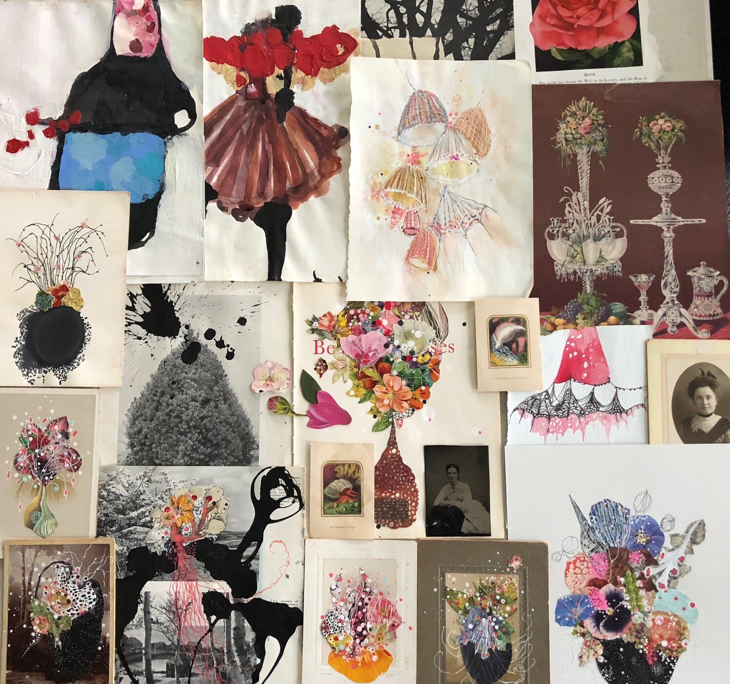
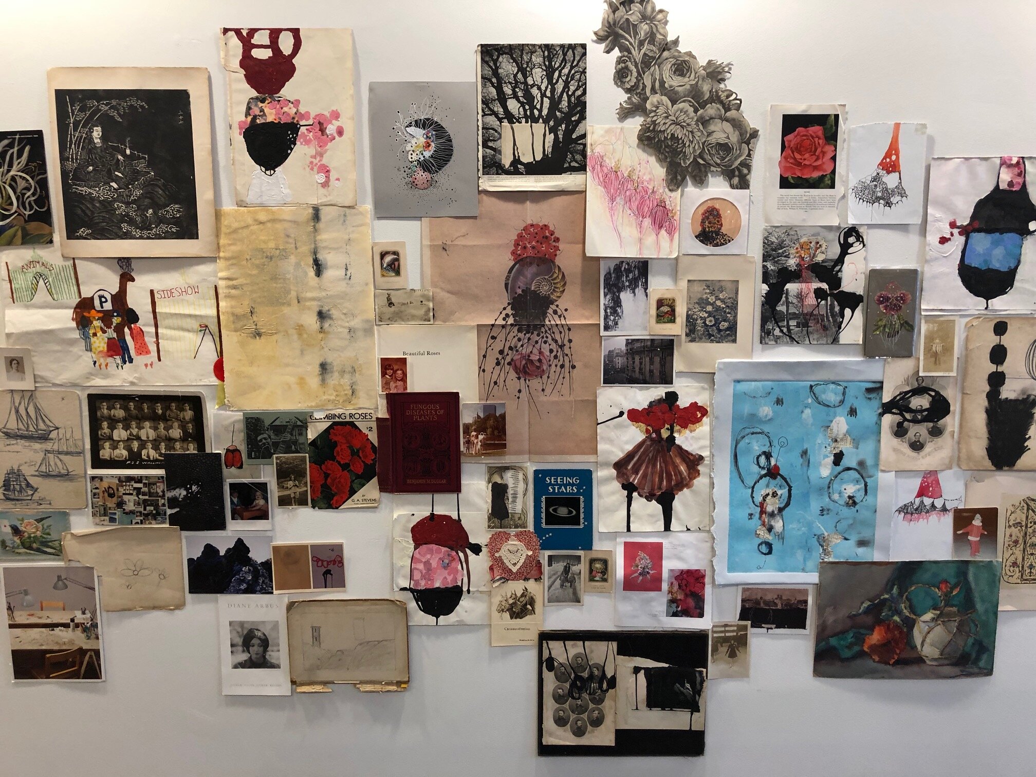
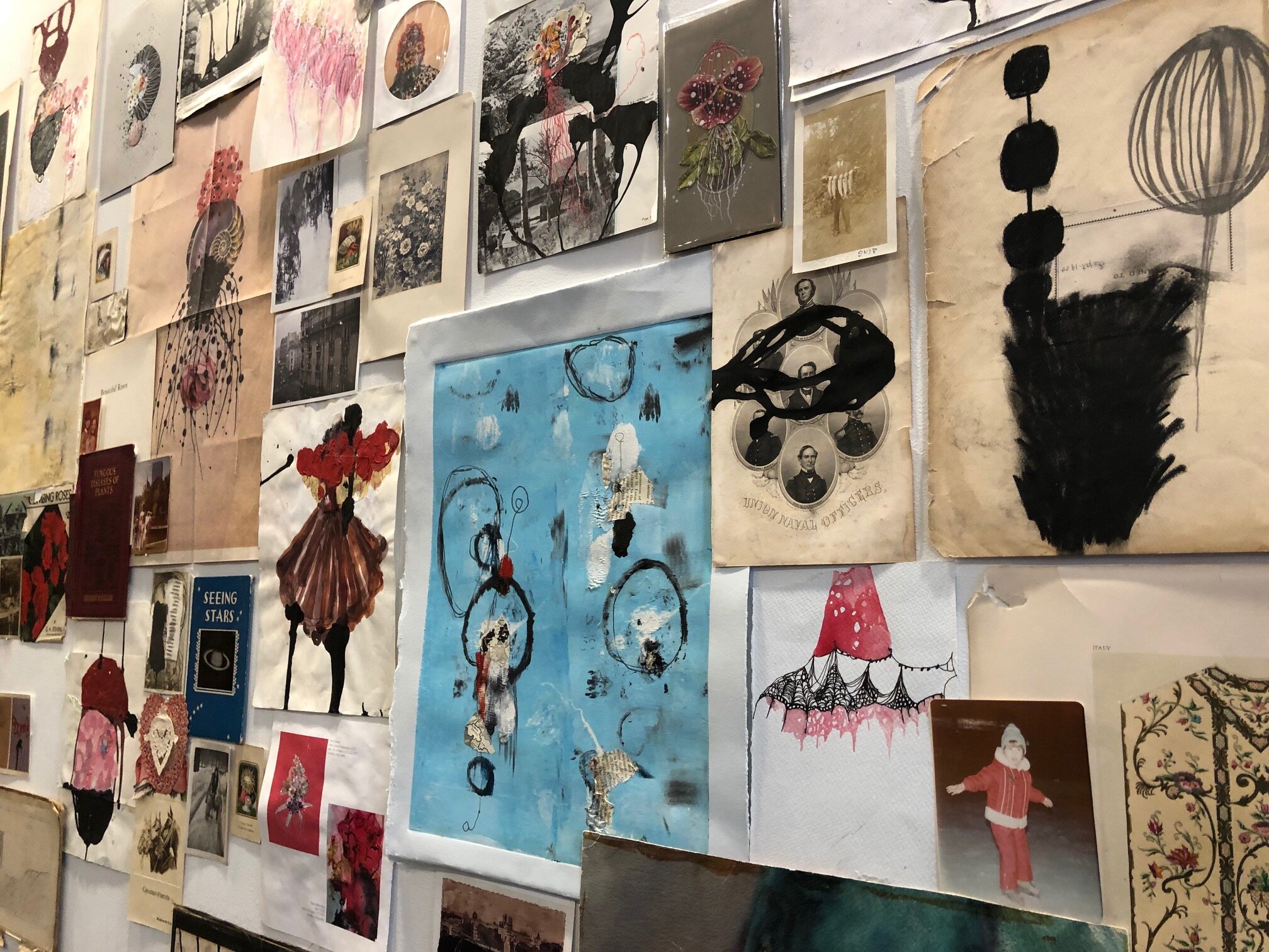
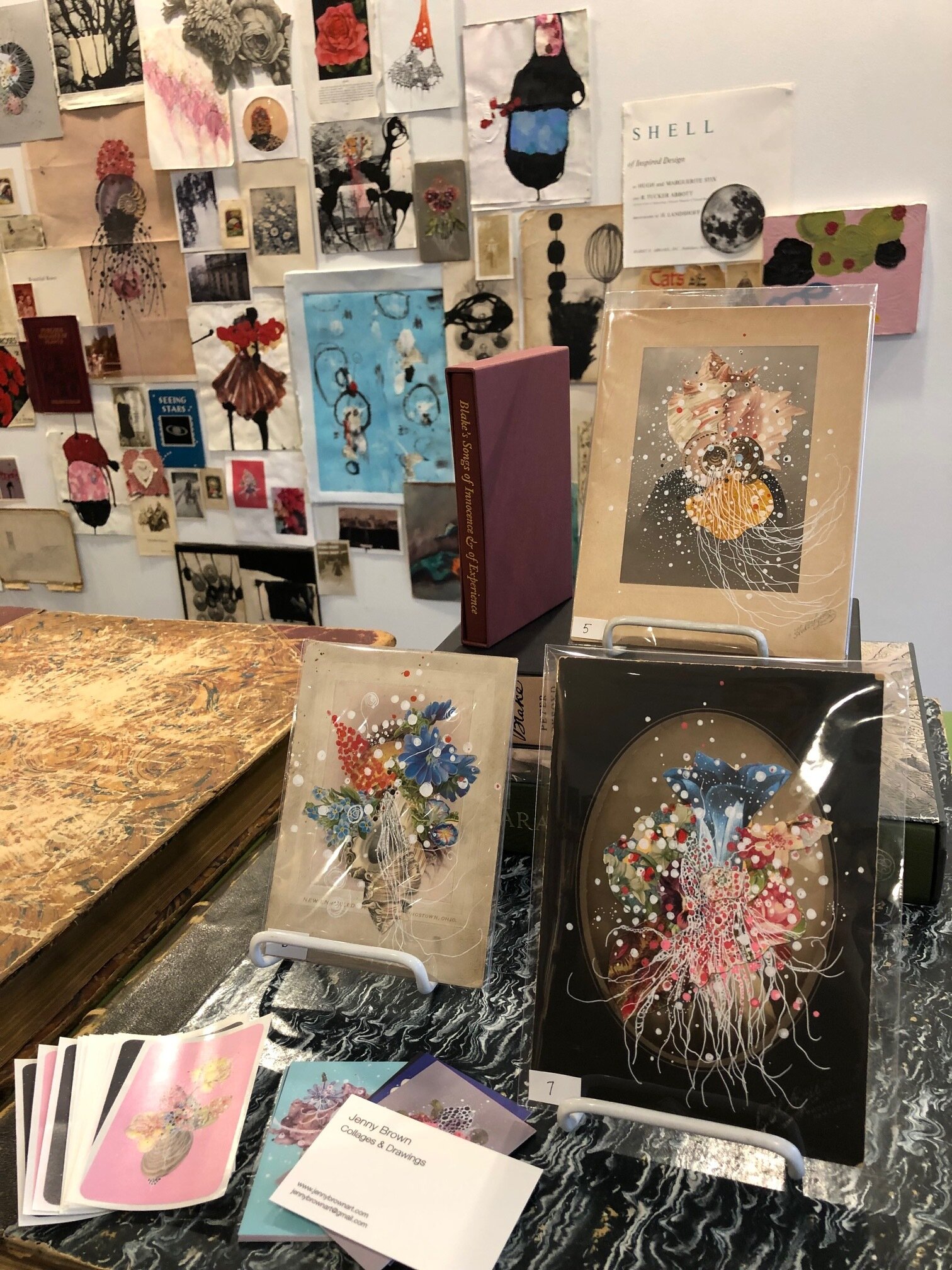
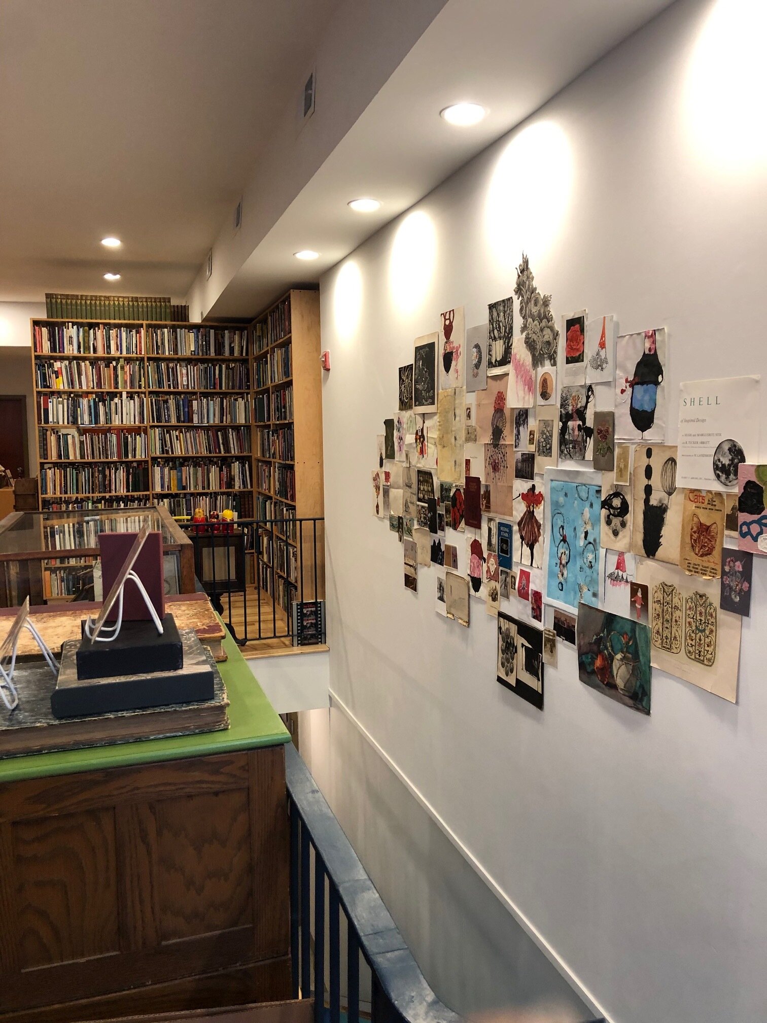
After closing Periphery Space (December 2017), I was invited by Kristin Sollenberger, the owner of Paper Nautilus to continue creating small shows at her store. Paper Nautilus Books is an inspiring place for many of us, it is a place to find the books we want to read but also to discover things like antique shirt collars, sculptural porcelain flower holders, engraved illustrations, or a mid-century modern stool. In thinking about what kind of work to show in a bookstore and what that could entail - an artist like Jenny Brown came to mind. Jenny makes collage with found materials such as vintage postcards, photographs, and old book illustrations that she has drawn or painted over often referencing an underwater creature or a unique flower no one has ever seen before. It turns out that she is a frequent visitor to the store, so an aesthetic was already in conversation.
In discussing her work and her connection to Paper Nautilus, we decided on showing a version of her studio wall where finished works and works in progress live alongside family photos, a postcard of a favorite artist, or a watercolor that her grandmother painted. On the day of the install, she arrived at the store with bundles and boxes and spent the morning sorting through and recreating a new version of a wall where thoughts and memories speak to her creative process. The installation is called When You Speak to Me, This is What I See.
Statement
“As an artist who sees the process of creating art as non-linear, I find that I experience the past, present, and future lives of my work all simultaneously. These stages of time happen all at once, sometimes not at all, and sometimes infinitely with no end in sight. I find everyday curiousness, the physical mementos (such as photographs & paper ephemera), and the history and images from past travels to be present every time I bring a pen to paper. For when one speaks to me about my work and my creative process, this installation is what I wish they could see-the beginnings, the unknowns, the forgottens, the lost, the joyous, and the never-ending beauty of the story that brought me to this place and time.”
Bio
Jenny lives in Providence, Rhode Island. She earned her BA from Bennington College and an MFA from The School of Visual Arts in New York. She has shown locally, nationally, and internationally. She has been a featured artist with the stores West Elm and Anthropology and interviewed by the podcast series “The Jealous Curator”. Her works are in private and corporate collections.
To see more of her work go to her website.
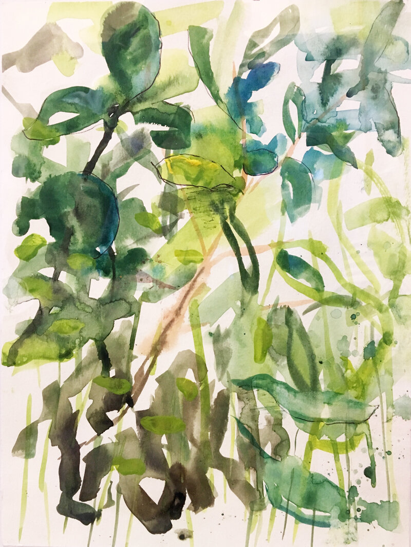
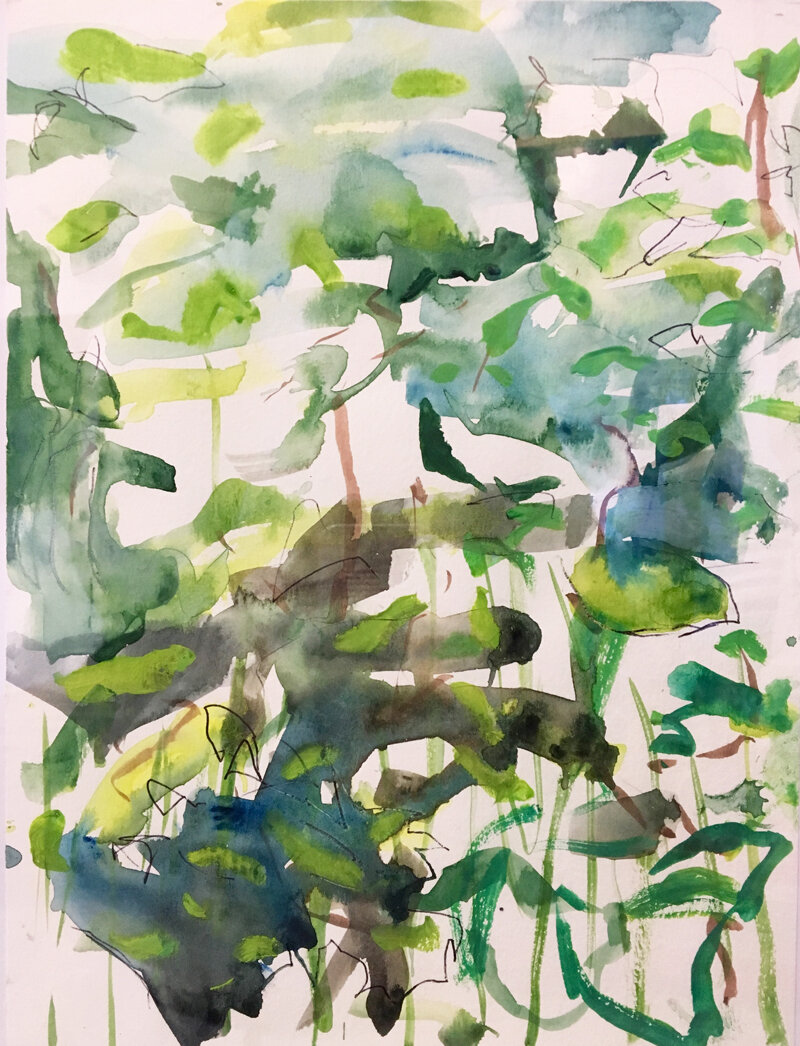
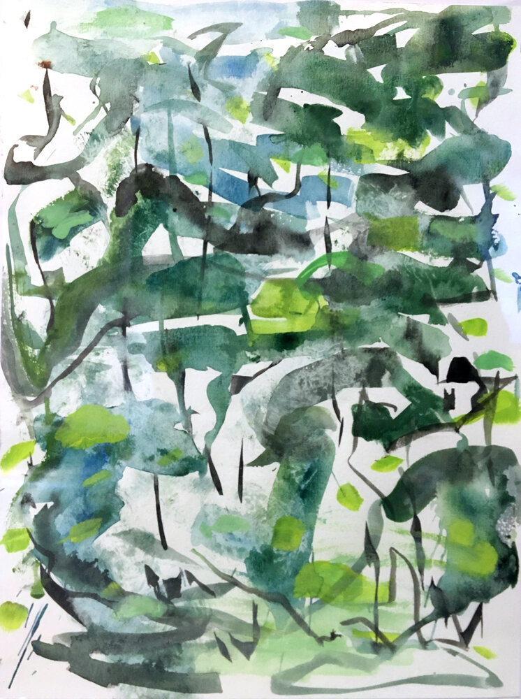
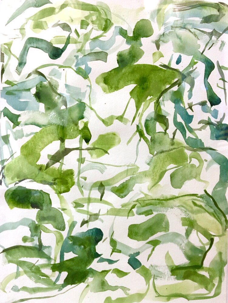
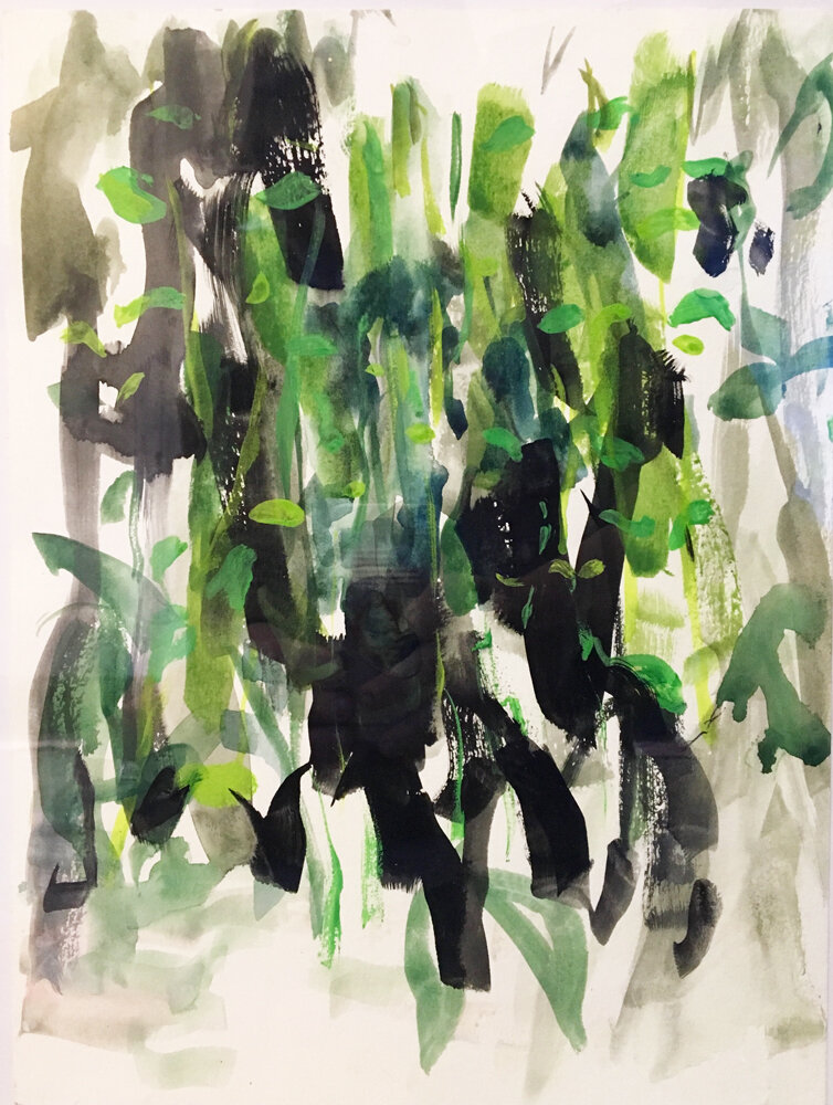
James Sundquist | Living Nature
November 3 - December 1, 2018
~
Artist Statement
The motifs for the work came out of small places, the little patches of grass and vegetation that become a world and ecosystem unto themselves through persistent observation. These tiny ecosystems reveal their layers through persistent looking, and a poetics of space comes to life.
The larger pieces in this show are made in the studio using some of the spatial motifs and gestures generated in the smaller works. The result is, like a poem, the amplification of the order and beauty of the natural world.
- JS
To see more work by the artist go to this website
oil on paper, 29.5 x 42.5 in. SOLD
watercolor on paper, 11 x 8.5 in.
watercolor on paper, 11 x 8.5 in.
watercolor on paper, 11 x 8.5 in.
watercolor on paper, 11 x 8.5 in.
watercolor on paper, 11 x 8.5 in.
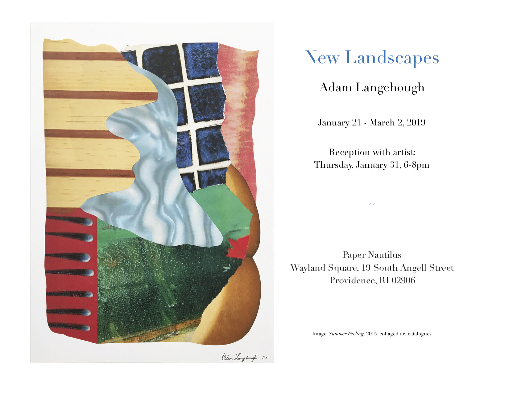
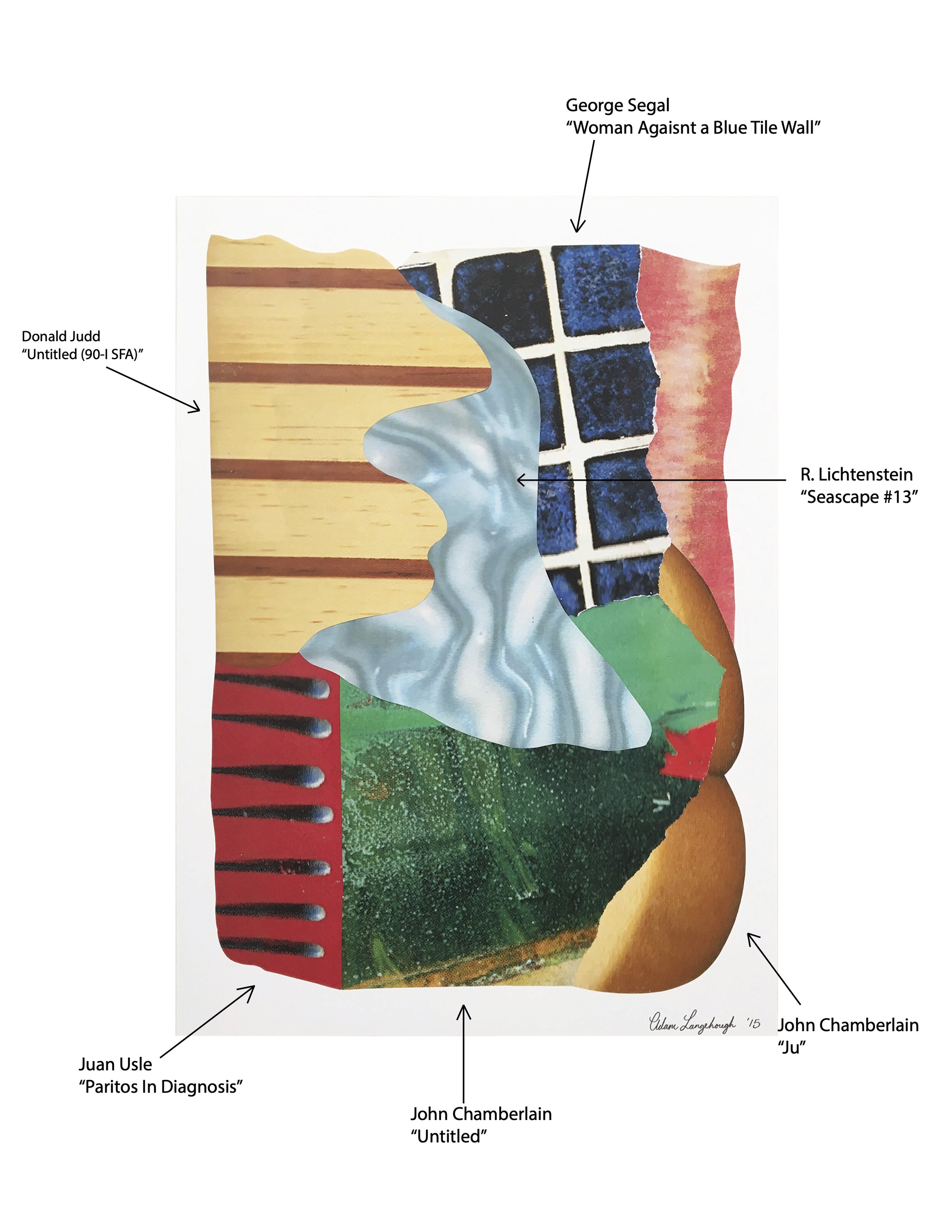
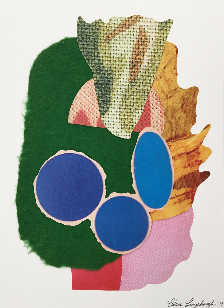
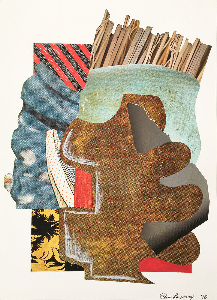
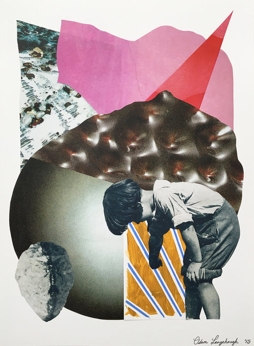
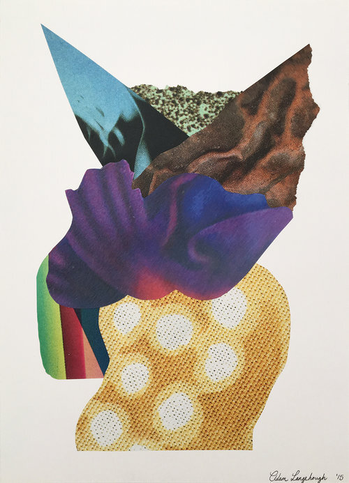
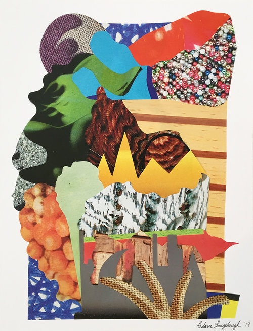
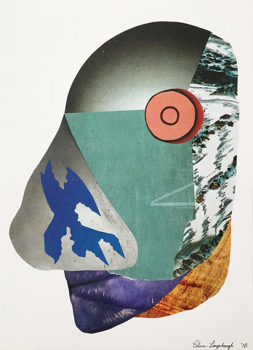
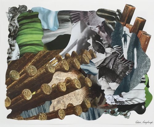
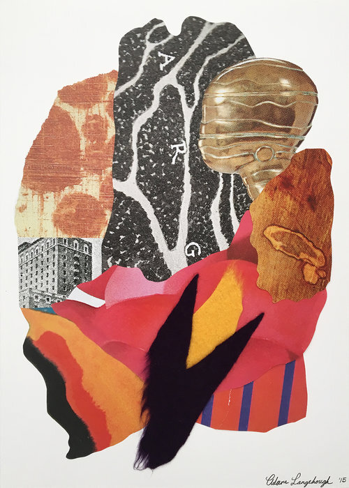
Adam Langehough | New Landscapes
January 21 - March 2, 2019
“My artwork is essentially a diary of my life, and when I view it in hindsight, I can understand the twists and turns, the narrative of my interests, my jobs, the people I care about.” - Adam Langehough
______________________
Below is a conversation between Adam Langehough and Barbara Owen in preparation for Adam’s show of collages made out of art catalogs. “New Landscapes” will be on view from January 21 – March 2, 2019, at Paper Nautilus in Providence, Rhode Island.
Barbara Owen: You were an art handler at Christie’s Auction house in Manhattan a few years ago. We share this experience as I too was an art handler in New York. It is hard work but exciting as one often gets to see and handle incredible works of art.
The body of work that you will be showing at Paper Nautilus is a series of collages that you made out of Christie’s catalogs. One of my favorites from your series is “Summer Feeling” and incorporates a bit of Donald Judd, a corner of a John Chamberlain, a Juan Usle next to a Roy Lichtenstein and a George Segal. What I Iove about these are that I recognize these bits, even torn and out of context, it’s like an art history guessing game. Also, for this catalog, they must have been auctioning off a collection of Pop Art. As I look at your collages, I can’t help wonder who owned it and of course who bought it. What inspired you to start using them for collage?
Adam Langehough: One of the perks of working at Christie’s was the access to all of those amazing catalogs from all the different sales. It’s just a fact that they need to get really good photos of the work they’re trying to sell and present them in catalog form on high-quality paper for prospective buyers, and those beautiful catalogs are just lying around everywhere in the whole building. They cover all kinds of artwork of every genre you could think of from Contemporary Post-War to Chinese ceramics, to old master drawings, spanning all the different auctions over the last ten years or so, too.
As an art handler for the 20th Century Decorative Arts, we had a pretty small department that would only do 3-4 sales a year, so I could have long periods, weeks to months of downtime in which I would pour over all the different catalogs I had accumulated. I just loved seeing all the different art and discovering lesser-known artists, as well. Near my desk, there was a really nice, high-quality photocopier, and I just started photocopying art from these catalogs, manipulating them by blowing them up and shrinking the photos in size, amassing these stacks of printed images. And then I started cutting them up and piecing them together in collage form because I was just bored at work, but I really started to like the way these images looked, all mashed together and overlapped. I really enjoyed the challenge of piecing them together, almost like a puzzle in reverse, creating new art from all of this old artwork. In some cases, I started to push the use of the photocopier itself as the tool for making the art and I was photocopying inanimate objects, like the hand brush seen in “The Past Shouldn’t Be So Dismissable,” in the top right corner.
BO: I first became aware of your work on Instagram. Since then we’ve become friends but it wasn’t until recently that I came for a studio visit to see the work in person. You showed me two bodies of works one was the collage series and the other a series called “Subliminal Detritus Maps”. These are intricate drawings, using vaguely familiar images from magazines, or the web, a kind of collage but of your own drawing. Can you speak a little about where you are culling the imagery from? Do you see these related at all to the collages?
AL: The “Subliminal Detritus Maps” series that I’m working on is similar to this series of collages in that it’s also a thematically driven collection of images being pieced together, however, the “Subliminal Detritus Maps” are less abstract and more politically and culturally motivated. As you mentioned, the source images are culled from the web and magazines, my own drawings, and all of the imagery is more linked to pop culture and ordinary concepts that are fairly recognizable. The title of the series, “Subliminal Detritus Maps” sort of explains an aspect of the process; while I’m at my day job I let my mind wander around various topics, ideas, and specific images, and I note these down, then, later, I search for images from the lists I’ve made to manipulate in my studio. The pictures need to be collaged or fit together based on shape and size, so in that sense, the process is pretty similar to the work in this show. In the end, each piece is like a map of the mental process of all these various images floating around my subconscious. I should also mention that I see all forms of collage as a challenge of compositional balance, just like any painting, sculpture, or drawing.
BO: Which artists are your greatest influences?
AL: Dieter Roth, Mike Kelley, Lucian Freud, John Chamberlain, Ariel Pink, David Lynch, Phillip Gustin, Yayoi Kusama, Christo and Jeanne-Claude, Jenny Holzer, Claes Oldenburg, Joseph Beuys, Richard Tuttle, Jack Whitten. The list goes on and on, really. I feel like I’m the opposite of every artist I’ve ever known, in that I like more art than I dislike. Most artists and musicians I know are incredibly critical and dismissive of other artists.
BO: Now that you work as a security person at the RISD Art Museum do you feel any influences from working daily in a museum?
AL: Every job I’ve had in the art industry, from art handling in galleries, museums, auction houses, to storage/shipping companies has expanded my scope and understanding of art on the whole. Art is more than a visual medium, a business, a means for sociopolitical statements. It’s all of these things, and/or none of these things, depending on who is contextualizing the work. Sometimes that person is a curator in a gallery, and sometimes it’s a super-rich collector. Other times it’s a group of twenty-somethings in a basement in Brooklyn, and sometimes it’s a docent in a museum. My vantage point is educated by all the various forums and contexts I’ve been involved with, so it’s inevitable that working as a security guard in a museum would also contribute to my perspective. I find influence in almost everything I observe if there’s something interesting happening. I often directly adopt imagery, as I’ve done with these collages.
BO: What is your most important artist tool? Is there something you can’t live without in your studio?
AL: That’s tricky because part of what sustains me as an artist is allowing myself to dabble in several mediums simultaneously; currently I’m working on several sculptures made of wood, twine, and plaster, a couple “Subliminal Detritus Maps” — which start off in Adobe Illustrator, get printed and then materialize as oil pastel on paper, — and I’m almost always painting with oil and acrylic. If I had to choose, I think my most important tool would be one of my knives. I use some kind of knife in almost everything I do, and without them, I’d be a little lost. Aside from that, although it may sound cheesy or cliché, the most basic thing as a pencil is often the most valuable tool for an artist.
BO: What does your work aim to say?
AL: Ultimately, the aim of all of my work is to communicate a visual aesthetic. Whether that will take the form of political/social outcry, or abstractly reference the visual language of the art market, I can’t really predict. My artwork is essentially a diary of my life, and when I view it in hindsight, I can understand the twists and turns, the narrative of my interests, my jobs, the people I care about. At times it reflects aspects of my identity, and at other times it’s as undefined as the random thoughts that float in and out of my mind.
Thank you, Adam and thanks for breaking down your collage “Summer Feeling”.
Mixed media paper collage and felt. SOLD
Mixed media paper collage, 12 x 16 in. SOLD
Mixed media paper collage, 12 x 15 in.
Mixed media paper collage, 12 x 16 in.
Mixed media paper collage, 16 x 20 in.
Mixed media paper collage, 12 x 26 in.
Mixed media paper collage, 12 x 16 in. SOLD
Mixed media paper collage and felt, 12 x 16 in.
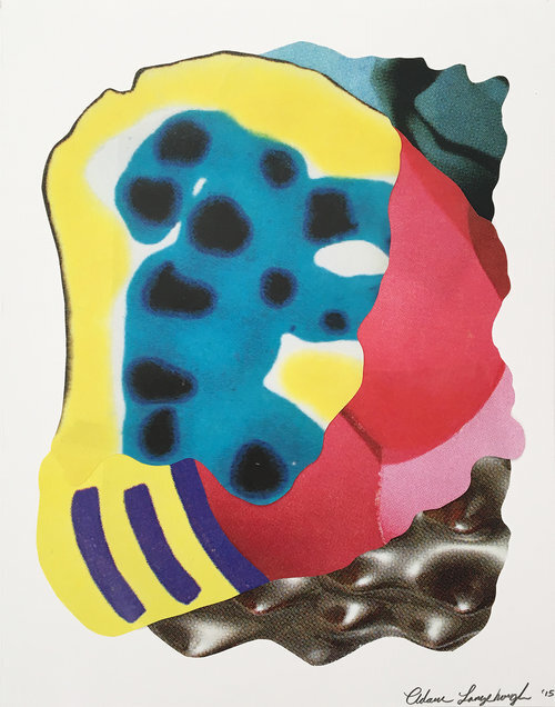
Mixed media paper collage, 12 x 16 in. SOLD
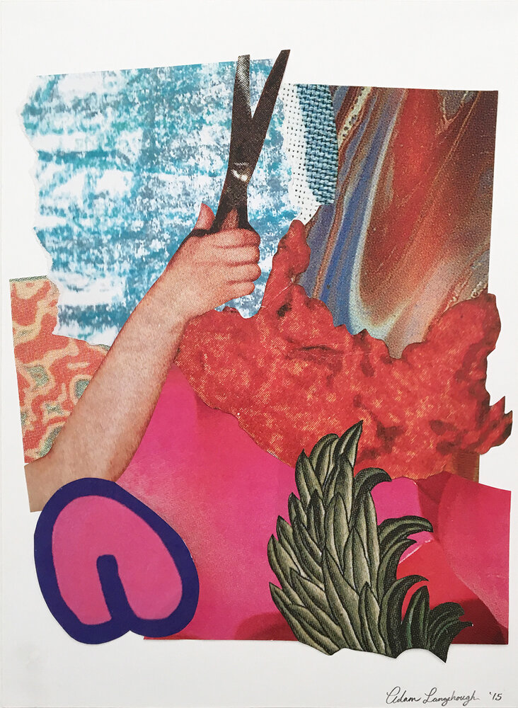
Mixed media paper collage, 12 x 16 in.

Mixed media paper collage and acrylic, SOLD

Mixed media paper collage, 12 x 16 in. SOLD
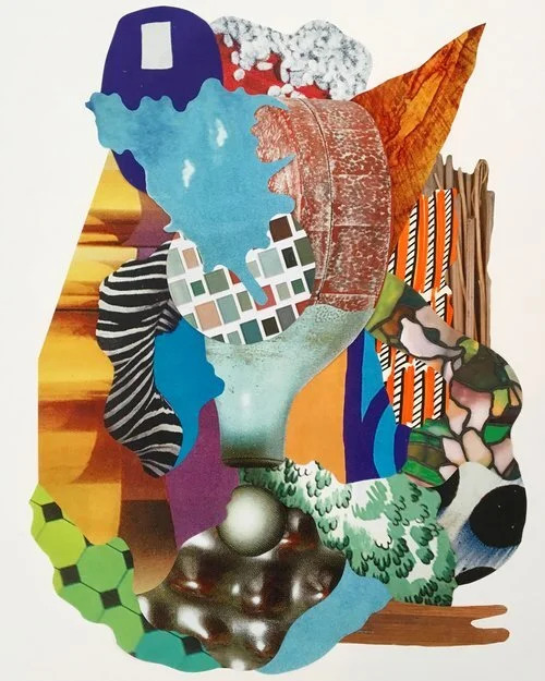
Mixed media paper collage, 16 x 20 in.
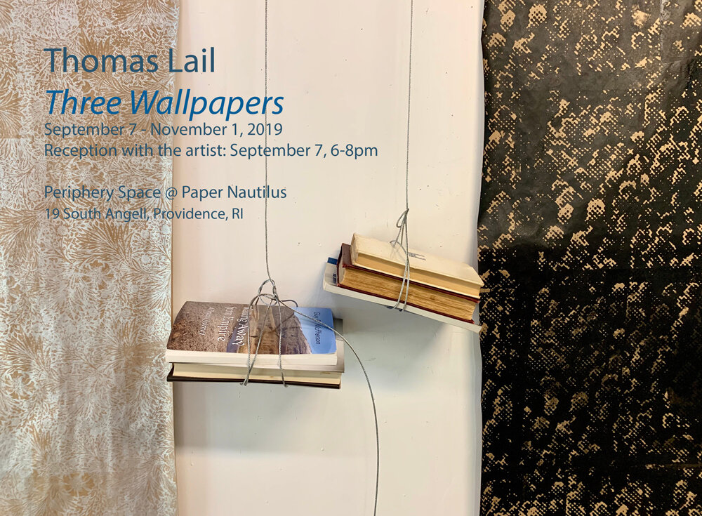
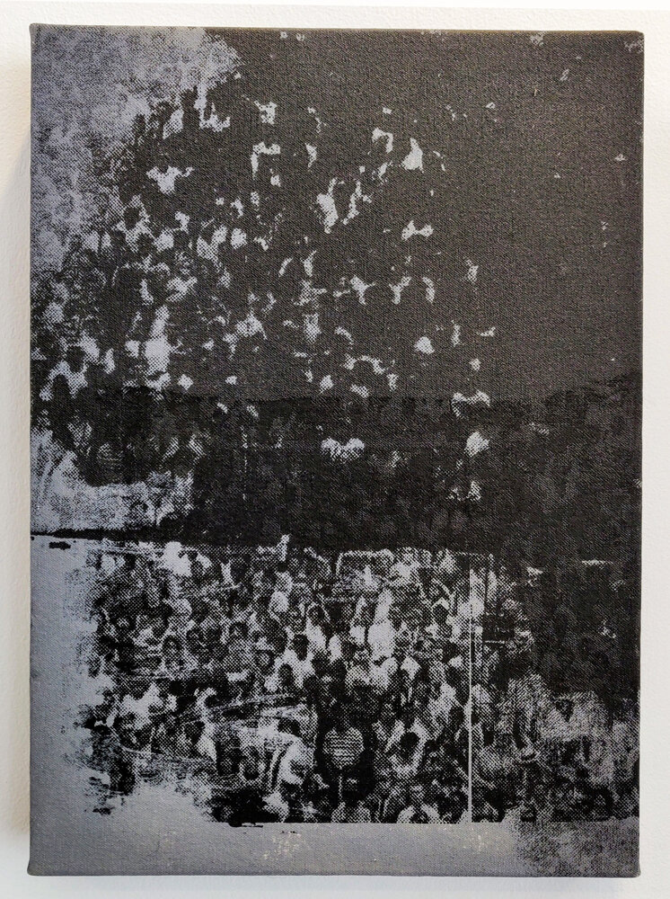
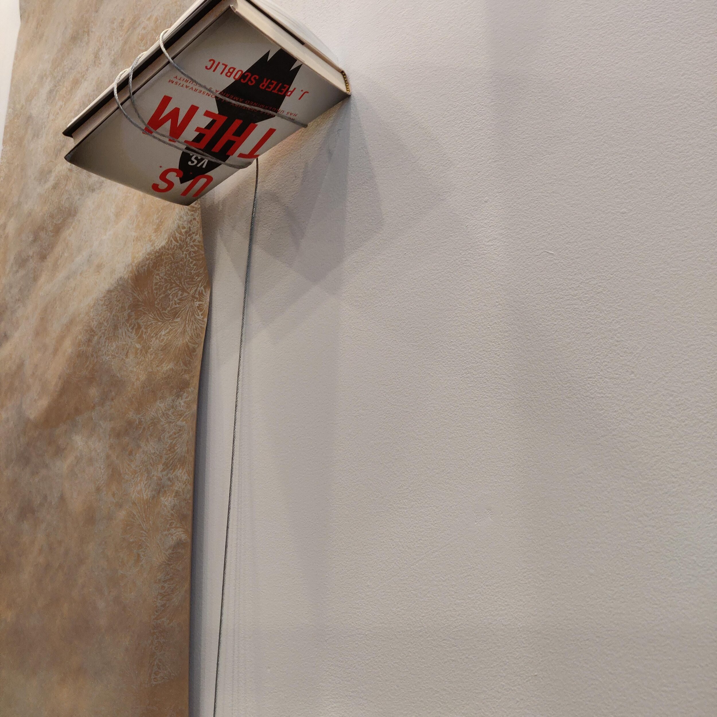
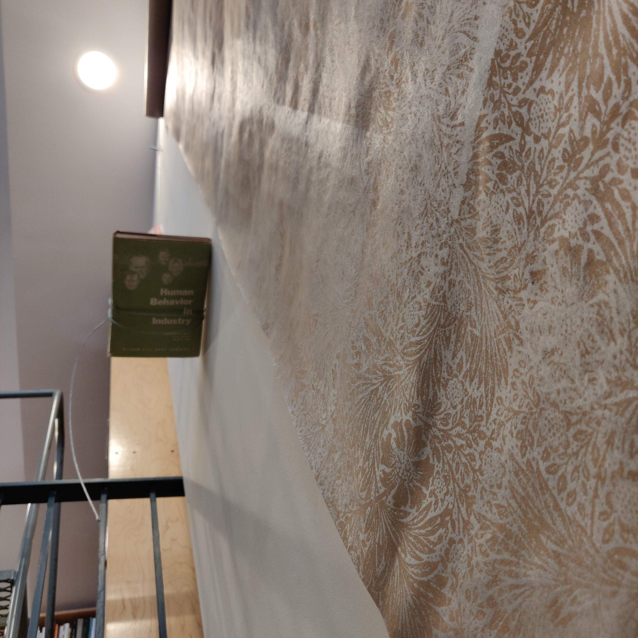
Thomas Lail | Three Wallpapers
September 7 - November 1, 2019
Periphery Space at Paper Nautilus presents an installation by Thomas Lail.
“Three Wallpapers” unfurls three silkscreened rolls of wallpaper down the stairwell of Paper Nautilus. Counterweighted with bundles of suspended books Lail’s printed images reference the patterns of Utopian designer/writer William Morris and found images of protesting crowds. Bookended by degraded overprinted images of Morris’s Marigold pattern - itself a reference to the beauty of the common and ordinary - and with the central panel repeating an appropriated image of gathered protestors, Lail’s wallpapers locate us between the Utopian strivings of the past and the muddled conflict of the present.
Biography
Thomas Lail exhibits in the United States and internationally and is represented by One Mile Gallery. Since 1993, Lail has taught drawing and painting at Hudson Valley Community College, SUNY in Troy, NY where he is Professor of Fine Arts and a recipient of both the President's Award and the State University of New York Chancellor's Award. He is a past recipient of numerous New York State Foundation for the Arts Special Opportunity Stipend awards as well as a Fulbright-Hays award from the United States Department of State. A native of Upstate New York, Lail grew up across the street from a geodesic dome- perhaps foreshadowing his current interest in Utopian dreams. Throughout the 1990s and early 2000s, Lail was involved in the Greenpoint/Williamsburg Brooklyn art scene. ThomasLail now lives and works in a bricolage former-tractor barn on what was once Heald Orchards in Kinderhook, NY with artist Tara Fracalossi and their son, Coltrane.
To see more of the artists work go to his website
silkscreen and enamel on canvas, 16 x 12 in.

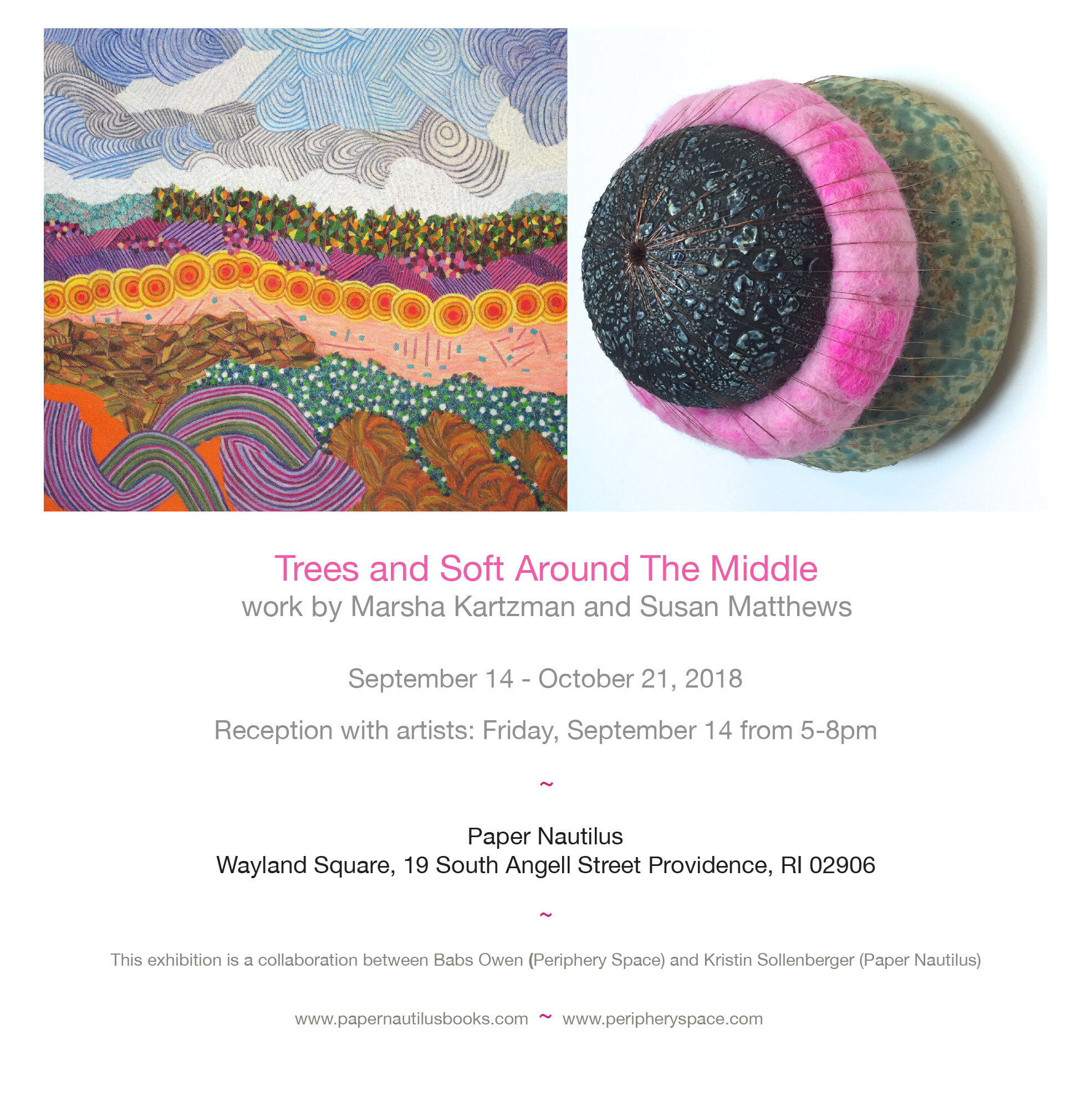
Trees and Soft Around the Middle | Marsha Kartzman and Susan Matthews
September 14 - October 21, 2018
Trees by Marsha Kartzman and Soft Around The Middle by Susan Matthews are two works that share a common language. There is a witty conversation taking place with materials that have to do with imagination, amusement, and pleasure but also about peculiarity, unconventionality, and visual deception. One imagines the works saying to each other: “What are you? How did you come here? You look like me”. The artists themselves are speaking about color and objects in an eccentric room or landscape, richly embroidering and embellishing upon these places.
Where Marsha coils string or cuts up a cloth and adheres it to paper to make a series of swirled lines, she just as purposefully paints the same somewhere else. Her work makes one lean in with curiosity to determine how the delicate and intricate marks are made.
Susan constructs three-dimensional forms from fabric, wood, clay, wire, and wool. The works feel animated and playful, drawing viewers in through their tactile surfaces and unexpected material combinations. As she writes, her intention is to “question the viewer’s comfort level and find the space between fear and silliness, playfulness and power struggle.” By working with materials often associated with craft, she activates their familiarity while highlighting their inherent tensions—hard and soft, strong and fragile.
-B. Owen
Artist Bios
Marsha Kartzman
My work is defined by mark-making, color, and the interplay of one with the other. Though each medium is distinct from the other, they cross-pollinate and inform the totality, as well as providing continuous avenues for new challenges and explorations. Color reflects the gestalt of my creative process - its emotional underpinnings. My imagery comes from memories of landscapes deconstructed into abstraction. I believe as Camus said that the oeuvre, the life-work, is the journey back to the simple great images on which the heart first opened. For me, this is always the landscape.
Marsha Kartzman came to the practice of art in an unconventional manner. She had studied the Chinese language in college and learned Chinese calligraphy as part of this study. Using the brush to make the characters fascinated her so much that she continued with the calligraphy even when learning the language ended. Marsha began an intensive study of the fundamentals of calligraphy and Sumi-E painting with the painter, Judith Liniado, who was devoted to this art form. After these beginnings, her studies expanded to regular classes at the Massachusetts College of Art. While at MassArt, Marsha took a workshop from Gema Philips in monotype printing that led to a shift in her focus from painting to monotypes. Using the monotypes as an outline, Marsha reworked the surface using water-based media, such as watercolors, watercolor and gouache pencil, and crayon adding lines, dots, and shapes over the image. To give the piece more dimension, she began to cut and paste pieces from previous monotypes and eventually to incorporate thread and wire. Using these materials has pushed the work to a different and distinctive place. Marsha is currently exploring the dynamics of mark-making and its interaction with color in a series of pieces that no longer use a monotype as the basic building block, but rather paper painted with gouache as the ground. Thread, wire, and collage are affixed as the means of “drawing” the marks. This allows for the piece to be built out from the paper thus forcing a dimensionality, which had previously only been implied. The imagery of the pieces comes from memories of landscapes deconstructed into abstraction.
~
Susan Matthews
My primary artistic objectives are to better understand and illustrate how contradictions and variability can be integral to, and inherent in, a single entity as well as to create an experience of interaction; intimacy, or denial of intimacy. With this experience, I intend to question the ‘viewer’s’ comfort level and find the space between fear and silliness, playfulness, and power-struggle. I use materials that are traditionally thought of as ‘craft’ mediums for the associations and familiarity they bring to the work as well as their intrinsic hard and soft, strong and fragile qualities.
Susie Matthews is a multi-media artist, currently working primarily with ceramic and textile mediums. She first moved to Rhode Island in order to attend college and received a BA in studio art from Brown University in 1995. She also studied wooden boatbuilding in the Northwest and earned her one hundred-ton captain’s license soon after graduation. After working in the nautical world, she returned to graduate school and received her master’s degree in the art of teaching at the Rhode Island School of Design in 1998. As she was teaching high school art in Bristol, she rediscovered her passion for ceramics and moved on to study at UMASS Dartmouth and RISD. She received her MFA in ceramics from RISD in 2004. While focusing her energies on being a domestic goddess for the last decade, she also served for three years on the board of the Jamestown Arts Center and chaired the exhibition committee there. Her work has been shown in various venues, primarily in the Rhode Island area, including AS220’s reading room, the Newport Art Museum, the Jamestown Arts Center, the Warwick Museum of Art, and the South County Art Association. Susie lives with her family in Jamestown RI and works in her studio at the Shady Lea Mill in North Kingston.
Uncover
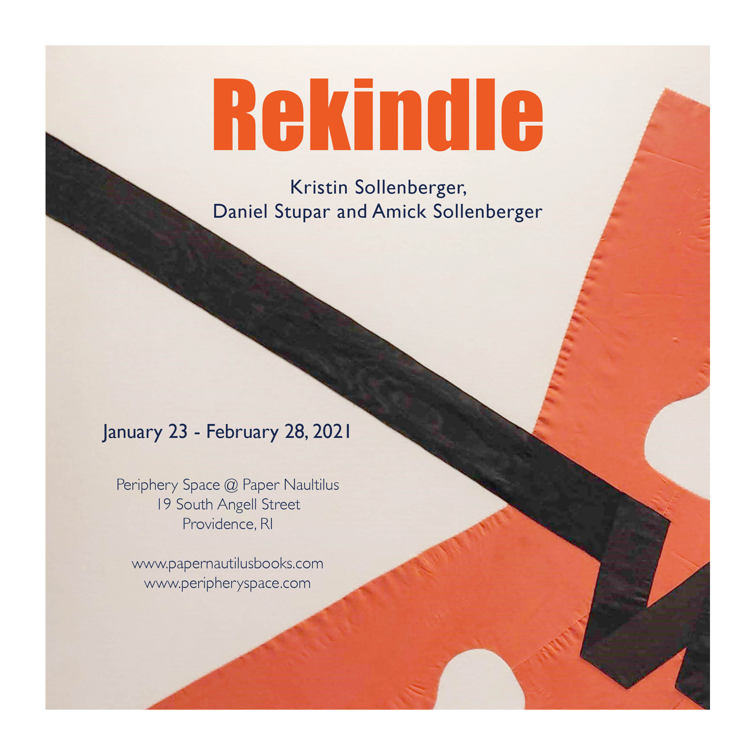
Rekindle
Providence, RI - Periphery Space @ Paper Nautilus is pleased to present Rekindle featuring select works by Kristin Sollenberger, Daniel Stupar and their daughter Amick Sollenberger.
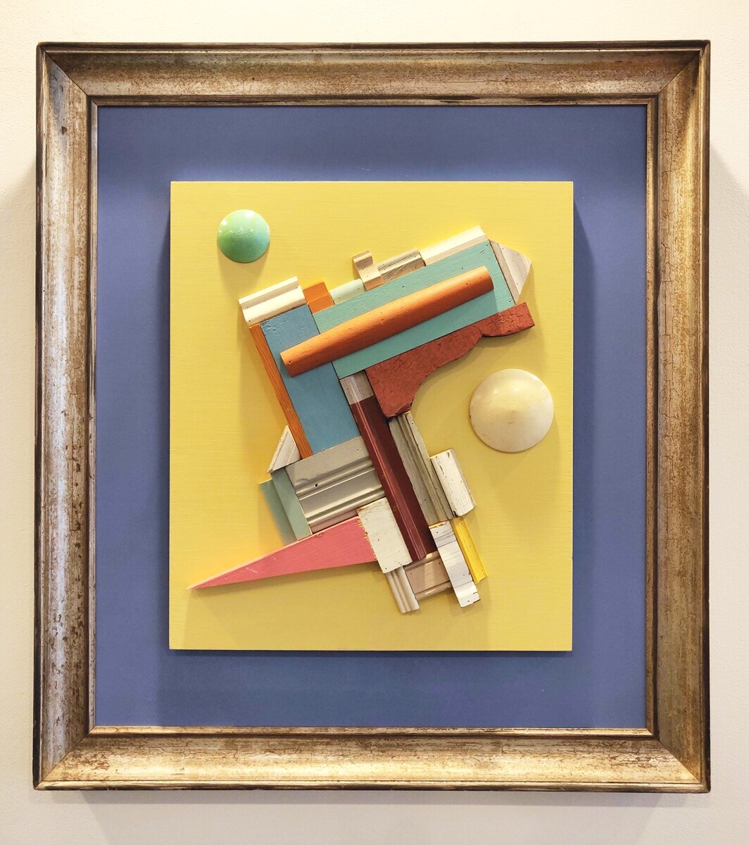
It seems fitting to talk about rekindling these days: a new year, a new president, new vaccines, the potential for a return to normal. While we isolate, there is a natural desire to take stock of the objects that surround us, to look at them afresh, and, if possible, imbue them with new energy. For these three artists, taking something apart, and exploring new possibilities is part of their process.
In this show, each artist has used objects that are taken outside of their original context: a radio, a house, a boat. These objects no longer serve their original purpose and have been transformed into parts of something new, given a new lease on life.
Amick has taken apart an old radio and harvested its capacitors. She then soldered them back together in a geometric arrangement – the precision of the work makes one wonder what would happen if power was applied. Daniel’s architectural fragments have been cut and arranged – the result is reminiscent of architectural blueprints or industrial patterns - the two round disks in his piece once in a blue moon a green moon recall the half-sphere registration marks for a mold. Kristin has ripped the seams out of two life preservers and sewed them onto an old sheet to create a painterly abstraction.
This shared approach has led to three very different outcomes, yet the questions they raise are similar, the energy they radiate complementary. In each, a fair amount of rescuing has taken place; things have been saved from the trash heap, the sidewalk, the yard sale with the belief that they can surely be rekindled into something else.
If this show had a subtitle it could be Assemblage by a Family. It's not that common for an entire family to enjoy making things and to share an aesthetic.
~
Since 1996 Kristin Sollenberger has owned and operated Paper Nautilus (formerly Myopic Books), a secondhand bookshop in Wayland Square on the East Side of Providence. She currently lives with her husband, fellow artist Daniel Stupar, and daughter in South Kingstown, Rhode Island.
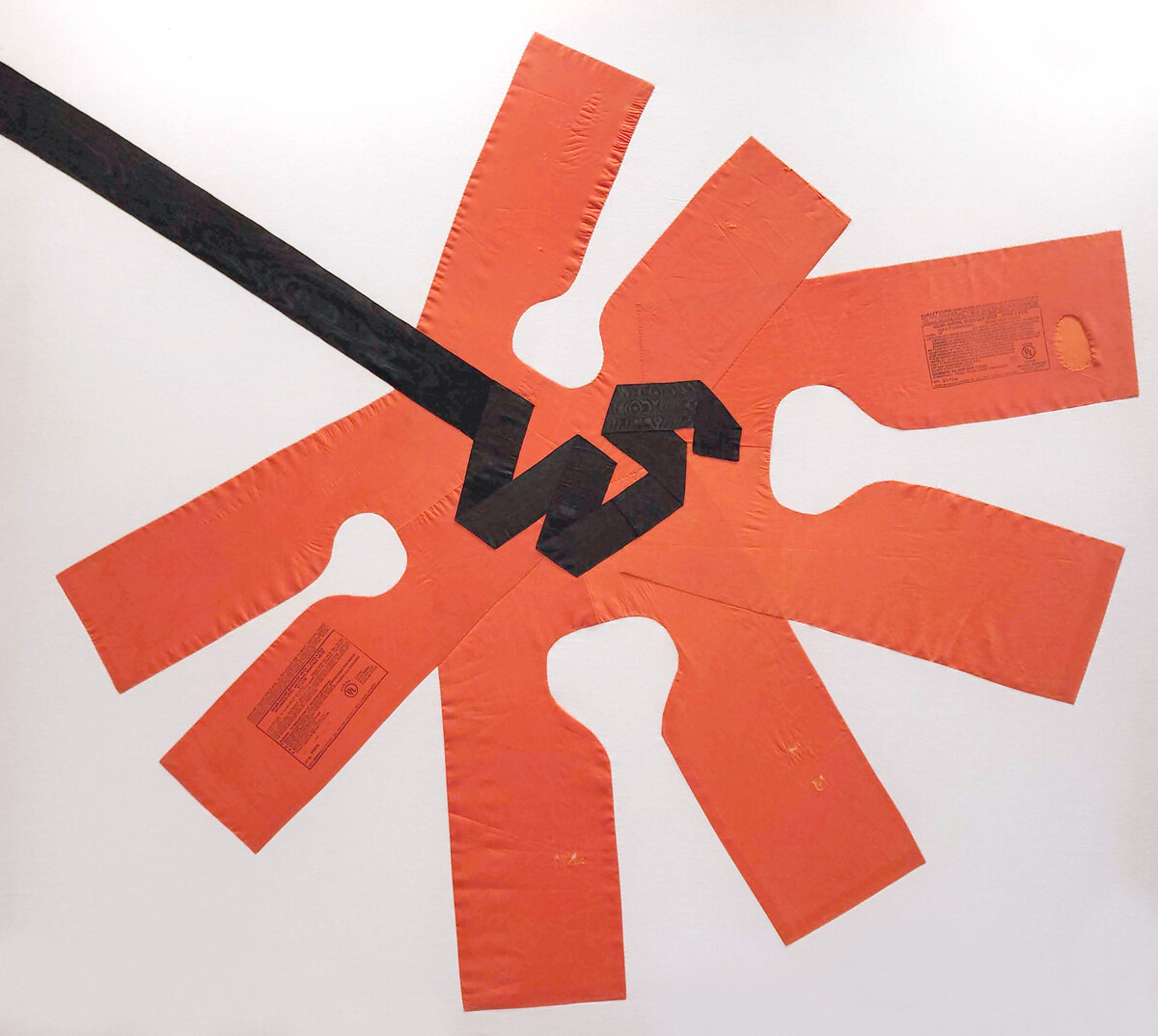
Safe, 2021
life vests, ribbon & fabric, 60” x 54”, Price upon request
Once in a blue moon a green moon, 2015
Salvaged wood, 28” x 31”, Price upon request
Duplex, 2015
Salvaged wood, 44” x 31.5”, Price upon request
Untitled, 2020
Capacitors & solder, 8.5” x 7”, NFS
Susanne Delatour Carey
March 5 - April 28, 2021
Providence, RI - Periphery Space @ Paper Nautilus is pleased to announce Vesica Piscis an exhibition by Susanne Delatour Carey featuring drawings and paintings which start with the simple shape of a circle.
Once a system has been put into place, like a serial ordering of circles, rhythm takes over and proceeds as a natural force. Systems can be seen as a way to avoid subjective decision-making, yet Carey's paintings are far from being impersonal or objective. Instead, the grid created by layering circles acts as a process; one thing leads to another. The result could be predictable, that is, until she starts painting. The framework of lines serves as a starting point. Her interventions leverage the grid's energy and give the work its own dimension and vocabulary, providing an insight into her painting practice.
An excerpt from Carey’s artist statement reads: In this series, I have been using six-fold symmetry as a method to organize my intentions for the picture plane before I begin to apply color. Using only a compass and a straight edge, I find the center and build a pattern starting from a single circle. Once I have the underlying grid, I can further build upon the structure or subtract from it. Initially, I try to establish a few simple parameters, for example, only using two colors or only using primary colors. Still, as the picture develops, I give over more to my intuitive process.
An except from our conversation These pieces are about making flat patterns and finding the beautiful secrets and forms embedded in the design.[…] I love the idea that anyone with a pencil, paper, compass, and a straight edge, can render the elements of matter with no prior knowledge of math and that math […] can create something that is so visually beautiful.
Artist Statement
Vesica Piscis: a type of lens, a mathematical shape formed by the intersection of two disks with the same radius, intersecting in such a way that the center of each disk lies on the perimeter of the other
In this series, I start with a six-fold symmetry pattern, or a lattice grid pattern, to organize my intentions for the picture plane. Using only a compass and a straight edge, I find the center point, and build the design from a single circle. Once I have the underlying grid, I can further build upon the structure or subtract from it. Initially, I establish a few simple parameters, for example, only using two colors or only using primary colors, but as the picture develops, I default to my intuitive process. The lines I have drawn are guides, not rules, and the points created are a reference’s which I use to navigate the picture plane. Sometimes I discover relics excavated from the archeological dig of my subconscious, while other times, it's more like adjusting the lens of a telescope to capture the image of a cosmic aberration. I let the image reveal itself to me. By manipulating the viewers' perception and creating the illusion of a three-dimensional solid or a receding space out of two-dimensional shapes, while leaving some of the two-dimensional pattern exposed, the esoteric mysteries of Euclidean mathematics are revealed in the exoteric observation of the artist's process. I invite the viewer to participate in the knowledge and experience of what is all around us on a personal level. Geometry becomes a bridge between human-made constructions and the harmony and unity of nature. When we connect our personal experience with the universal experience, it becomes the collective spiritual consciousness.
~
Susanne Delatour Carey lives and works in Westport, Massachusetts. She grew up in Chappaqua, New York and received her Bachelor's Degree in painting and sculpture from Bennington College. For over a decade Susanne had studio space in New Bedford, first at The Cummings Building on Williams St., and later on Orchard St, in the Howland Mill complex. Susanne has exhibited at Judith Klein Gallery, Colo Colo Gallery, Gallery X, The Rope Works Gallery, and The Pour Farm Tavern Gallery. She has participated several years in the Open Studios New Bedford, and Open Studios South Coast tour. In addition, her work has been exhibited at The Narrows Center for the Arts in Fall River, MA, Westport Artists Group, Westport, MA and The Producer’s Club, in New York City. Susanne now works from her home studio on the Westport River.
_____________________
A conversation between Susanne Delatour Carey and Barbara Owen on the occasion of Susanne’s show Vesica Piscis at Paper Nautilus in Providence, Rhode Island. April 2021
Barbara Owen: In your artist statement, you talk about using six-fold symmetry as a technique "to organize my intentions for the picture plane before applying color." As an artist with a long history of painting abstractly, can you tell us how you came to be interested in using a geometric grid and vesica piscis as a process?
Susanne Delatour Carey: When I make an abstract painting, I let my intuition and aesthetic sensibility lead me, but I wanted to understand better what I thought I knew intuitively. I decided to deconstruct my process by limiting my options to isolate and explore the basic elements of composition individually. I limited my palette and simplified my forms until I was drawing circles and squares in red, white, and black or repeating shapes using only primary colors. As the work became more geometric, balance and accuracy became more important. I was having issues with centering my forms until I realized that canvases are never perfectly square due to the unstable nature of wood and canvas. Measuring from the edges of a canvas would never be accurate, so the only way was to find the relative center and measure out. Without using the edges, the solution was to use a compass and a straight edge. My high school knowledge of geometry was pretty rusty, so I searched books on geometry, and that's how I discovered Euclidian Geometry, or Sacred Geometry, as it is known in the mystic sense. Starting with a point and drawing a circle with a compass, you can create any shape, both two-dimensional and three-dimensional, that exists in nature. When you add color and texture, whether you choose to make a pattern, the possibilities are infinite.
BO: In our conversation about your paintings, you said the dot is symbolic of and is referred to as the "seed of creation." Can you expand on this?
SDC: The dot is both the point of origin and the point of conclusion. It is both the beginning and the end. It has no dimension but carries all the possibilities of the universe within it. The dot is referred to as The Seed of Creation. Many religions and cultures all over the world have symbolic references for the dot. For example, In Hinduism, a dot called the Bindhi is placed on the forehead, at the position of the third eye, which is believed to be the seat of the soul. When the dot is extended into a line and connected back to itself in a continuous arc, you get a circle. With no beginning and no end, the circle is unassailable. The circle is created from something (the unbroken line) and nothing (the empty center and the space around it). Again, there is a commonality across cultures and religions that suggests the circle is a symbol for both Spirit and Matter, The Universe, or even God.
The Greek philosopher Empedocles said, "God is a circle whose center is everywhere and whose circumference is nowhere." A compass set to the radius of a circle, and placed anywhere on the circle's circumference, will divide the arc of the circumference into six equal arcs. This is known as six-fold symmetry. The six-fold symmetry pattern is the foundation for the Hexagonal Lattice Pattern, also known as the Matrix pattern. It is sometimes referred to as the Flower of Life pattern or The Matrix of Nature. Within this hexagonal lattice pattern can be found the design for everything from molecules to music. All this begins with a single point on a blank plane.
BO: What do the shapes that you arrive at mean to you? What are these shapes?
SDC: I have only begun to scratch the surface of the complexity of making shapes and forms using six-fold symmetry. I have already discussed the circle, but all the other two-dimensional shapes are there; the triangle, the square, the rectangle, the hexagon. The Vesica Piscis is the shape created by overlapping two circles of equal circumference at their centers. There are volumes on the Vesica Piscis (also known as the Double Reuleaux Triangle). It is first mentioned in Euclid's Elements (300bc). In mathematics, it is the first step in drawing an equilateral triangle. Due to its strength, the Vesica Piscis is used extensively to construct the medieval arches of the great cathedrals and temples in Gothic and Byzantine Architecture. The Reuleaux triangle, which is obtained by adding a third circle, is used frequently in engineering. The most recognized Vesica Piscis as a religious symbol is the Christian fish and the Holy Trinity. Still, it is also found in Egyptian culture, as in the Eye of Osiris and Hinduism, the symbol for the vagina or Yoni.
Also contained in the Hexagonal lattice pattern is Metatron's Cube. Named for God's scribe, the archangel Metatron, It is of interest to scientists, mathematicians, musicians, artists, mystics, and conspiracy theorists alike. Metatron's Cube is a geometric structure, built with a six-fold symmetry pattern, composed of thirteen equal circles. By drawing intersecting lines from the centers of each of the thirteen circles to each other, you will every single point needed to construct every pattern made by man or made in nature, all of the geometric shapes, and the five Platonic solids: the tetrahedron, the Cube, the octahedron, the icosahedron, and the dodecahedron. Though representations of these three-dimensional shapes date back to the fifth century BC, they are named for the Athenian philosopher Plato, who assigned these shapes to the five elements that he supposed formed all matter: fire, earth, air, water, and heaven; they are known in mathematics as the regular polyhedrons and consist of three-dimensional shapes constructed of identical polygons meeting at the same three-dimensional angle. These polyhedrons make up everything from crystals to human DNA, the formation and movement of celestial objects. I love the idea that anyone with a pencil, paper, compass, and a straight edge, can render the elements of matter with no prior knowledge of math and that math and science can create something that is so visually beautiful.
BO: How does your work relate to current social and political issues, if you think it does?
SDC: I do think it does. However, I don't think anything regarding the current social and political situation is new. I believe we have been in this place repeatedly since the beginning of what we call "civilization." I am not alone in the theory that the dawn of civilization was the downfall of civilization. When humankind settled down and began taming the animals and farming the land, it was the end of an egalitarian society and the beginning of the hierarchal community. The man with more land, more crops, more livestock can wield more power and rise in the hierarchy. It created an imbalance. Like the dot, it is both the beginning and the end. The matrix pattern is universal. It is in everything that exists on a molecular level. It is a great unifier. Geometry is also about knowledge and education. Numbers, Geometry, Music, and the study of the heavens were considered the four Great Liberal Arts in the ancient world. The sign above the entrance to Plato's Academy said: "Let none who enter here be ignorant of geometry." Plato introduced the idea that an understanding of a class of entities he called "forms," principally "Justice," "Truth," and "Equality," was essential to the understanding of ethics and creating an equal, just and productive society. I think that the world today is in desperate need of that kind of understanding.
BO: What themes do you navigate in your work?
SDC: These pieces are about making flat patterns and finding the beautiful secrets and forms embedded in the design. After I draw the design, I can use colors to emphasize rhythms or objects. Depending on the values and hues I choose, or what lines I choose to reveal or hide, I can create the illusion of a three-dimensional object within the two-dimensional pattern. I can show movement or stillness or advancing or receding space. I often leave areas of the pattern alone so the viewer can see the construction. I'm not trying to hide the process or obscure the reality of the illusion. I like the viewers to understand that simple lines can become a shape or a pattern and how the illusions of space and time are rendered on a flat surface. For many, Both Art and Geometry can seem so esoteric and mysterious. Mathematics, music, visual art, nature, and the cosmos are all intertwined, and the connection is illustrated in geometry. I think that is so beautiful. I wish more children learned about math using art and music; I think it would be a much more effective and holistic (and fun) way to learn. Everything has been so compartmentalized, and we have all become so isolated in our minds, careers, politics, and religions. We are all just points in the pattern. We are all necessary to each other because we are all connected. Everything is connected.
BO: Who or what influences your work?
My influences range from nature to the cosmos, Jazz and the Delta Blues, street art, the layers of graffiti.... I love Basquiat. But the first painters that I admired (and still look at) are Dekooning, Rothko, Richter, Diebenkorn, and Agnes Martin. One of my favorite books is called "The Tantric Paintings of Rajasthan." I have always loved Japanese prints and patterns and the tiles and mosaics found in Byzantine architecture. My heroine of the last few years is Hilma of Klint. I discovered her through searching Amazon for books on Sacred Geometry, and unrelatedly, on Diebenkorn. The Amazon algorithms presented me with Hilma. I had already been doing circles and squares for a while, and when I stumbled upon a book about her, I bought it. I was blown away as she painted and drew themes that I struggled to understand with such scale and beauty. When the Hilma Af Klint show came to the Guggenheim in NYC, I was very excited. Lately, I have been trying to tackle Plato.
BO: Thank you for your responses. Congratulations on your show.


oil on Canvas, 24” x 24”,


Oil on canvas,10” x 10”,


oil on Canvas, 20” x 20”


oil on canvas 9” x 12”

oil on canvas 6” x 9”

oil on canvas, 5”x 5”

colored pencil on paper 12” x 18

oil on canvas, 5”x 5”


pencil on paper 12” x 18”
Marcella Green | Points of Impermanence
May 3 – June 20, 2021
Providence, RI - Periphery Space @ Paper Nautilus is pleased to announce an exhibition featuring the work of Marcella Green.
In this thought-provoking show, titled Points of Impermanence, Marcella Green uses photographs and text to produce a visual narrative that explores her thoughts about death. The work is contemplative, melancholy, and transformative. The result of Green’s meditations is usually in the form of a book or zine, and she has produced several books as artworks; Before Waking and As of Late Marcella Green (published by Oranbeg Press, 2018) are the most recent indexes. For this show, she will use the wall as if it were pages to display text and photographs and, in doing so, tell a story about the power of creativity and a life revealed through photographs as artifacts.
From the artist’s statement:
“To die will be an awfully big adventure,” J.M. Barrie, Peter Pan
Points of Impermanence narrates and reflects on my once childlike understanding of death. As a motherless daughter who has known parental loss all my life, stories like Peter Pan and The Little Prince have always helped me feel less alone. Unsurprisingly, my creative practice centers on the passage of time, evidence that all things in this world are temporary, and transparency about my grief journey. For this exhibition, I have combined photographs taken during the current pandemic with a text piece that abstractly narrates both an imagined death adventure and reflections on the evolving grief I feel in response to the loss of my mother. Marilyn, the main character, represents the interwoven identity of myself alongside personality traits that I attribute to my mom through listening to stories of her life and musing over old family photographs. The constellation of images that accompany this work each meditate on passage in varied ways.
Biography
Marcella Green is a socially engaged artist based in Providence, RI. She works primarily in photography, writing, and interactive art installations. She is the founder of an independent art library and community space called fathom library. She earned her bachelor’s degrees in Creative Writing and Sculpture from Binghamton University in 2014, a Post Bac Certificate in Photography from MassArt in 2016, and her MFA in Image and Text from Ithaca College in 2018.
Artist Statement
My work centers on positive social change and community through the personal growth of intentional noticing and action. I make because the process grounds me, it is my personal means of working to be a better person, to structure my research, and to move through the world with consciousness. I hope to connect with others with my work, build community, and to find creative ways to ask hard and deeply honest questions about our existence and influence. Thematically, I focus on storytelling as a way to examine my identity in connection to others, and through this examination, to learn how to continually cultivate and share meaningful love.
I see myself as a photographer, and sometimes writer and sculptor. I often wander through my community to make quiet photographs. I like to balance this photographic process with camera-less image-making processes such as flatbed scanned images and cyanotypes. I also write poems and fragmented poetic prose in conversation with my images, and I often consider them another form of image making. I make zines and books as my preferred method to share this type of work. Lastly, I design and construct places to share the creative work of others within my community.
A little more about my photography, writing, and bookmaking; my photographs are still, yet layered both visually and metaphorically. I do not often photograph people, but rather places where beings have been, and where meaning lingers in the absence of figures. My photographs primarily incorporate color, texture, and light to communicate observations, feelings, and opinions. I think about what it means to flatten the world with a photograph or scanner, and how this can relate to the normative structures within the United States that I have grown up in, and that I am learning to reflect upon and work to transform. My writing is made up of fragmented contemplations that include sensory language, and playful sentence structure with similar serious thematic undertones as my photography.
Lastly, my spatial design work has manifested primarily as a pop-up art reading room and library space for my neighborhood in Providence, RI. The project is a submission-based collection of creative work in the book form. The collection includes handmade art books, zines, comics, poetry, and short run publications from independent publishers. The collection emphasizes local and emerging work, and originated from my genuine love for picture books. I am also responding to a need for inclusive community spaces outside of a gallery to share contemporary creative work.
_________
Questions for Marcella Green on the occasion of her first solo show, "Points of Impermanence" at Periphery Space (2021) by artist and friend Jason Lipeles.
Jason Lipeles is a writer, curator, and video artist. His manuscript Letters to M., a finalist for the Chautauqua Janus Prize, is forthcoming from Pilot Press in 2021. He is an alumnus of Asylum Arts’ Reciprocity Artist Retreat and the Institute for Jewish Creativity. His work has been featured in Black Warrior Review Online, Yalobusha Review, and the Racial Imaginary Institute.
_________
Jason Lipeles: Your work spans photography and writing, zine and installation. Can you describe what it is like to work within and across these mediums?
Marcella Green: Hearing you list the different mediums I work in is quite a fun way to reflect for me on my process as a human navigating the world and also trying to let my creative being thrive. I really enjoy situations where I can let my playful side take center stage, and making art has always been an outlet for discovery, exploration, and curiosity for me. Truthfully, I can also get bored easily and enjoy working on different types of projects at one time. This can lead to many things with loose ends, lost ideas, and unfinished endeavors, but it’s also pure magic when synergy appears over time across the mediums I’m playing with. I grow from the feeling of activating different parts of my brain. Working in multiple mediums encourages me to ask complex questions, to challenge the work and myself, and to build layers of meaning both visually and metaphorically.
JL: In the zine, "ocean hum", included in the installation, there is an interaction between characters named M and Marilyn, who may or may not be the same person. What does it mean to be in-between worlds, identities, lives? How does this invite questions into your artistic practice?
MG: What a transcendent question! I love that you’ve focused on this aspect of the narrative because it’s a question that I’ve asked myself repeatedly, and I feel that many folks can relate to in their own varied and specific ways. Honestly, I’m currently learning to live the in-between, the hope in uncertainty, the transformative quality of life and my identities. Some parts of me feel that I will always be learning to ebb and flow between space and time. Am I always becoming? I loooove asking questions and to be asked questions in return (especially ones I can’t answer quickly).
JL: There is one sentence you have hung on the wall which reads, "She made a draft with her wings, brushing all that was below." How does "a draft" relate to the practice of art-making for you? Are you ever finished?
MG: I never feel finished! Each event, presentation, exhibition, zine, publication, anything, all feel like a version of completion and varying levels of resolution. One the other side, I also love deadlines because they encourage me to come to a point of clarity and finality. Will this option of “finished” be lasting or fleeting? Either way, they feel like affirming milestones, and also warm moments to share with others. I’m really thankful for this exhibition and opportunity to try on an image and text pairing that I haven’t yet.
JL: In "ocean hum", the narrator asks a number of prominent and poignant questions such as "How can it be both?"; "How quiet could her body be?"; "How would history be different if the light of the world had lost their mother just after birth?" Can you talk about your relationship to the asking of questions?
MG: When I started to take being a photographer more seriously, to practice making pictures and to learn its history, I found that what activates my process the most, and my experience of viewing photography, is asking questions. In practice, whether these questions are being asked of me, in response to my work, or I am asking them to initiate a project, I find them just as essential as my camera. I began asking more and more questions upon realizing that making something pretty wasn’t enough for me. I’m not saying art for the sake of beauty isn’t valuable, it certainly is. But I found that this approach in creating was not working for me because I need art to be educational, I need it to be transformative, I need it to be loving, I need it to be questioning.
JL: Lastly, what's your relationship to the color blue? How does impermanence inhabit the color blue for you?
MG: Jason, I love that you specifically asked this question. Remember the summer we met and you asked our cohort individually, what is infinity? I answered something like, the color blue the Boston sky becomes just before the sun disappears over the horizon. I had a tough time the first time I lived in Boston. I was lonely, insecure, in some toxic relationships, and quite depressed. I’d look up to the rich, calm sliver of almost night sky peeking through the tall buildings and breathe easier because I sensed the impermanence of infinity. I sensed uncertainty, and comfort in the knowledge that the vastness of the sky could hold all the ugly I felt in that moment. I felt a little less alone. I remember these moments of growth with both sorrow and gratitude. So maybe today I’d answer your question again but a little differently: Infinity is the repeated impermanence of sky slipping from indigo to darkness. That’s why, perhaps, in ocean hum, that M is dressed in blue. Blue both holds, guides, and comforts her, but Blue also reminds her she’s malleable and ultimately lets her go. (Eeep! And this is an example of moments I love questions the most ~ I had no conscious idea how deep my connection to the color blue was until you noticed and asked. Thank you for your warm and thoughtful questions!)
John Barnett
Periphery Space @ Paper Nautilus is pleased to announce the newly published book Carbon: One Atom’s Odyssey by John Barnett, with an exhibition featuring a selection of the drawings that illustrate the book.
An interview conducted by Andy Smith of the Providence Journal is included below.
JOHN BARNETT was born in Buffalo, NY. His favorite job was as a shepherd in Cornwall, England. For many years he enjoyed working as a carpenter, even building his own sailboat which, the last he knew, still floats. For the past decade he has worked as a graphic designer and illustrator, skills he has applied toward many books. Carbon is the first of his own. The drawings within were done ‘old-school’ with fine-tipped mechanical pencils on paper. He lives on the shore of (and quite often on) Narragansett Bay in Rhode Island with his wife and three children.
_________________
links to articles about John’s book:
Six archival prints (signed editions of 100) on etching paper made from scans of the original pencil drawings are on view at the bookstore.
________________________
Atomic journey gets graphic in Warwick artist's new book, 'Carbon'
By Andy Smith
Special to The Journal (Providence Journal) June 27, 2021
A single carbon atom is the star of a new book, simply called “Carbon,” by Warwick artist/designer John Barnett. Through a series of exquisite drawings using a fine mechanical pencil, Barnett traces the journey of a carbon atom from an exploding star at the beginning of the universe to a neuron in Barnett’s own brain.
Carbon atoms, with their ability to bond with other atoms in molecular chains, are a basis for organic life as we know it. So, Barnett shows us the carbon atom within unicellular phytoplankton, a peregrine falcon, a grape leaf, a glass of wine, a farmer chasing a bolting horse, a cedar in Lebanon, and a moth’s compound eye. “Carbon is often referred to as the backbone of life,” he said.
Barnett, 57, is co-owner of 4 Eyes Design in Warwick with his wife, Isolde Maher. For Barnett, “Carbon” has been a long time coming. It began decades ago when someone handed a much younger Barnett a copy of Primo Levi’s book “The Periodic Table” after Barnett had dropped out of college and decided to see some of the world.
Levi, an Italian chemist, writer and Holocaust survivor, finished that book with a chapter on carbon, which tracked a single atom through time and space.
“It was a moving and beautiful story that bypassed the particulars of [Levi's] life and connected all things. So succinctly and beautifully, to me,” Barnett said. He had long thought about adapting “Carbon” to a visual medium but had never gotten around to it. About three years ago, he decided to begin.
Losing his vision to eye disease
Part of the reason, he said, was that the Trump administration had him feeling down, and he wanted to create something beautiful. Part of it was an effort to explain some of the world to his three children, now 18, 16 and 10.
And a large part was his eyesight. Barnett has a progressive, incurable eye disease called retinitis pigmentosa that leaves his field of vision smaller and smaller — like looking through an increasingly narrow tube.
“I’m not sure how much more time I’ll have to do this,” he said. When he demonstrates how he had to draw “Carbon,” his eyes almost touched the paper.
“I finally got myself a white cane,” Barnett said. “I used to be able to fake it, on job interviews, for example. I didn’t want to let the world know I was less than totally capable ... But I feel less handicapped with the cane than with stubbornness and pride. It’s like a coming out. I’m not ashamed of it; I’m still me.’’
A globetrotting carpenter
Barnett’s career has taken some intriguing turns. A native of Buffalo — he still roots for the Bills — he studied architecture and then fine arts at SUNY Buffalo for 2½ years before deciding college was not for him. So, he became a carpenter and traveled the world. Martha’s Vineyard was his home base, but he renovated a house in Australia and spent some time in Europe, painting houses in London, picking grapes in Greece, working on a dairy farm in Ireland. In Cornwall, England, he worked for a sheep farmer who promised him room, board and a weekly trip to the local pub. (More like a monthly trip, Barnett said.)
Back in the U.S., he worked in Vermont, Boston, Minneapolis and Seattle, where he met his wife. And almost always, he returned to work on Martha’s Vineyard.
In 1996, he and Maher married. Soon they began thinking about buying a house somewhere and settling down. But they couldn’t afford a house on Martha’s Vineyard, or Boston. So, in 2000 they moved to Rhode Island, without knowing anyone here.
He still worked as a carpenter, but he and Maher slowly built up their art and design business, which now has clients all over the country. A friend from Australia, Stephen Morrow, became an acquiring editor for Simon & Schuster, and 4 Eyes Design began working with a lot of book publishers, including university presses from Stanford to Oxford, along with local clients such as Adler’s Design Center and Hardware, The Wheeler School, the French-American School of Rhode Island, and the Providence Children’s Film Festival.
Collaboration with Nobel Prize winner
While trying to find a publisher for “Carbon,” Barnett contacted chemistry departments at a number of colleges. A professor at Harvard suggested he contact Roald Hoffmann at Cornell. Not only did Hoffmann, 83, win the Nobel Prize in chemistry in 1981, he is also a published poet and playwright. And, like Primo Levi, he is a Holocaust survivor.
Barnett emailed Hoffmann an early copy of “Carbon,” and a collaboration was born, even though the two men have never met.
“We talked on the phone and corresponded extensively by email,” Hoffmann said in a phone interview. “He wrote to me, he told me the story about the Primo Levi book and what it had meant to him. I got a very good feeling about what he was doing, about the art.”
Hoffmann helped Barnett with the molecular formulas in the book (“Some of them were obviously not right to a chemist,” he said.) He even agreed to write the foreword.
“We have carbon; our molecules are constructed on the chemistry of this unique element,” Hoffmann wrote. “Levi wanted to tell the story of an atom of carbon. ... Here John Barnett invites us to follow the atom in its wondrous graphic journey.” Hoffmann said that while he was corresponding with Barnett, he never knew of Barnett’s eye disease; he only became aware of his retinitis pigmentosa after the book was published and an article on “Carbon” appeared in a journal of the American Chemical Society.
From passion project to published book it took Barnett three years to finish “Carbon,” working on it in between other jobs for 4 Eyes Design. But then came another problem — how to get it published. After all, it wasn’t quite an art book. And it wasn’t quite a science book.
But Barnett saw an ad saying that a company called No Starch Press in San Francisco was looking for freelance designers. And on the No Starch website was a poetry book about the Periodic Table of Elements. A company that would publish that seemed like a good home for “Carbon.”
Once “Carbon” was published, Barnett stayed busy with marketing.
“I feel like I have to make this work, so the publisher will allow me to do another book. If this isn’t going to work, it won’t be because I didn’t do enough,” he said. Large prints of the “Carbon” drawings will be on display (and for sale) at Paper Nautilus, a bookstore at 19 S. Angell St. in Providence, through July 25.
Hoffmann said he was impressed by Barnett and the making of “Carbon.”
“It was a pleasure to work with John and be associated with this project. ... This is not a chemistry textbook. It’s not an art object. It’s something he felt compelled to write about. It’s very much an object of love.”
Published, May 2021 by No Starch Press, San Francisco
$ 17.99
signed copies available, shipping extra, contact book store for details. Paper Nautilus Books, (401) 521-5533
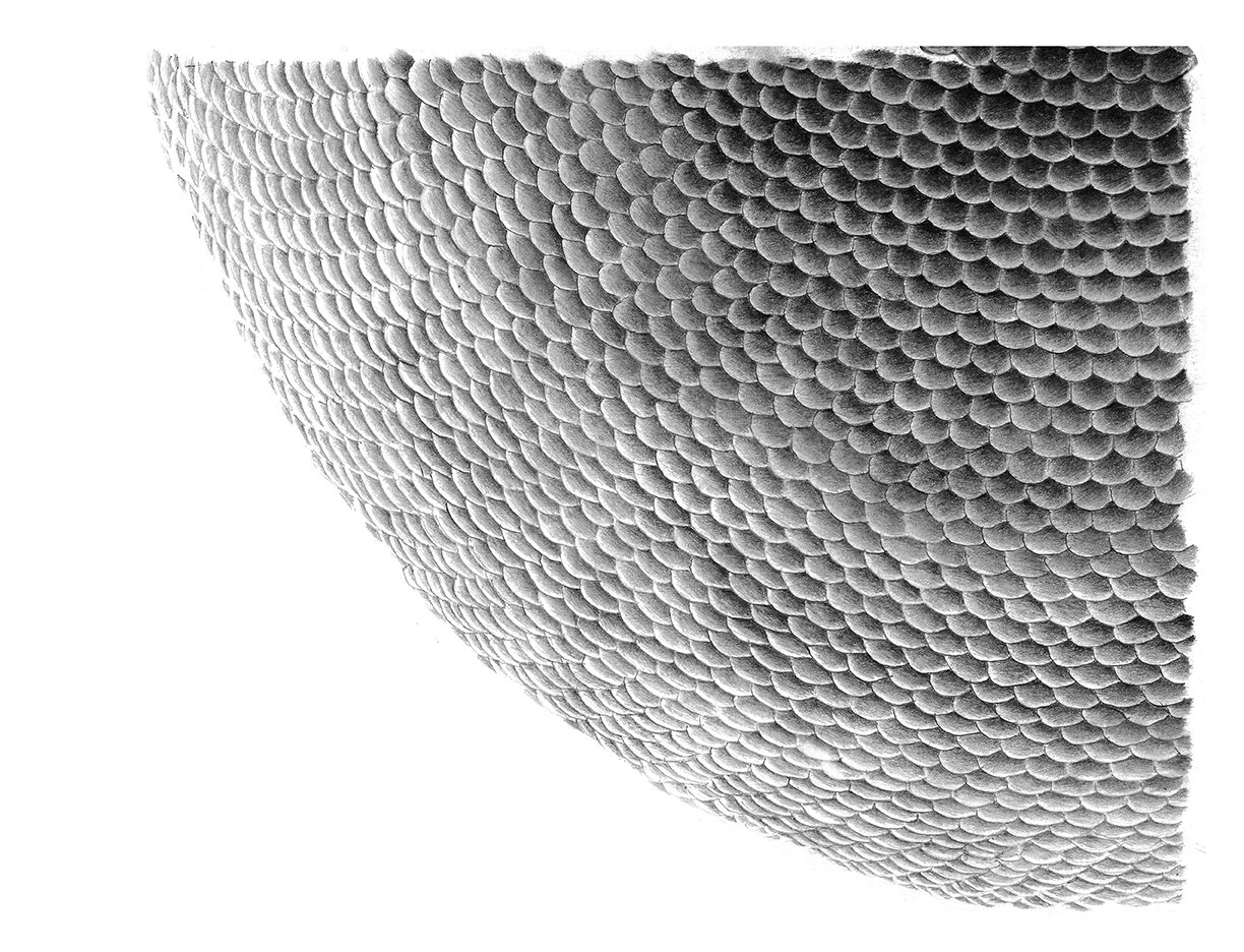
17” X 13”, Archival prints (signed editions of 100) on etching paper
$225 unframed/ $275 framed
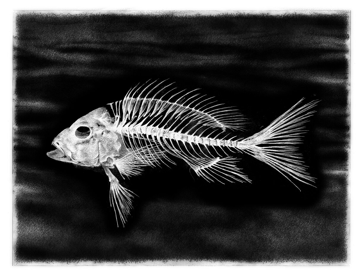
17” X 13”, Archival prints (signed editions of 100) on etching paper
$225 unframed/ $275 framed
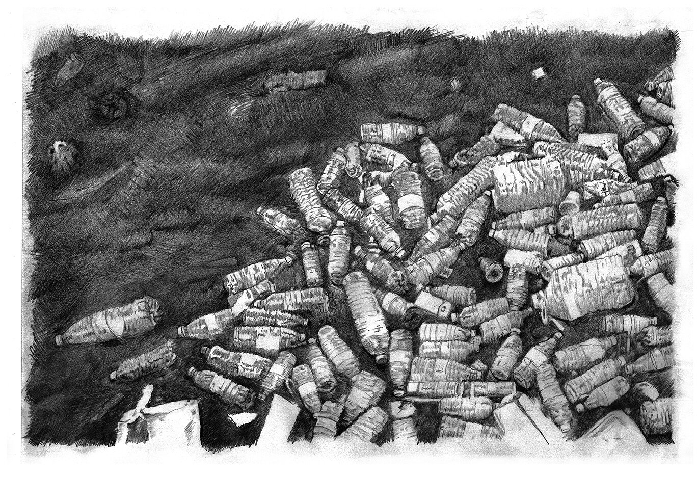
19” X 13”, Archival prints (signed editions of 100) on etching paper
$225 unframed/ $275 framed

17” X 13”, Archival prints (signed editions of 100) on etching paper
$225 unframed/ $275 framed
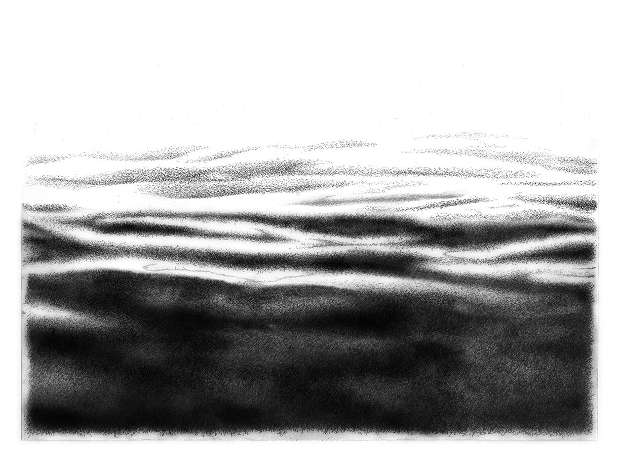
17” X 13”, Archival prints (signed editions of 100) on etching paper
$225 unframed/ $275 framed
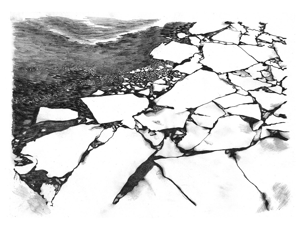
17” X 13”, Archival prints (signed editions of 100) on etching paper
$225 unframed/ $275 framed
Susan Strauss | Western Painting
July 28 – August 30, 2021
Providence, RI - Periphery Space @ Paper Nautilus is pleased to announce an exhibition titled “Western Painting” featuring new work by Susan Strauss.
Strauss describes these as pivotal paintings as they were influenced by a change of place but also a state of mind brought about by the crisis of politics and covid. Strauss traveled to Northern Arizona to paint in the winter of 2019 and stayed out west through most of 2021. Starting with daily painting, direct observation and walks through the landscape, she began working on a series of abstract paintings. Book sized; the small landscapes help you travel to the high desert. The larger works connect the elemental immediacy of the Western landscape and the timelessness of Eastern cosmology represented by the mandala.
Strauss has lived and had maintained her studio in Westport, MA since 2005 and is part of the South Coast Artists open studio community and the Art Drive. She is a founding member of the Brickbottom Artists Building in Boston and has received grants from Mass Arts Lottery and Public Works RI. Her work has been exhibited in many group and solo shows throughout the New England area including Gallery at 4, Tiverton, RI, Deedee Shattuck Gallery, Westport, MA, Gallery NAGA, Boston, MA, Newport Art Museum, Newport, RI, New Bedford Art Museum, New Bedford, MA, Tufts University, UMass Boston, Boston University, Prince Street Gallery, New York, NY and Atlantic Gallery, New York, NY.
For more information about the artist visit her website and social media
https://www.susanstrausspainting.com
Instagram @susanstrausspainting
_______________________
Interview
Alexander Castro interviews Susan Strauss on the occasion of her show “Western Painting” at Periphery Space @ Paper Nautilus.
Alexander Castro is a freelance writer and journalist based in the Providence/Boston area. His writing has appeared in Big Red & Shiny, Newport Mercury, and Art New England. He won First Place in the ‘Arts Review or Criticism’ category at the 2015 Rhode Island Press Association Editorial Awards.
~
Susan Strauss’ “Western Painting” at Periphery Space@ Paper Nautilus
Susan Strauss and I met on the staircase at Paper Nautilus, underneath a grid of enthusiastic, magazine-sized, oil-on-panel landscapes she made in the last two years. We talked wildlife, painting classes, and the distinctive vistas of Arizona, where the land can stretch for miles, visible and unobstructed. Strauss’ latest body of work subscribes to an ethos that’s best summed up by her own words: “not thinking too much, just painting.” The following interview was conducted online and picks up some of the threads from our in-person conversation. — Alexander Castro
ALEXANDER CASTRO: Let’s start with the title of the show, Western Painting. Most of these paintings were made during your time in northern Arizona, which was your home base for a good chunk of the pandemic. Can you describe the landscapes out west? How did Arizona influence, shape or refresh your approach to painting? What did it teach you, or urge you to reevaluate?
SUSAN STRAUSS:
Alex, I love that you used the word refresh in your question! The landscape where I stayed is vast, surprising and ancient. It made me feel receptive, ready for something brand new.
AC: I can definitely sense (and see) that newness in Western Painting. I remember an earlier body of work from you, circa 2016, that used nets, meshes and other patterning tools. Is it accurate to say your work is moving away from overlays and patterns, and toward paintings that are more directly about mark-making? Personally, I deeply appreciate the gestural intensity and variety in Western Painting; I like that viewers could see these paintings as landscapes, abstractions, or both. What role does mark-making play in nurturing this ambiguity? Similarly, what makes landscapes especially receptive to an artist’s gestures and observations?
SS: Yes, there have been a lot of changes since 2016! This series of small mark-y landscapes in the show are painted outside in the landscape and usually in one session. The older series were larger, slower studio paintings with lots of layers and lots of marks too. They were about water journeys and weaving. I would have to say that whether they are painted from direct observation or inner seeing, they all are about place. I am looking for something that is “inside of the there.”
AC: Speaking of the “inside,” one of your goals when painting is to “open a space” for the viewer, to give them a way inside. Your painterly approach seems to pursue a complementary mission of opening up space for yourself. When painting, how does a lack of rigidity or expectation act in harmony with these ends? Where does your mind wander when you’re painting?
SS: I have looked at art my whole life but I realize that many people do not have much of a relationship with painting. Instead, we are used to advertising, moving images, sound bites and now social media. Paintings can be quiet. They may need to be looked at more than once or over a period of time. When I paint, I do look for a space to open, and that is a way to enter in but it is about revelation, not goal or plan. Painting is about being present.
AC: Yes, “goal” might be too hasty a choice of word—a little business-y, almost. After all, you don’t paint with an agenda, and you allow for plenty of intuition, revision, and changing course. Why is oil paint a good choice for your working style? Does oil’s flexibility help you to render or redo ideas quickly? Did its wide range of color help you to achieve new “western” palettes? Were there any environmental conditions or limitations you had to account for when painting in Arizona?
SS: I recently traveled back east by car and because there was not much room in the packed car for wet paintings, my painting set up was acrylic. It dried so fast I could barely get it out of the tube. This was not very satisfying. Heat and light are intense, even dangerous in AZ.
AC: The 8x10-inch paintings are a highlight and I adore the way they fill the wall—it reminds me of the way I used to plaster my walls with xeroxes of comic book covers. But there are also two larger canvases in Western Painting, one of which you mentioned is more a “looking out from within,” than the “looking inward” perspective you often employ. How do the smaller paintings inform the large ones and vice versa? Are you applying the same looseness of plein air technique to these large canvases? How do you mimic the energy of painting outdoors in your studio?
SS: I really like how the large and small pieces in the show speak to each other. The plein air helps me get into the cycle of the seasons and acts as a springboard for studio ideas.
AC: “I think all of my paintings are about painting.” That quote really stuck out in my notes from earlier. This is a slightly unwieldy question, but can you elaborate on what “painting” means to you? Is it about the materials, the process? The way you translate or render an observation of the natural world?
SS: Painting is a way of channeling the creative forces that shape this world.
Alex thank you. Your questions about my work have given me a lot to think about. I don’t have all the answers or all the words that translate a non-verbal experience.
AC: Thank you too for sharing your work with me. And I completely understand. From a writer’s perspective, putting words to something so deep, personal and meaningful is a tricky task indeed. I suppose that’s the task of any art, whatever materials one might choose.
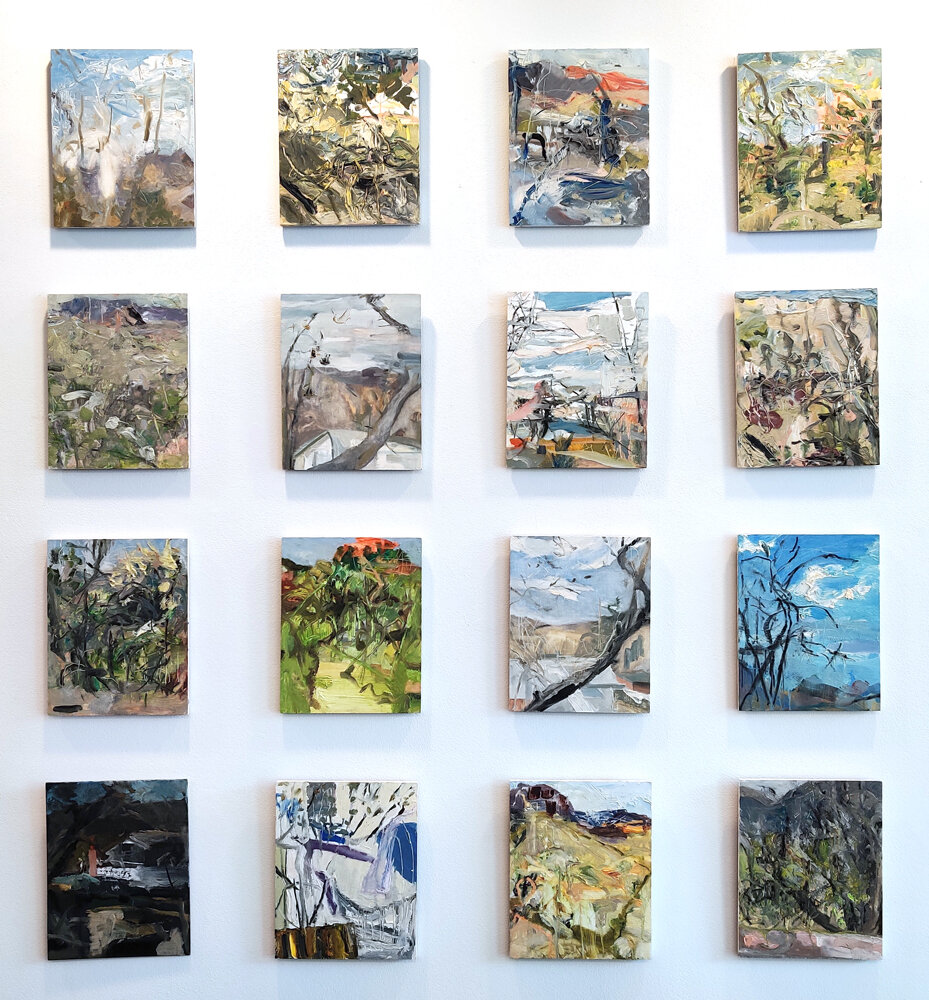
Each small 8 x 10 inch painting is $280

10” x 8”, oil on panel, 2020
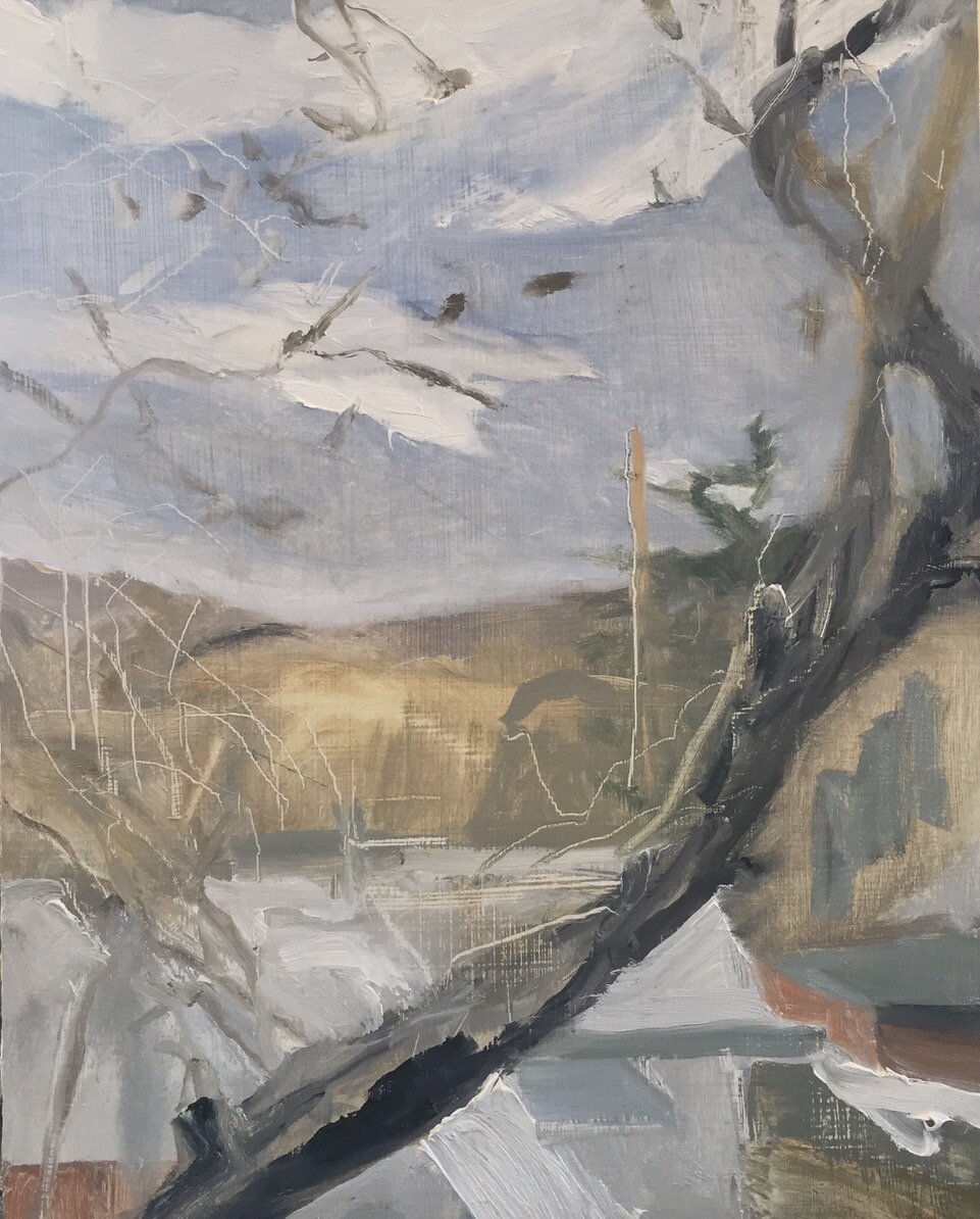
10” x 8”, oil on panel, 2020
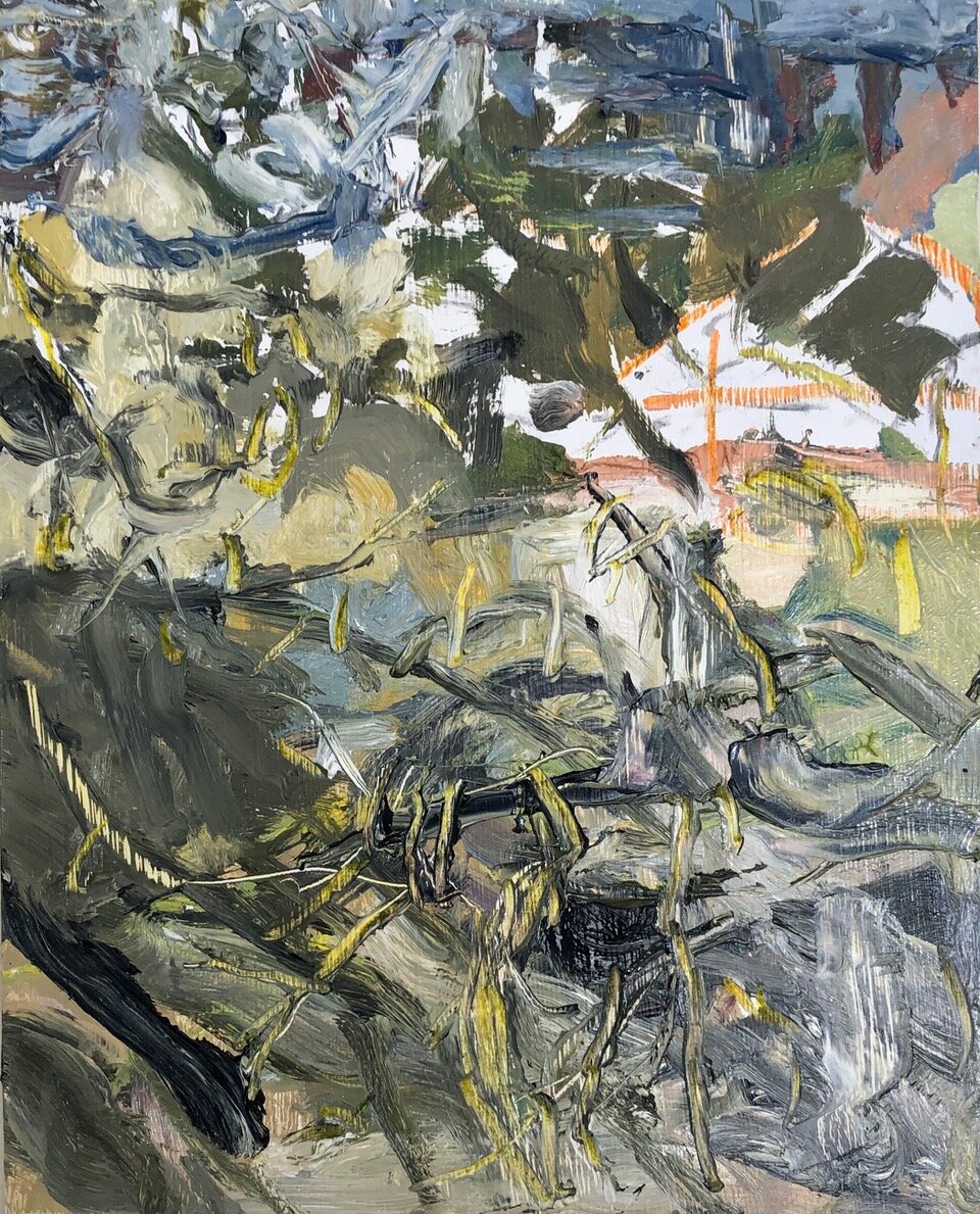
10” x 8”, oil on panel, 2020
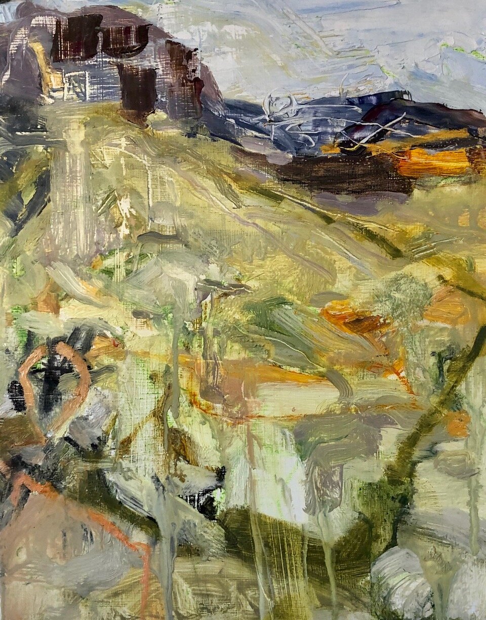
10” x 8”, oil on panel, 2020
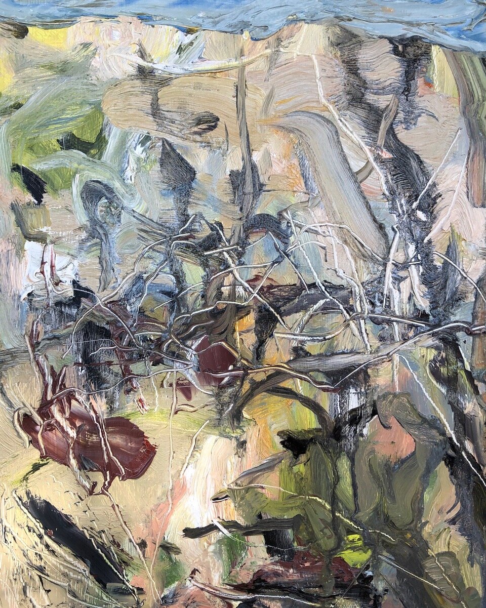
10” x 8”, oil on panel, 2020
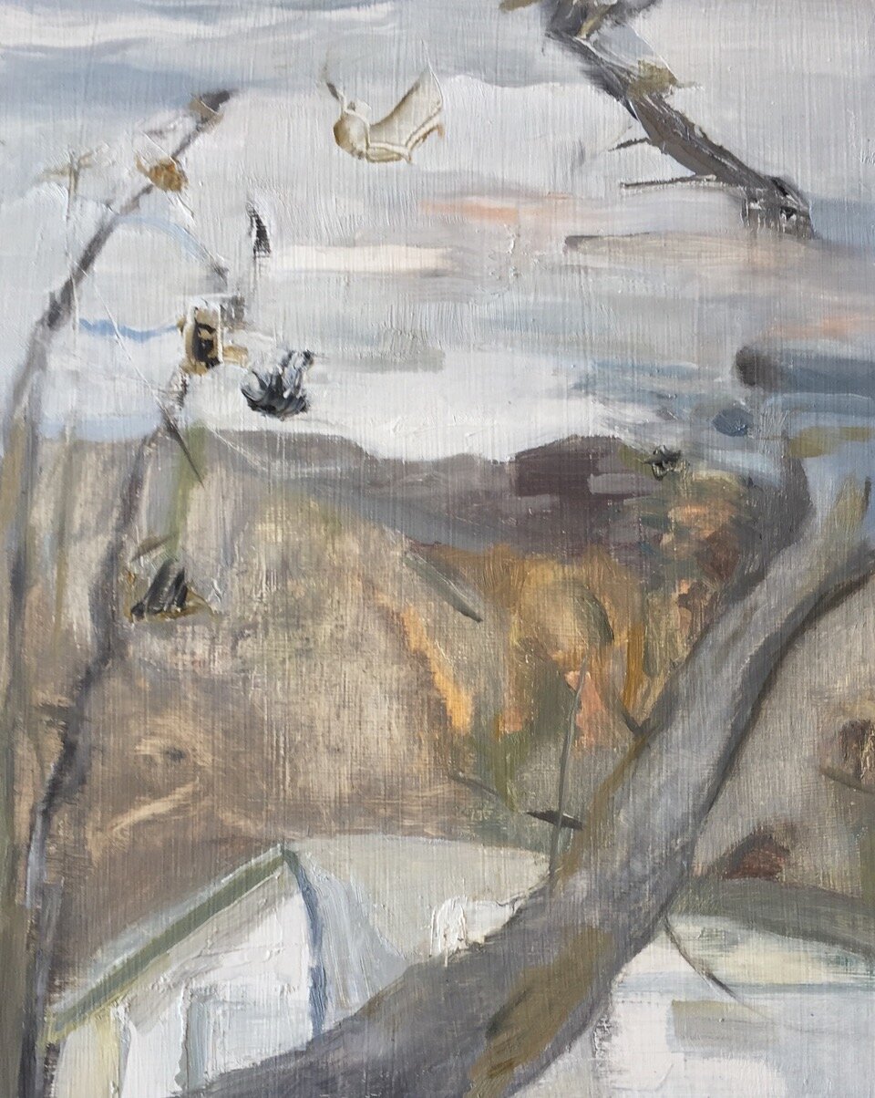
10” x 8”, oil on panel, 2020
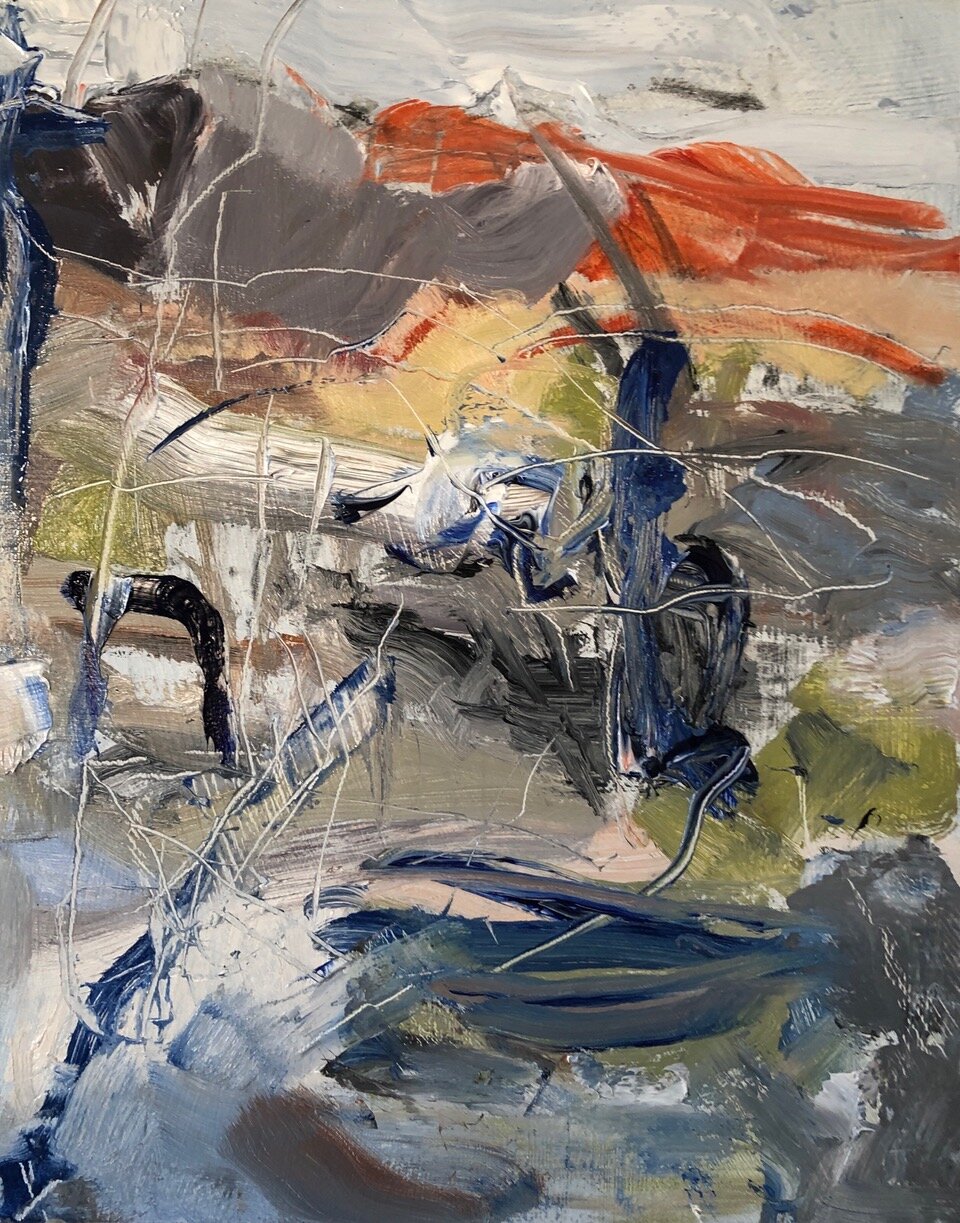
10” x 8”, oil on panel, 2020 -SOLD
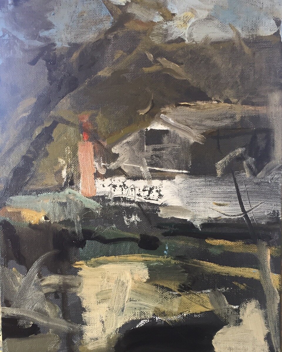
10” x 8”, oil on panel, 2020
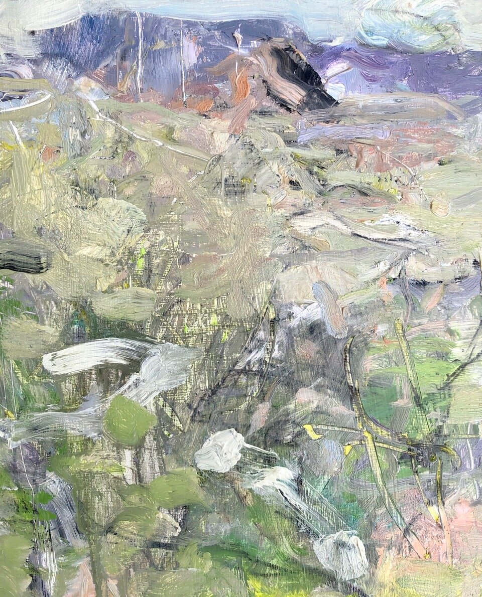
10” x 8”, oil on panel, 2020
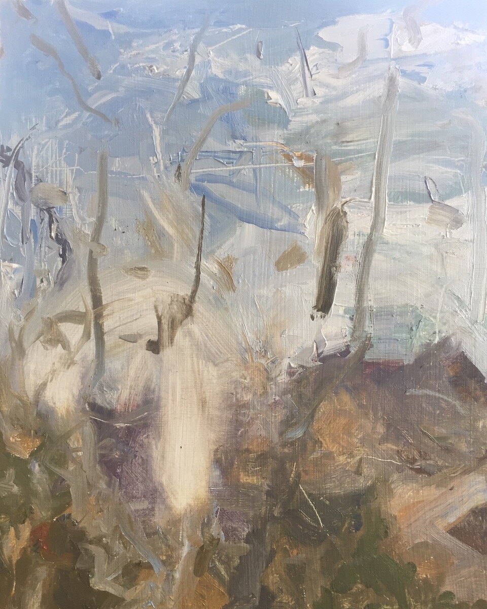
10” x 8”, oil on panel, 2020
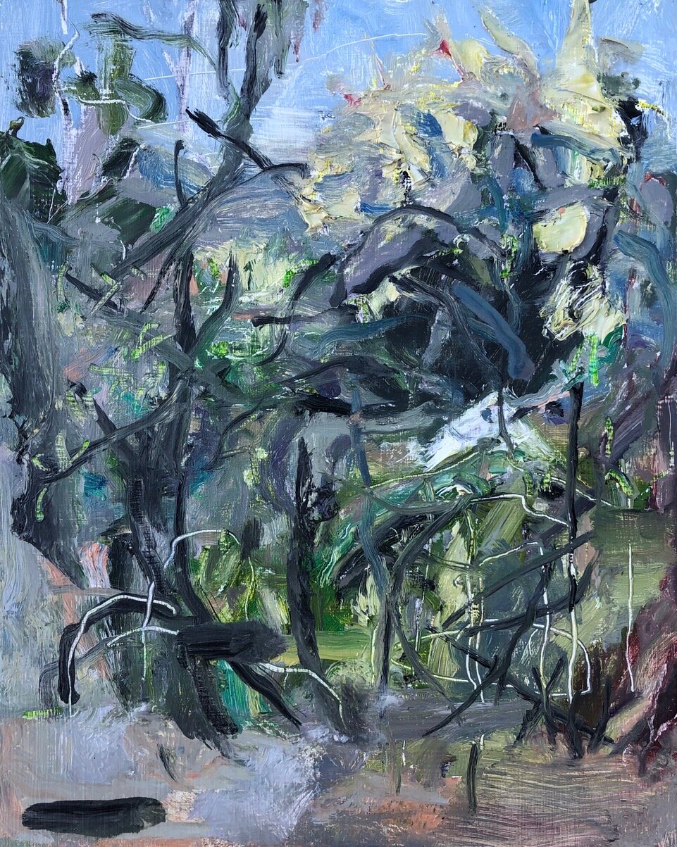
10” x 8”, oil on panel, 2020
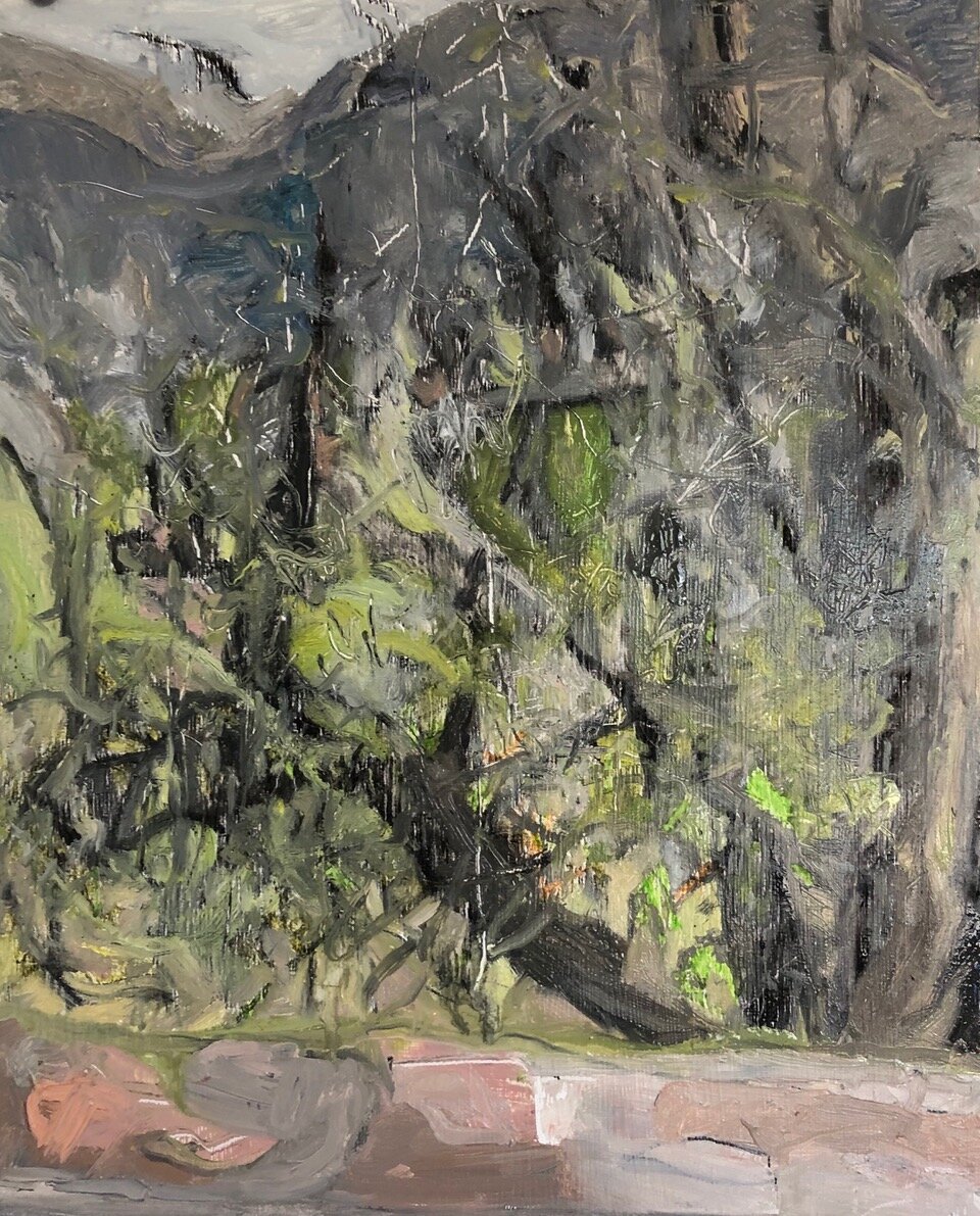
10” x 8”, oil on panel, 2020
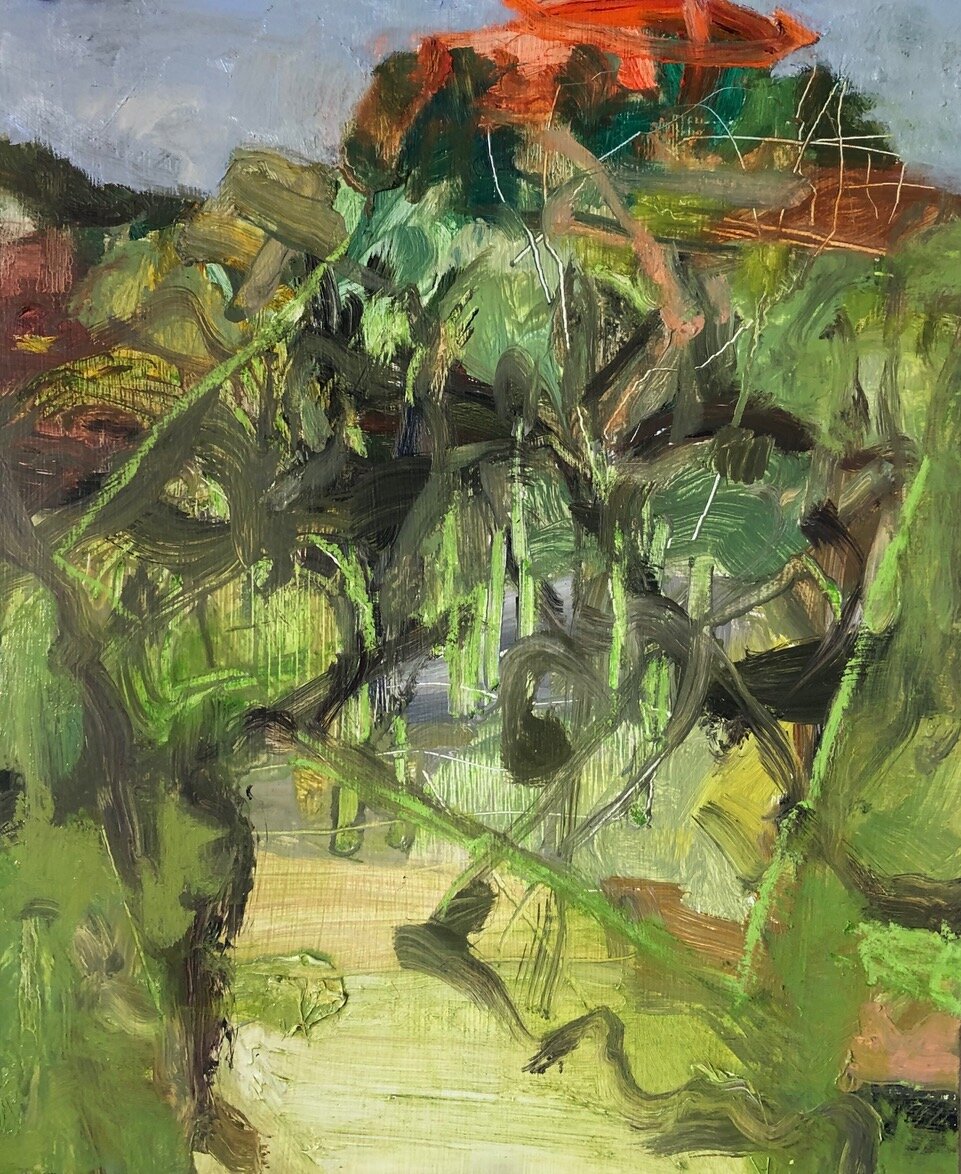
10” x 8”, oil on panel, 2020

10” x 8”, oil on panel, 2020
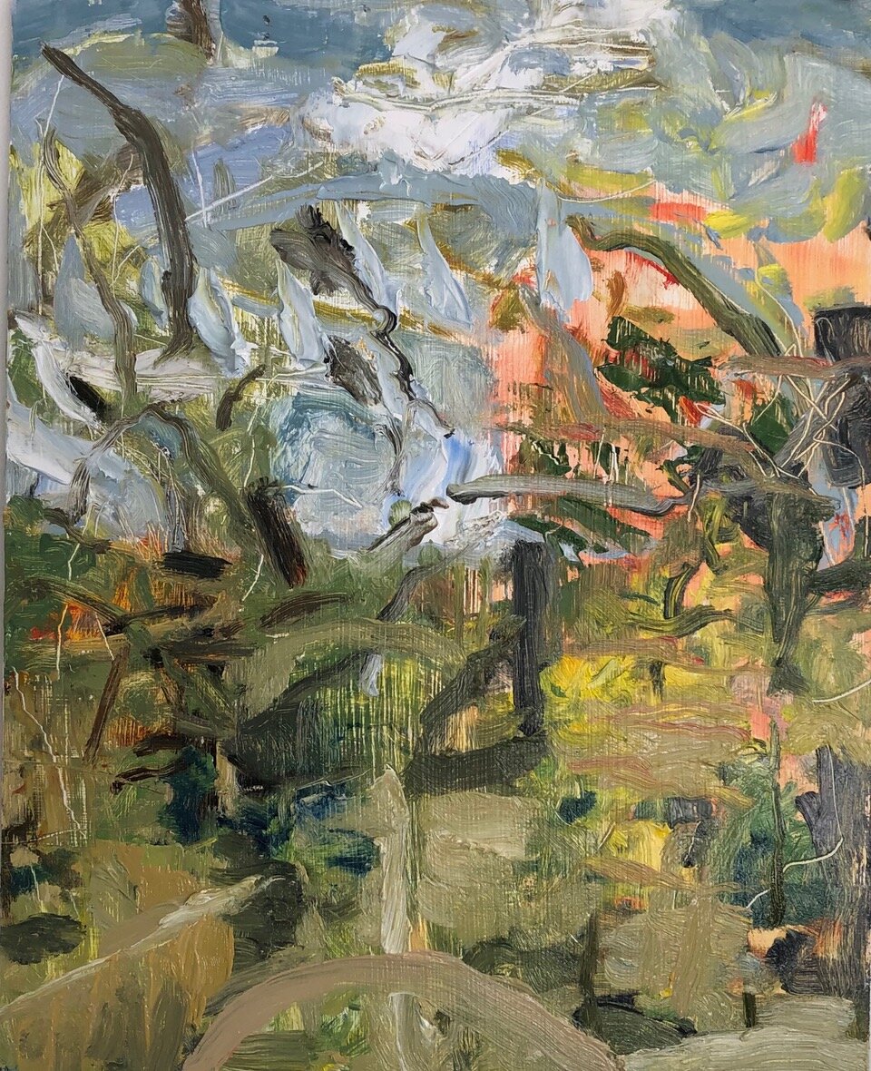
10” x 8”, oil on panel, 2020
10” x 8”, oil on panel, 2020
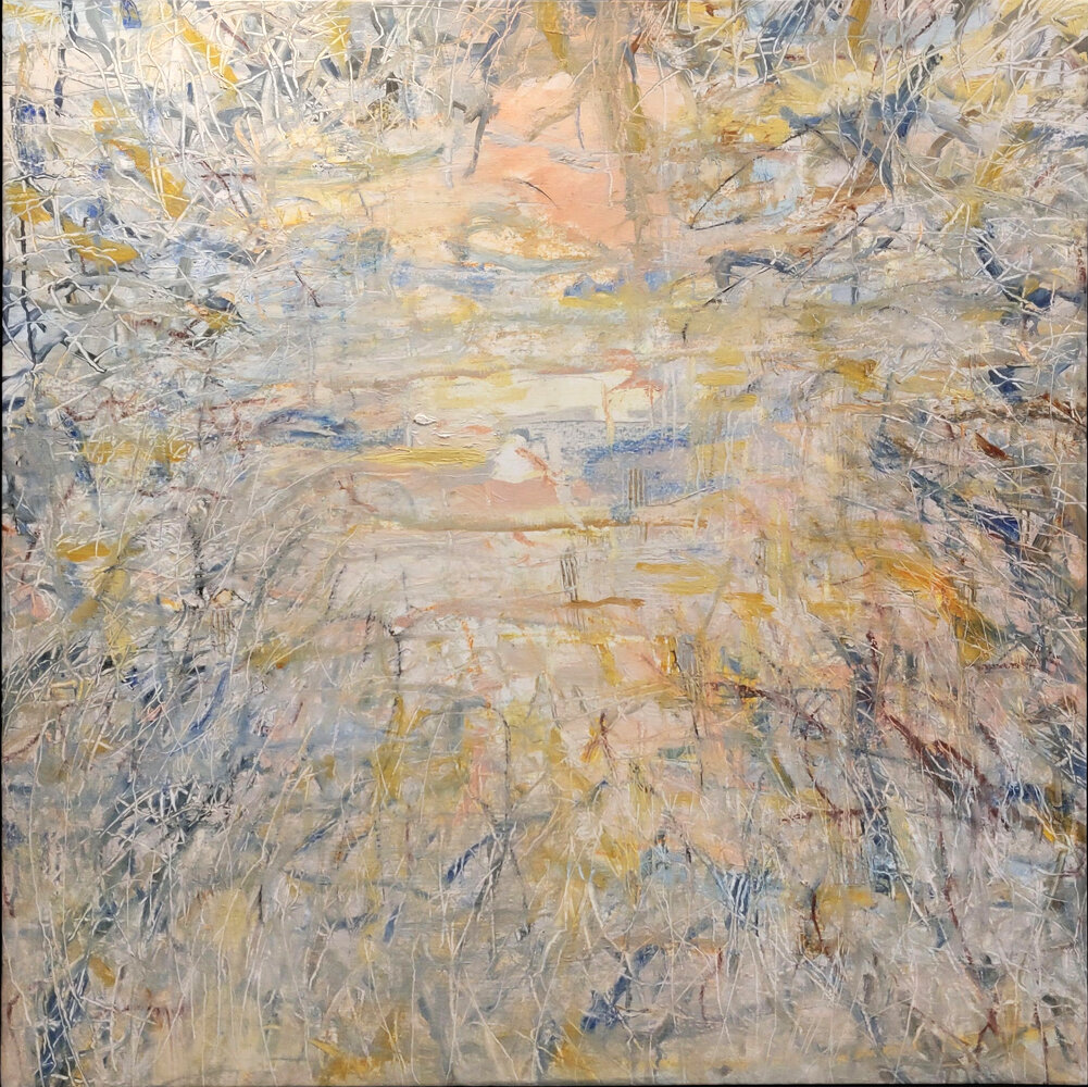
36” x 36” oil on linen, framed in birch, 2021
$3,250
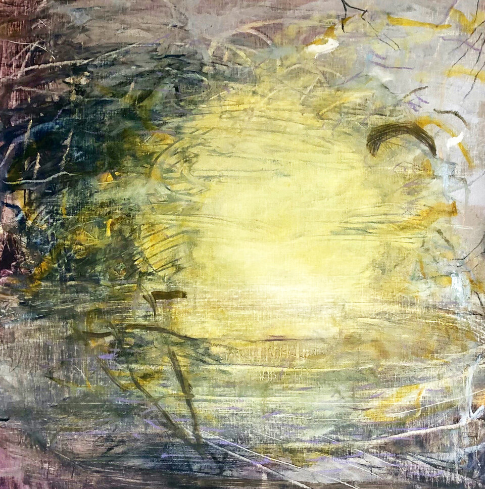
21” x 21” oil on linen, 2021
$1,200
10” x 8”, oil on panel, 2020
Masha Ryskin and Serge Marchetta | Convergence
September 2 - October 17, 2021
Periphery Space @ Paper Nautilus is delighted to present Convergence, a collaboration between artists Serge Marchetta and Masha Ryskin. Convergence is the duo's tenth collaboration; this exhibition shows a suite of new abstract mixed media panels made during Ryskin's extended visit to Montreal in winter 2021, after nine months of separation. Made in the confined space of a small apartment, they describe the experience of making the work as: "[…] providing an escape to an expanded imaginary space. Put together, these paintings become fragments of thoughts, longings, and conversations."
Masha Ryskin (Providence, RI) and Serge Marchetta (Montreal, QC) met in 2009 at a residency at CAMAC Contemporary Art Center, France, and have been working jointly since 2010. Together, they have participated in numerous collaborative international residencies. Their work has been exhibited in solo and group exhibitions in the United States, Canada, The Netherlands, Finland, and Slovakia. Most recently, an exhibition was reviewed in Art New England.
In conversation with the artists the question of how they happened to choose each other to collaborate with and how they view the collaboration in regards to their individual work, they replied:
When we met at the CAMAC Contemporary Art Center, we saw that we shared common aesthetic and conceptual concerns. We also felt that our processes had the potential to be complementary. At the same time, we had tremendous respect for each other's work, which is crucial in any collaboration. We began with a series of works on paper and gradually expanded to include video and installation.
Collaborative work allows us to develop a distinctive vocabulary, which at the same time enriches and expands our personal work.
Statement
Serge Marchetta and Masha Ryskin’s collaborative practice stems from investigations of memory, a sense of place, and displacement. They are interested in the memory of a place evidenced by traces of presence in a landscape, both urban and rural. Utilizing a variety of materials and processes, they manipulate the space through the use of drawing, light, and shadows. In their video work, they explore subtle shifts in movement that occur in space over time. The viewer is invited to be aware of the subtleties of one’s surroundings, providing space for contemplation and reflection. Marchetta and Ryskin’s new line of inquiry is loosely aligned with immigrant artists who deal with the relationship between place, history, and identity.
Ryskin and Marchetta’s collaborative process is symbiotic and is a melding of their identities and ideas. They are able to explore the work together in an intuitive manner, allowing for an awareness of both their thought processes. This allows for more intertwining of the vocabulary, where it is not always possible to separate the individual ideas and visual language. While one meticulously plans, the other responds, then the roles flip. The collaborative process provides an opportunity to expand their way of thinking and fosters cooperation and flexibility. They have sometimes divided the roles, with Marchetta providing the geometric framework and Ryskin weaving between the framework and the architectural space in a more organic manner. Regardless of methodology, the conceptual framework of the practice is always collaborative.
This body of work was made during Ryskin’s extended visit to Montreal in winter 2021, after 9 months of separation. Made in a confined space of a small apartment, the pieces provide an escape to an expanded imaginary space. Put together, these paintings become fragments of thoughts, longings, and conversations.
Bios
Masha Ryskin is a Russian-born painter, printmaker, and installation artist. Her work has been exhibited both nationally and internationally. She holds a BFA from Rhode Island School of Design and an MFA from the University of Michigan and is on the faculty of Rhode Island School of Design. Ryskin has worked and taught in the United States, Europe, and Indonesia and is a recipient of numerous grants and awards, including the Rhode Island Artist Fellowship and two Fulbright Awards, a Student Fellowship to Norway and Senior Scholar Award to Israel. Ryskin teaches drawing at Rhode Island School of Design. She is a recipient of 2015 Rhode Island Artist Fellowship and the Distinguished Scholar Fulbright Award to Israel in 2021-22.
A graduate of Université du Québec à Montréal, Serge Marchetta has participated over than forty solo and group exhibitions in Montreal, the Province of Québec, Europe, and the United States. He participated in residency programs in France, Italy, Iceland, and United States. He is also a recipient of numerous grants from Fondation Ténot, France, Conseil des arts et lettres du Québec and Société de Développement des Entreprises Culturelles du Québec. In addition to his artistic practice, Marchetta is a curator and is a founding director of C2S Arts et Evenements, a non-profit organization in Montreal that organizes public art events in Montreal as well as residencies in schools and senior communities.
_______
For more information about the artwork - please contact us All work is for sale. Thank you!
Interview
Abby Goodman interviews Masha Ryskin and Serge Marchetta on their show “Convergence” at Periphery Space @ Paper Nautilus in the fall of 2021.
Goodman is an artist and educator based in Brooklyn, NY.
________
Abby Goodman: Themes of memory, sense of place, and displacement inform your collaborative works. How does working together remotely affect this narrative? For example, does location alter the outcomes of your collective works?
Masha Ryskin/Serge Marcheta: Our work is always informed by the place where we are working. In most of our projects, we react to our surroundings. In this exhibition, it was more about yearning to be somewhere else while we were stuck in perpetual quarantine in a small space.
AG: There is a dialogue created through the use of repetitive marks and gestures in these works.
Were these markings initiated as a result of the collaborative process, or did each of you bring your own distinct styles of mark-making to the work?
MR/SM: It is a bit of both. Each of us brought our own language into the collaboration. Over time, some of it began to merge. In some cases, we are no longer able to tell whose marks they are. There is always a tension between Masha’s organic and Serge’s minimalist vocabulary but sometimes the roles are reversed.
AG: How have these marks developed over the course of your partnership? Are these elements unique to each piece or series, or do they continue to resurface as part of a continuing conversation?
MR/SM: It depends on the project. In this particular exhibition, we are continuing the work we have been developing for some years now. In other pieces, like in our Tangle of Time installation at a former synagogue, the form was dictated by the space and its history, although the drawings in that installation were definitely a continuation of our previous collaborations.
AG: What are some of the major differences between your individual working styles? How has that played a role in the creation of these cohesive works?
MR/SM: Our individual working styles are vastly different. Serge is a planner. Most of the time, he needs to have everything sketched out in advance. Masha, on the other hand, organizes everything in her head and then jumps directly to the piece. These differences have actually proven to be very useful in our collaborations, as we have both processes working in tandem.
AG: Has working collaboratively influenced your individual practices, and if so, how?
MR/SM: We have started asking ourselves each other’s questions as we work on our individual projects. We have also began adopting some of each other’s visual language. At the same time, our individual work stays distinct from our collaborations.

mixed media, 8 x 8 in.
mixed media, 8 x 8 in.
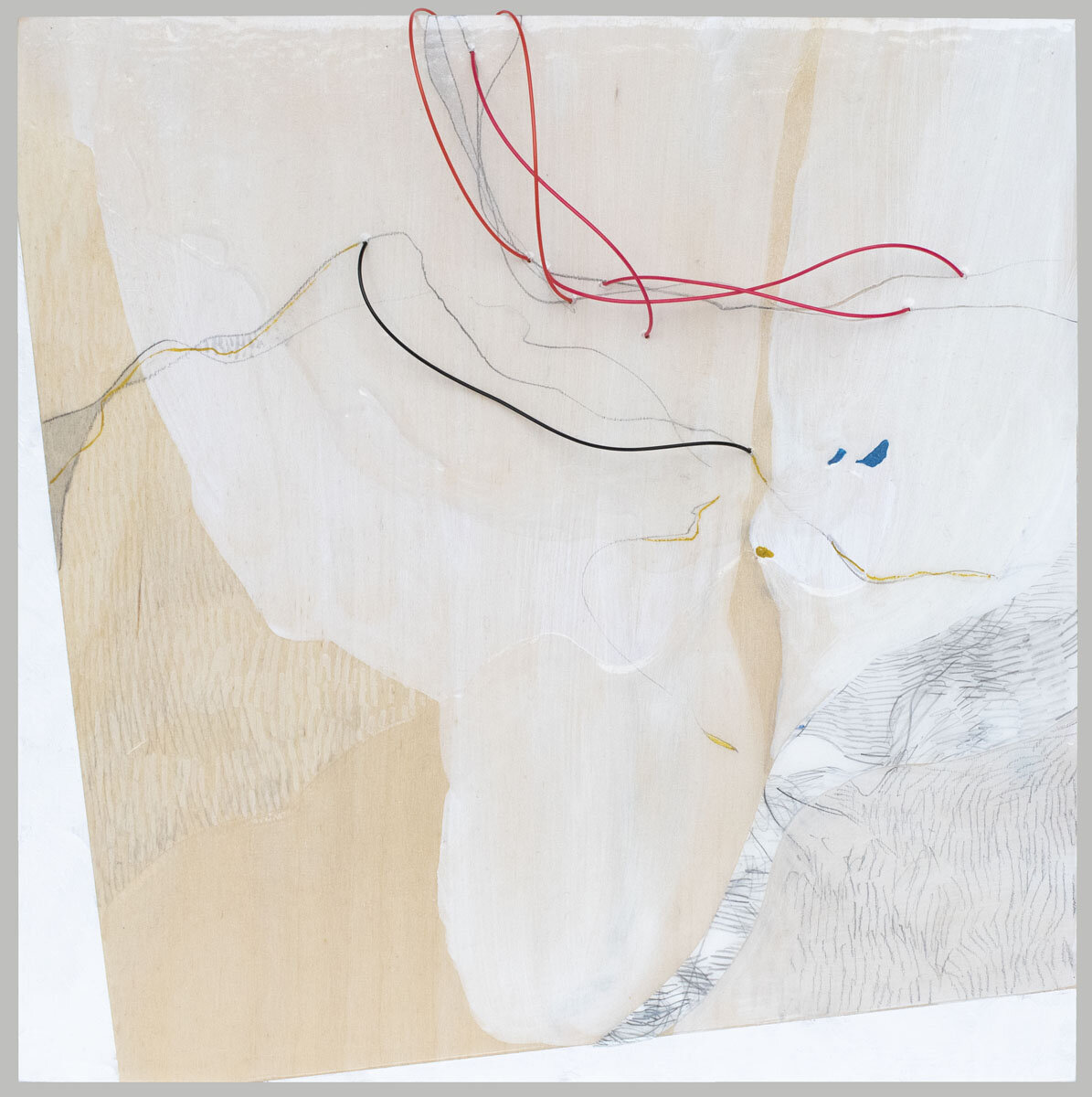
mixed media, 8 x 8 in.

mixed media, 8 x 8 in.
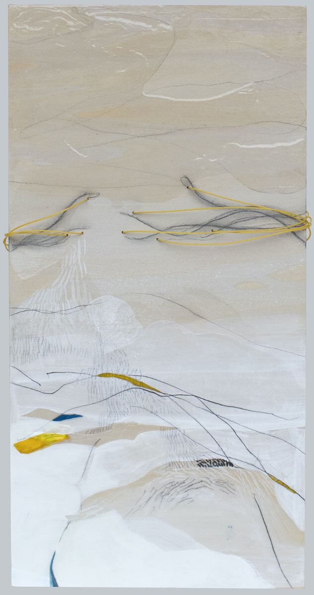
mixed media, 16 x 8 in.

mixed media, 8 x 8 in.
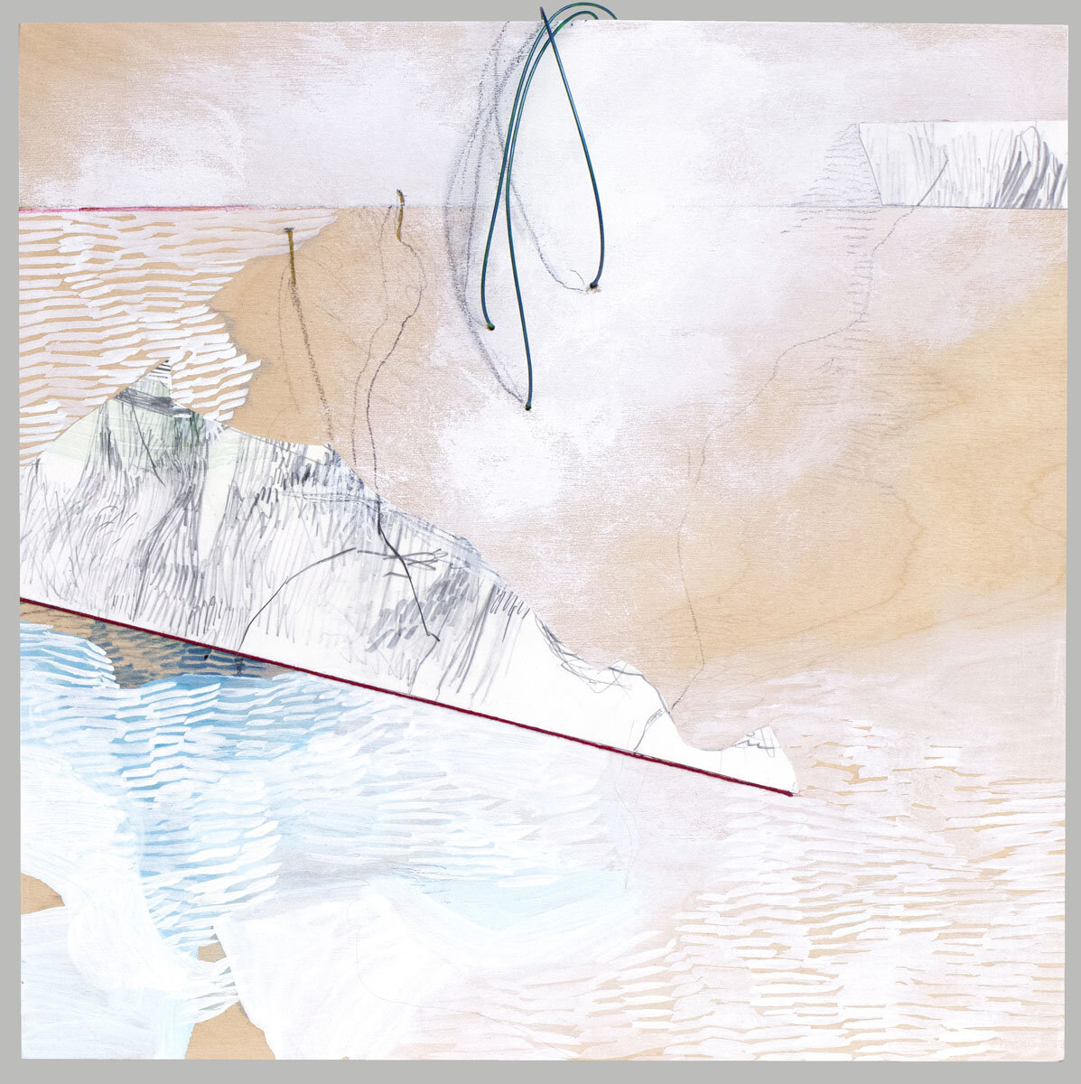
8 x 8 in., mixed media
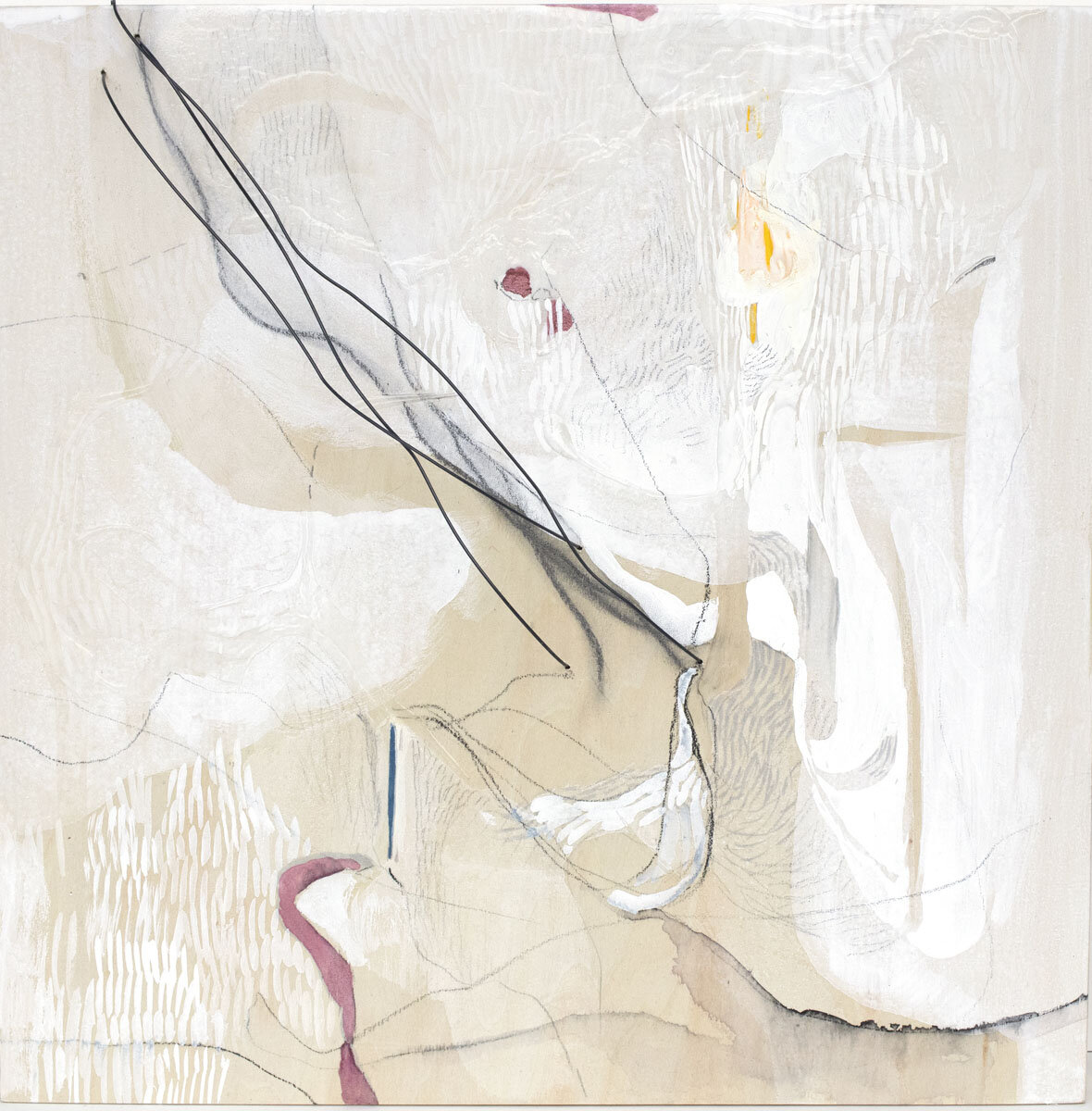
mixed media, 8 x 8 in.

mixed media, 8 x 8 in.
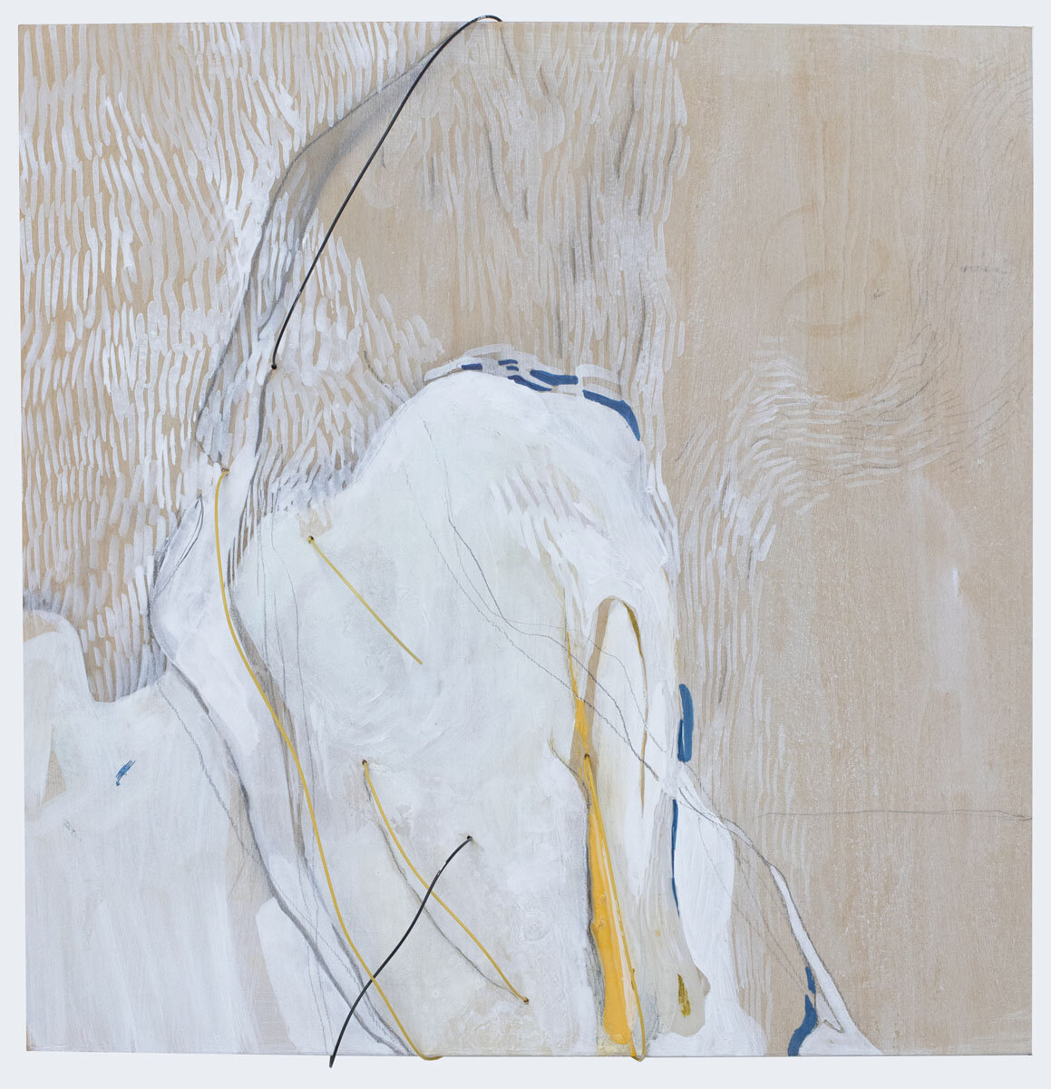
mixed media, 8 x 8 in.
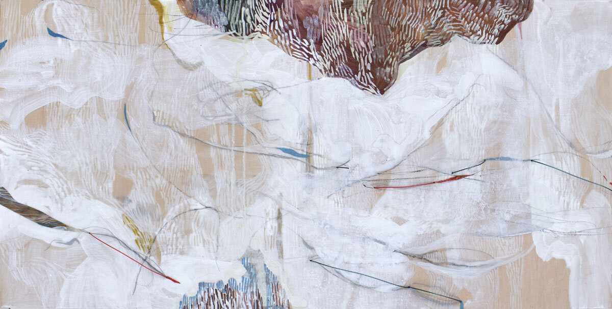
mixed media, 12 x 24 in.
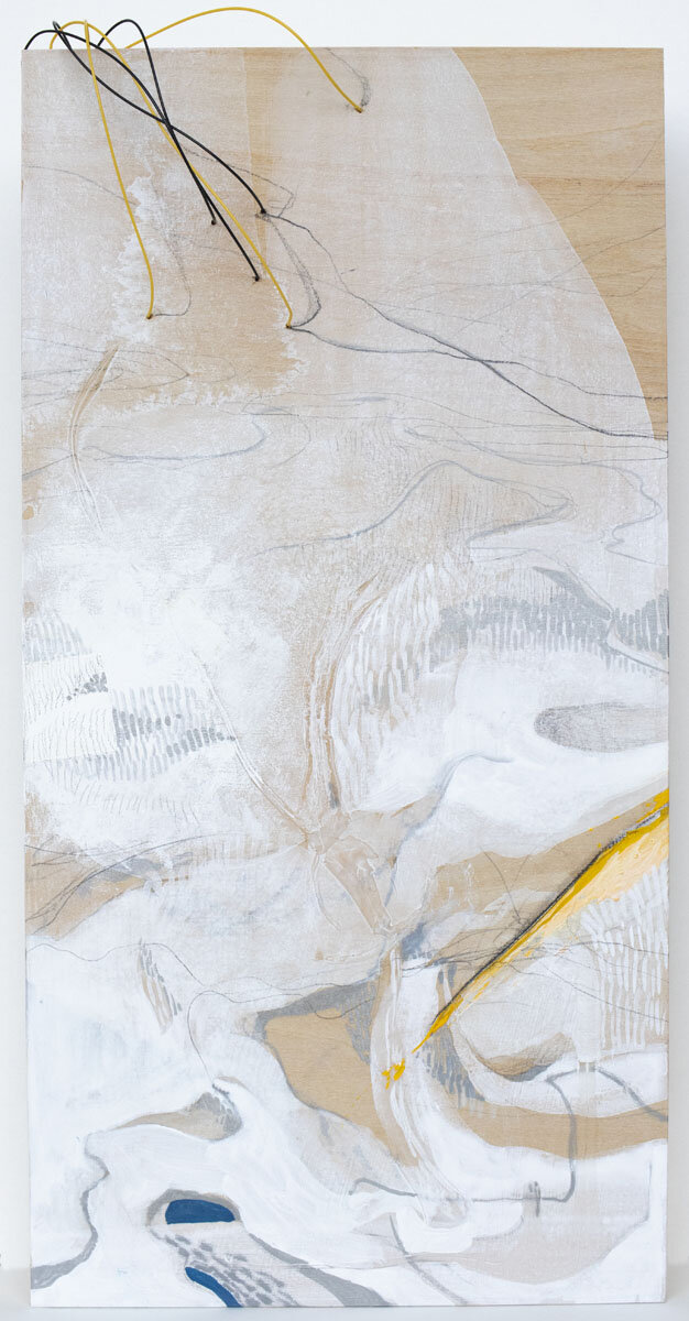
mixed media, 16 x 8 in.
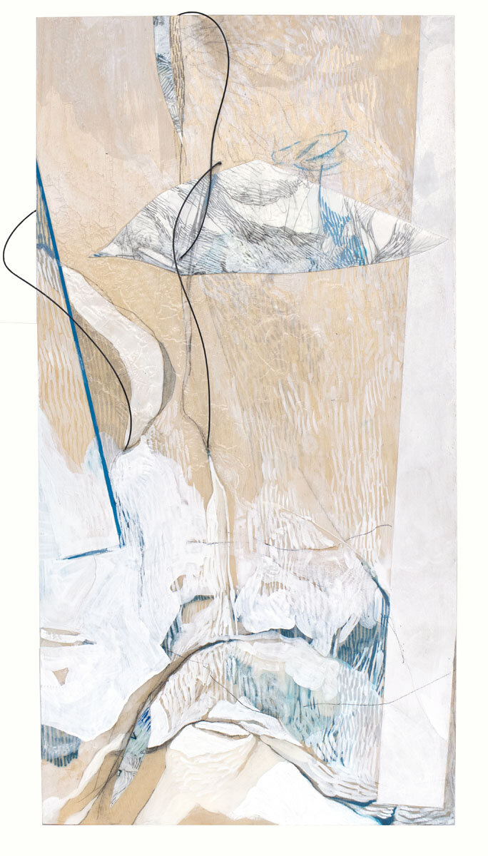
mixed media, 20 x 10 in.
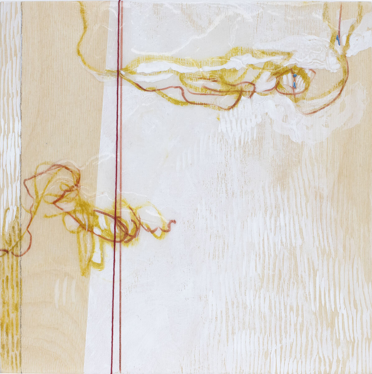
mixed media, 8 x 8 in.
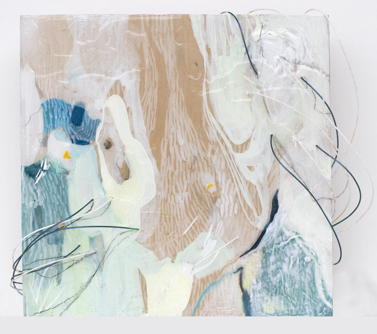
mixed media, 8 x 8 in.

mixed media, 8 x 8 in.
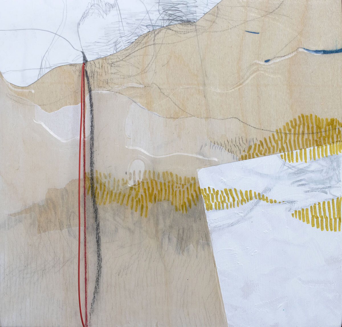
mixed media, 8 x 8 in.

mixed media, 24 x 6 in.
Small Doses
Providence, RI - Periphery Space @ Paper Nautilus is pleased to present Small Doses, artwork by fifteen artists with ties to Providence.
Small Doses will close out 2021 - a year of unpredictability but one of creative certainty and promise. This year of vaccines and boosters confirmed our commitment to each other, our collective well-being, and the beneficial importance of art.
Thank you for continuing to support Periphery Space and Paper Nautilus - we couldn't do this without you! We hope you'll take the time to visit the exhibit.
A big thank you to the artists in this show!
-Babs and Kristin
_________________________
The Artists and a short artist statement :
Mara Metcalf | About the Art
My pieces combine drawing and collage and are made with ink and acrylics on a material called Pellon. It’s a sheer cloth often used as interfacing between surfaces, but I love it for its floating and paper-like properties.
Many of the tools I use are a bit unusual. I have bamboo stakes from gardening, with brushes and pens attached to make a variety of strokes. And my sewing machine (from high school), is used as a way of "drawing" lines with stitches and collaging new forms.
With these fluid strategies, things easily get out of control. It is a dance between ideas and intuition; a back and forth between letting things happen and making them happen. All of these forces become pieced together in works that are both made and found.
Instagram: @mara.metcalf
____________________________
Jacqueline Ott | About the Art
“Study for udo 05” is a preliminary work for a much larger painting. In the study, I’m working out the size of the grid, layering, brushstroke, and color.
Instagram: @jac.que.line.ott
____________________________
Damon Campagna | About the Art
Nowadays we use digital fitness tracking devices to document our existence, breaking it down into discrete units of information, right? So, let’s say we consider mark-making one of the unique identifiers of the self, in the same sense as the heartbeat, blood pressure, running gait, glucose level, DNA, et cetera. I’m asking: if the mark could be reduced to metadata to be recorded and studied -- what would this reveal? Would this analysis of one’s mark-making enable one to establish any deeper, ontological “meaning” behind one’s art? Is it possible for the “self” to be distilled to mere statistics? Can the information embedded in the artist’s mark alone be used to decode some profound meaning? I can’t present answers to those questions, but I do challenge the viewer to consider the possibilities.
Instagram: @discodamon
____________________________
Angel Dean | About the Art
Working with a large gel plate and hand-cut paper stencils, I made dozens upon dozens of oil monotypes on thin rice paper. After about a month of drying time, I cut the monotypes and started layering them with an encaustic medium. The result is a harmonious blending that appeals to both the musician in me and the artist.
____________________________
Willa Von Nostrand | About the Art
My aim in painting is to create luminous surfaces that wrap, protrude and stretch to reflect my sensory state in accordance to my deepest and most sacred experiences of life and nature.
Part food fantasy, part abstracted still life, “Lemon Chiffon” is from an ongoing series of sculptural paintings inspired by experimenting with the visual dimensions of taste and digestion. I begin each painting by sketching a single gestural line across the canvas and then I scan my paint box for the right colors to activate the tone and mood of the line. I mix gouache, gel medium and gesso to build washes of color and I sculpt the paint with my palette knife for texture. Each color choice and brushstroke is an opportunity to mine my subconscious mind, an attempt to translate my natural stream of consciousness into visual, aesthetic terms. “Lemon Chiffon” is an ode to taste and how flavor can activate memory, comfort and a sense of place. Flavor, like aesthetic taste, is an individual experience and I’m fascinated by the ways in which food and art can appeal and delight one’s visual appetite.
Instagram: @wnvm
____________________________
Josh Baptista | About the Art
This work is a search to discover what exists between reality, fantasy, the unknown, and the general uncertainty in creating a meaningful reflection of life in a global pandemic. There is an undeniable parallel between the familiar yet distorted structures and architecture, and the psychic distress of sitting alone with our uncomfortable thoughts, shrouded in grief, confusion, and turmoil. I see these pieces as my living reactions to environmental chaos conveyed carefully on soft, torn paper. The process of making each piece is highly intuitive, with every move informing the next until it starts to evolve into a space that looks familiar to me. The creation of these realms is reminiscent of the careful solitary crafting of an old blanket or quilt with the stark black ink weaving in and out like a uniting thread constructing a new reality.
Instagram: @ joshuabaptista79
____________________________
Shari Weschler | About The Art
This small watercolor, Girl Emerging Girl Hiding, is from a substantial body of work that examines the state of humans evolving away from the natural source into an existence of technological dependencies. Within this complex journey of advancement, the collective consciousness grows more united, while the individual ego becomes increasingly aware of the many divisions. My imagery often runs parallel to where I am standing personally. At the time I was becoming increasingly aware of controlling parameters that were set upon me, how I was fighting to maintain strength within those boundaries and to eventually break free, shifting back into myself.
Instagram: @sumobunni
____________________________
Lisa Perez | About the Art
My work is deeply rooted in the interconnection between the natural world, attention, perception, and creative inquiry. From sculptural painting to works on paper, this process takes a malleable approach to form and prompts a slowing down, and a nod to the immense importance of presence.
"I embrace the expressive, wobbling beauty of something made by hand. Color takes on form and light bounces. A horizontal line may hint at a landscape but then shift like a tectonic plate. Using canvas, wood, paper, and paint, I seek a place where these materials meet, overlap, unify and resonate. The geography of where this leads me is both familiar and as elusive as the space between seconds." - Lisa Perez
The works for Periphery's "Small Doses" offer a small glimpse of both sculptural painting and works on paper that are prevalent in my practice. These weave together my focus on light and color as form, evanescent and transient shadows, as well as infusing landscape more overtly into the work. The exquisite nature of light shifting at varying times of day and in a myriad of natural landscapes speaks through both mediums in very different ways. This ongoing investigation through presence and attention in the experiences of the natural world continues to evolve in, on, and through my work.
Instagram: @lperezoo
____________________________
Becky Newsom | About the Art
I’ve made shaped, gouache drawings on paper since 2017. They are intentionally fast, flat, and small as opposed to my oil paintings that are time-consuming, laborious, and sculptural. The drawings are abstract, inspired by color and shape in nature, and explore the long history of non-rectangular painting.
____________________________
Sonja Czekalski | About the Art
I am an interdisciplinary artist, driven to tell women’s stories. I consider the bloodline of my grandmother, my mother, my sister, the web of women who raised me, and Mother Earth herself. I consider the idea of visceral memory. A type of memory so deep, perhaps even cross-generational, that the mind cannot remember, yet the body can. Using natural materials and traditionally feminine craft materials and techniques passed down by my grandmother, I create each of my works from my own body and personal experience. I am interested in the interconnectedness between the physical, biological, and spiritual relationships between my body, my ancestry, and the earth herself.
I want the viewer to explore the female figure through an empathetic gaze. I invite the viewer to question the validity of the stereotyped feminine; to experience and respond to the emotional labor, embarrassment, shame, confusion, richness, and power of female sexuality, fertility, social expectation, and responsibility. Ultimately though my practice provides more questions and contradictions about feminism than answers, it gives voice to the raw experiences of womanhood.
Instagram: @sonjaczekalski.art
____________________________
Lynn Mullins | About the Art
I'm fascinated by the precision, artificiality, and insanity of Ikebana, the Japanese art of flower arranging. Ordering nature seems like a lost cause, yet Ikebana strives to express emotion through embodying branches with symbolic meaning. Those dueling forces, control, and freedom, similar to 21st-century society, pack a potent origin story for this artwork.
Instagram: @giantpompom
____________________________
Susan Strauss | About the Art
On a clear, bright day after heavy snow, I went out to look and paint. The yard was transformed by snow, light, and cold. The familiar was disappeared, replaced by a space that was being seen for the first time.
Instagram: @susanstrausspainting
____________________________
Dan Wood | About the Art
I have been working with letterpress printing both as a commercial printer and in my artwork for over 25 years. As an artist dedicated to addressing and participating in the discussions of the day, I find letterpress printing, with its commitment to the democratic nature of the multiple, versus the single work of art, to be an ideal media within which to do this work. In practicing this trade, with its hugely important social history and impact, I hope to create contemporary work in a format that is relatable to the public, honest, and which can transcend and perhaps change our preconceptions of the subject at hand.
As a person heavily laden with nervous energy, I do find it interesting to be attracted to such a controlled and delicate process. I am still amazed, watching pristine sheets of clean white paper come into the chaos of the studio, travel through crazy machines covered in grease at high speed, and end up in nice, clean piles with ink and fingerprints only where they should be (generally speaking). It is this chaotic balance and the delicate intricacies of these printing processes that keep me working with prints. That, and the voice in my head which exclaims during every press run - Hey, it works!
Instagram: @thelinotypedaily
____________________________
Barbara Pagh | About the Art
This handmade paper collage is part of an ongoing Horizon Series. I live near the coast and I walk frequently on the beach at Matunuck. I love the way the colors change, particularly the water and the sky at different times of the day and in varied weather conditions. I concentrate on remembering colors such as warm grey sky, green sea, and line of light at the horizon. Mostly I work the collages from memory, but sometimes I have referenced a photograph. The compositions are simplified to horizontal bands. Making paper has been part of my studio practice since the 1970s. I make buckets of colored pulp and then pour sheets of 7”x10” paper of various colors and textures. These will be torn down for the horizon collages.
Instagramn:@barbarapagh
____________________________
Marjorie Hellman | About the Art
My work in collage and mixed media on paper stems from drawings I make in developing my paintings, although surface concerns could not be more different.
In my drawing process, observations from both the natural and manmade worlds combine to make abstractions that exist somewhere in the metaphysical realm. Ideas from other sources, such as scientific discovery enter in, adding an undercurrent of meaning to the visual. While my paintings (hard-edged geometric abstractions), seek to create a flat, brushstroke-free surface, where color juxtapositions are the focus, these small works employ visual elements that read like textures, sourced from an archive of my own drawings and other collected printed matter.
Using colored pencil and gouache, I alter the paper fragments, tuning color, and readability. Like my paintings, these small pieces deal with the ambiguity of space and structure. But while my paintings relate to human scale, these offer a world in miniature, in which the irregular perimeters offer a different emphasis on boundary and containment.
Instagram: @marjoriehellman
Ink, acrylic, stitching on paper, collage. 7”x8” inches, (framed 9”x11”). $250.00 SOLD
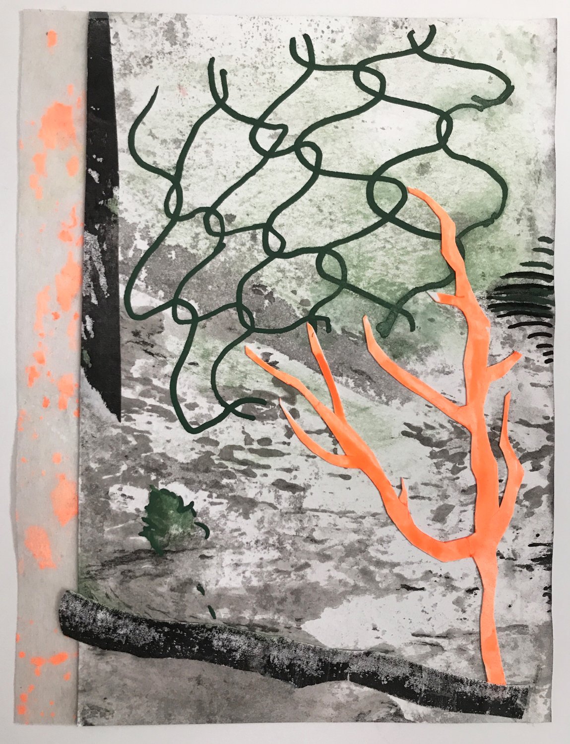
Ink, marker, collage, painted Pellon on paper. 5.5”x7.5”, (framed 9”x11”). $200.00
gouache, graphite on paper, 6” x 8”, (8.25” x 10.25” framed), $315.00 framed SOLD

Open bite copperplate etching on paper, Plate: 9" x 11", Sheet: 16" x 20", Framed, $395.
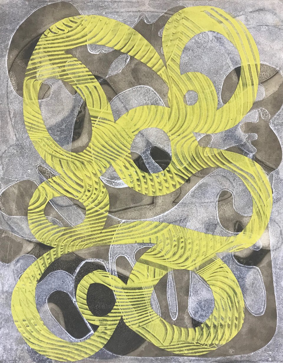
oil monotypes, cut and layered with encaustic medium, on clayboard, 11”x14”, Framed, $400
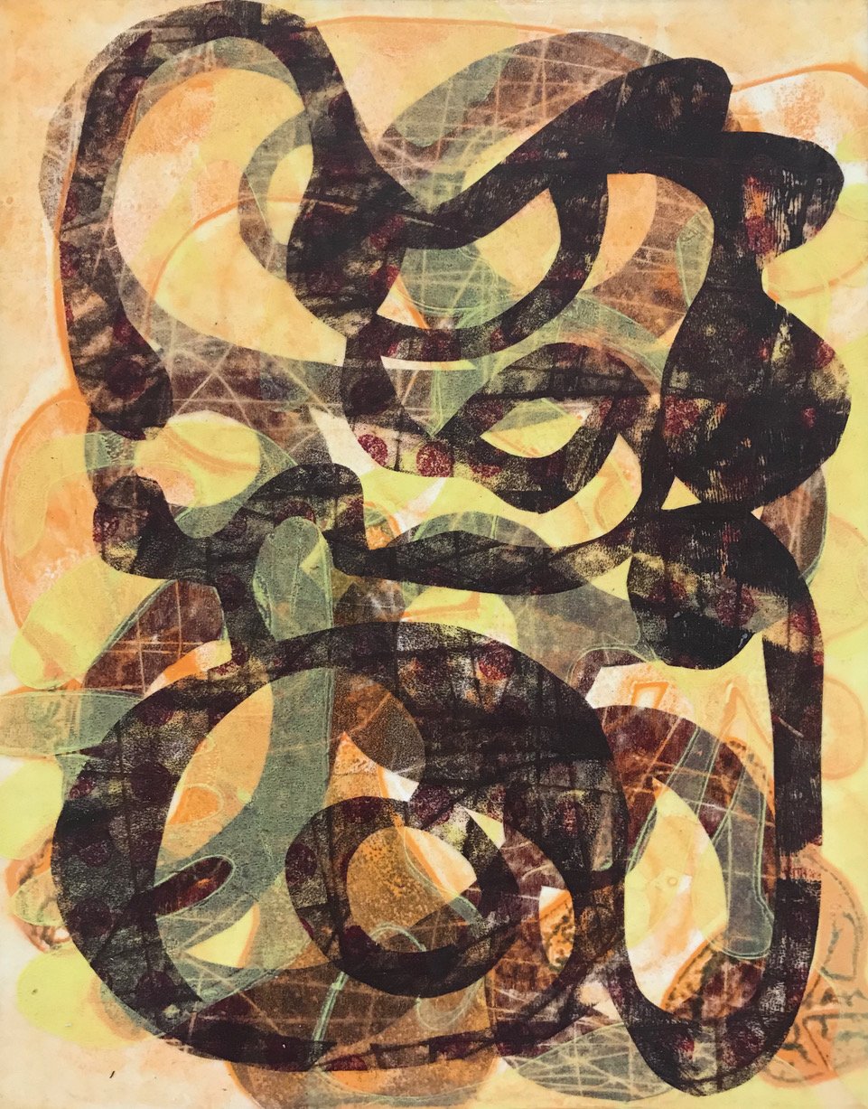
oil monotypes, cut and layered with encaustic medium, on clayboard, 11”x14” Framed, $400
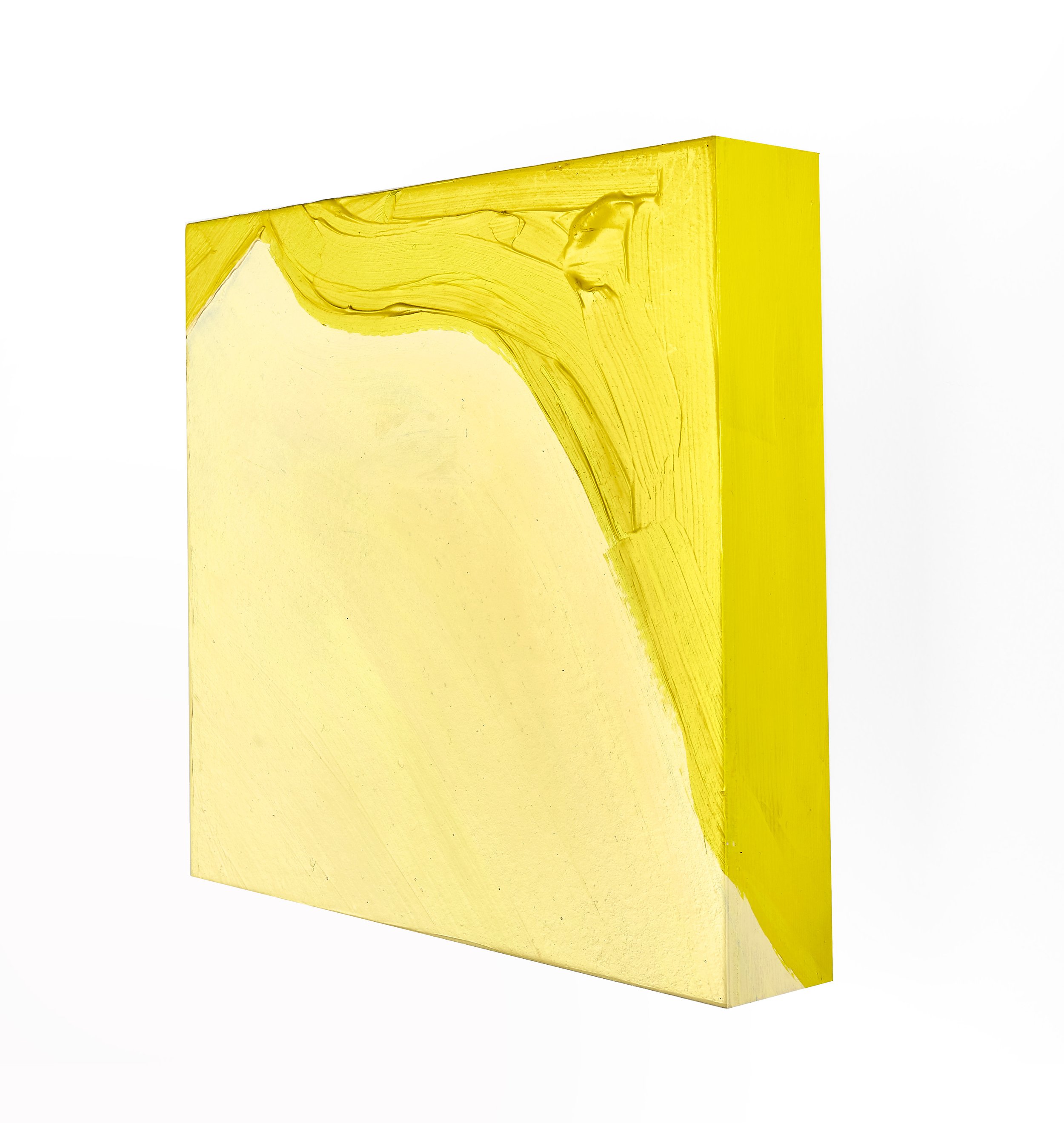
gouache, gesso, pine, 8"x8"x1.5", $220
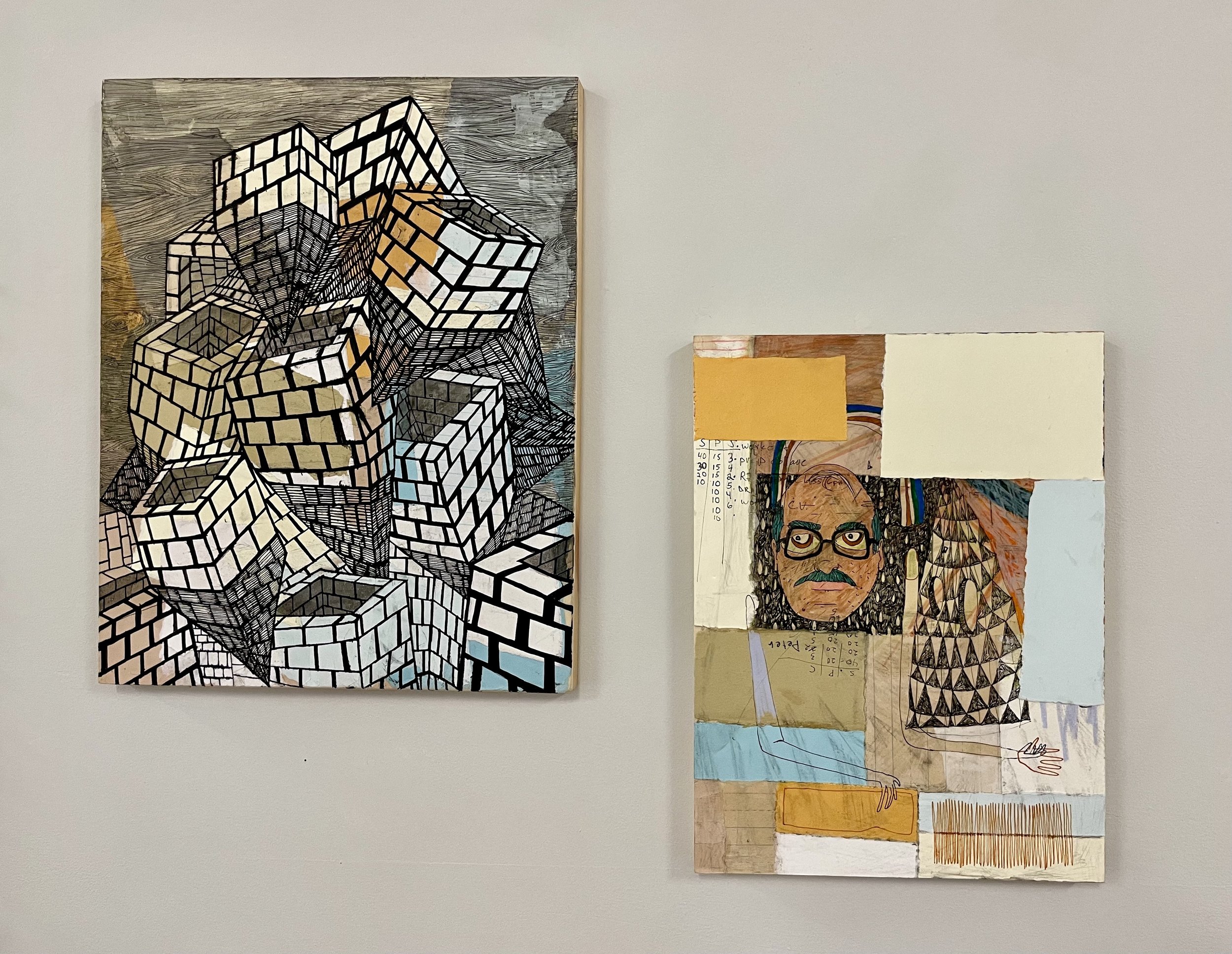
(left) ink and paint on wood panel, 11” x 17” $250.00, (right) ink and paint on wood panel, 9”x12”, $200

Watercolor on Yupo Paper 12” h x 9”w, Framed, $500.
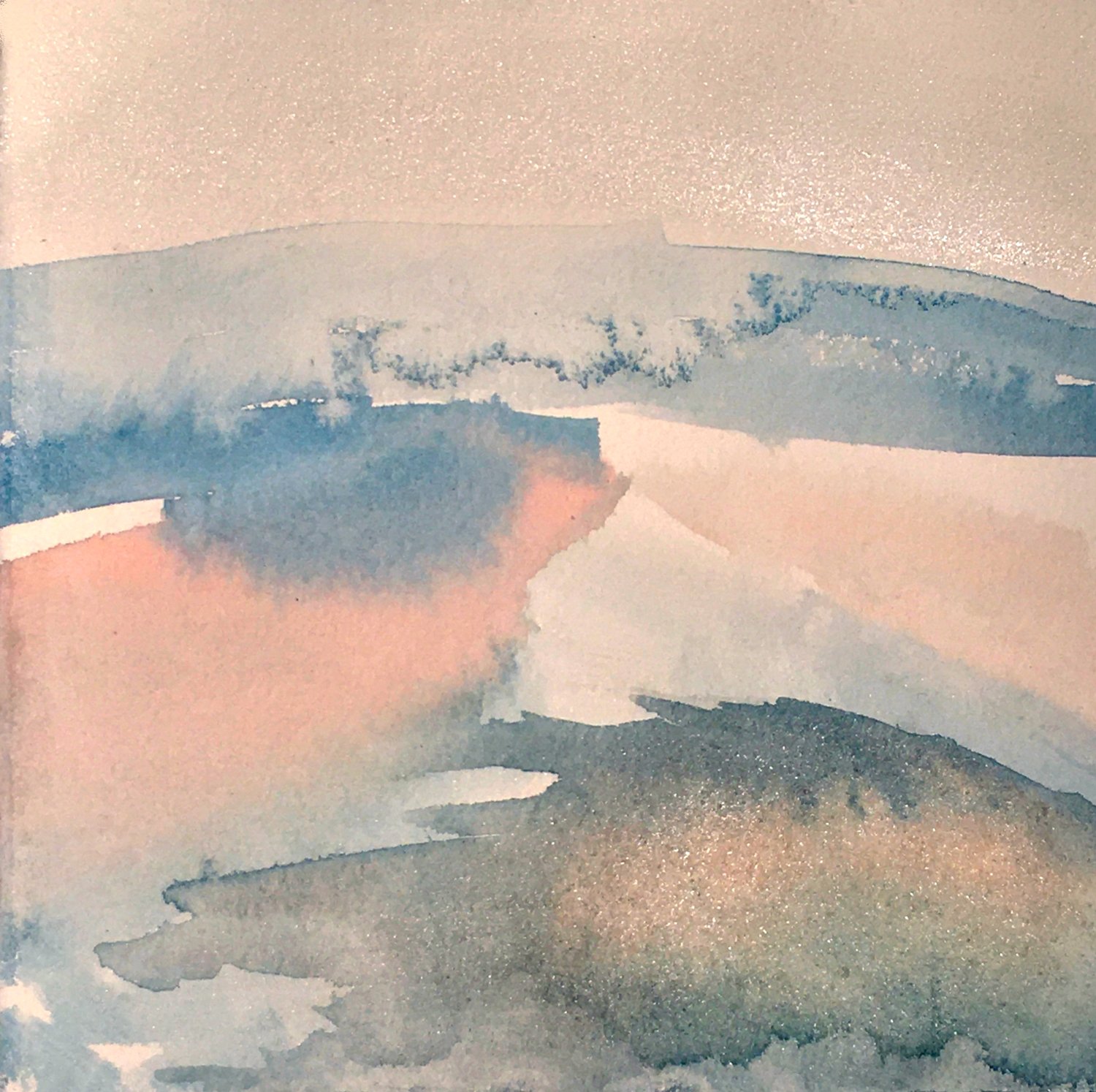
watercolor on paper, 7.5 x 7.5”, Framed, $275.
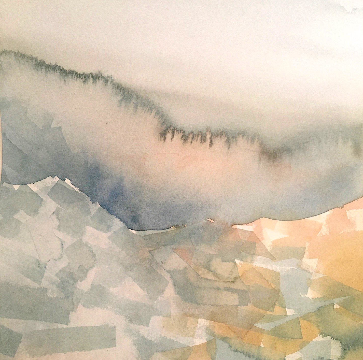
watercolor on paper, 9 x 9”, Framed, $375.
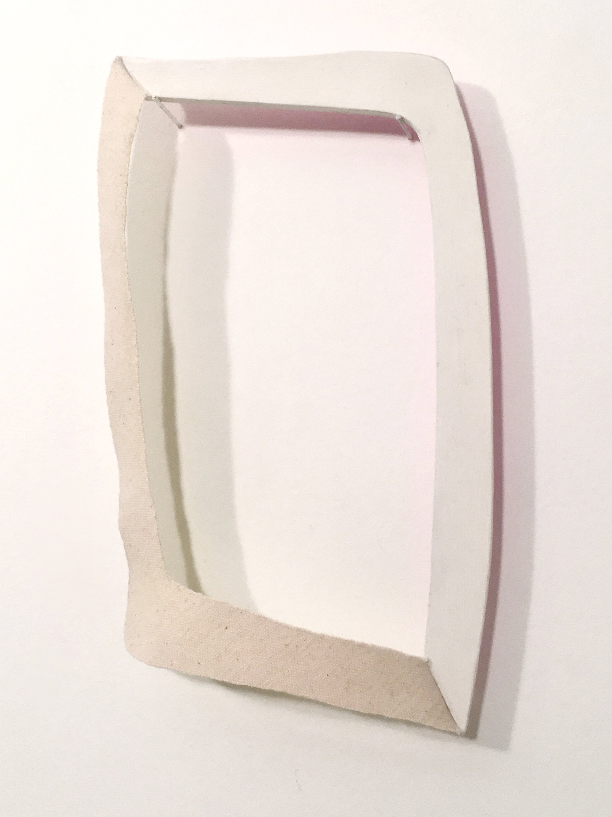
wood, canvas, gouache + colored pencil. $400

gouache on paper, 7 3/4” x 7”, Framed, $500.
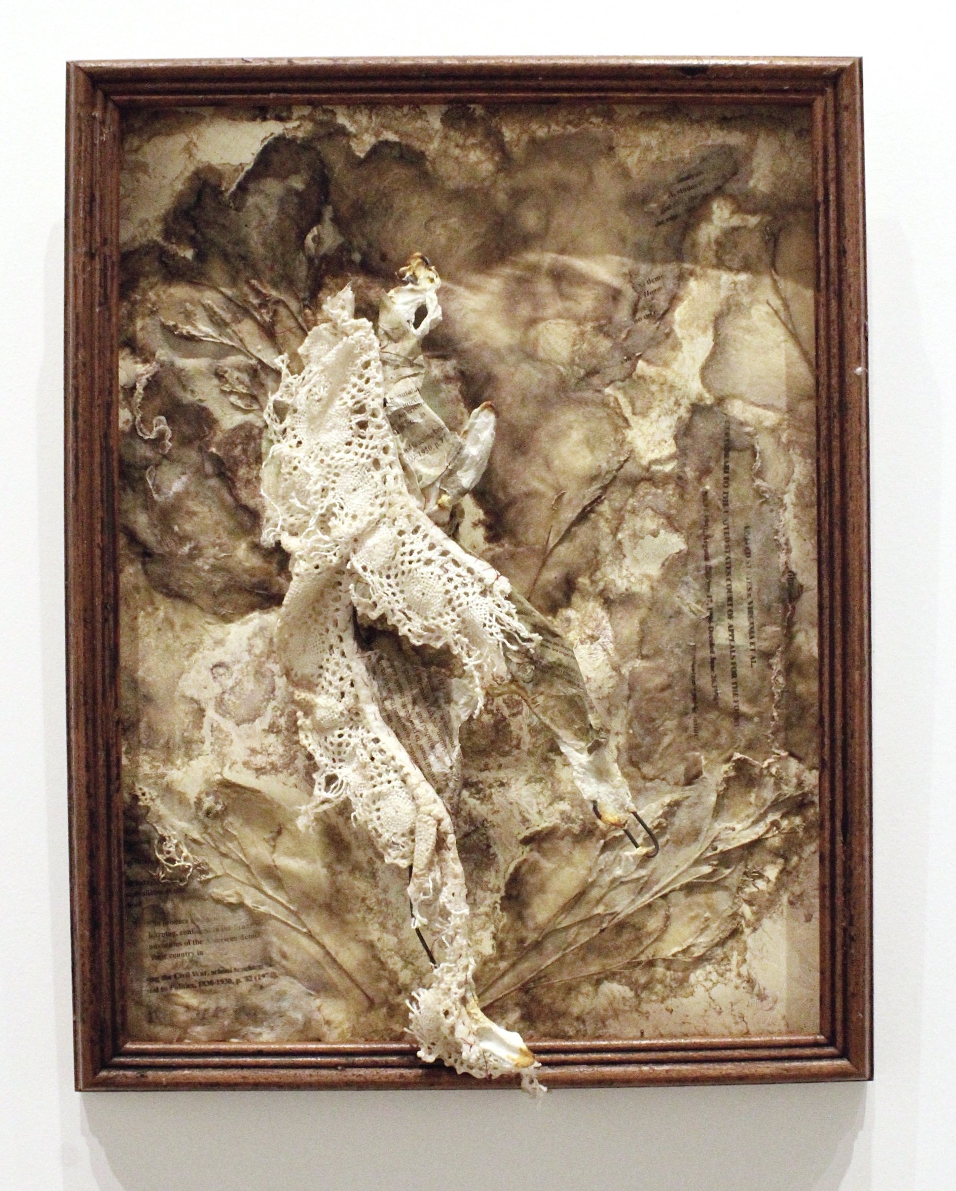
steel wire, my grandmother's lace, yellowed wallpaper, dried flowers, natural dyes, and handmade paper in an antique frame, 18"x 14", $150.

watercolor and collage on paper, 8.5" x 11.25", Framed, $300.
letterpress, 8” x 10”, Framed, $75.
Letterpress framed with cast metal type, 11” x 18”, $200.
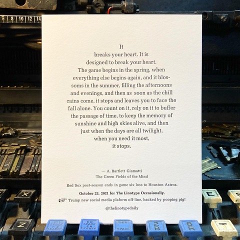
letterpress, 8” x 10”, Framed $75.
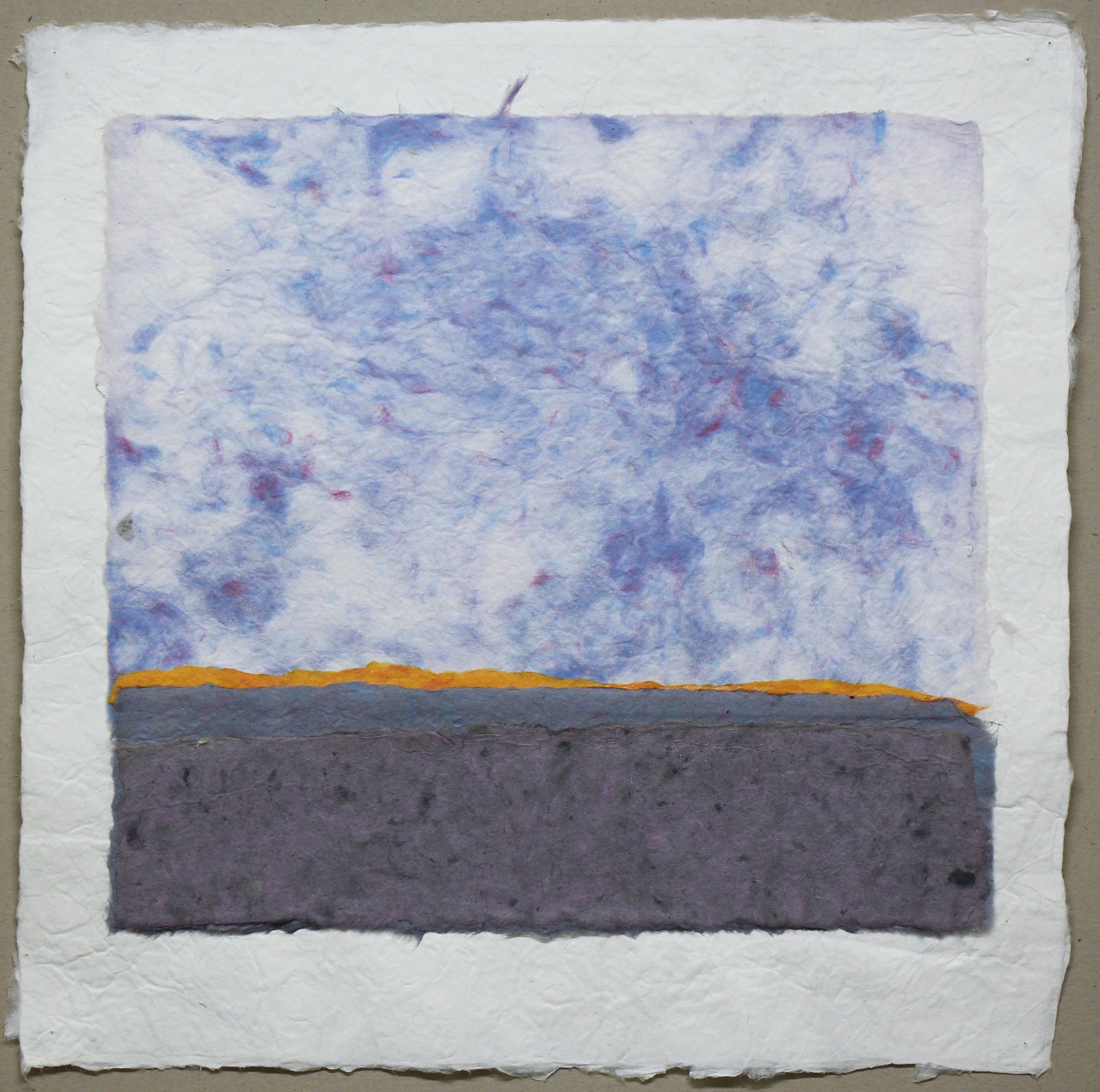
handmade paper collage, 12”x12” (15”x15” framed), $350.

collage, colored pencil, and gouache on paper 11.75” x 9”, Framed, $475.
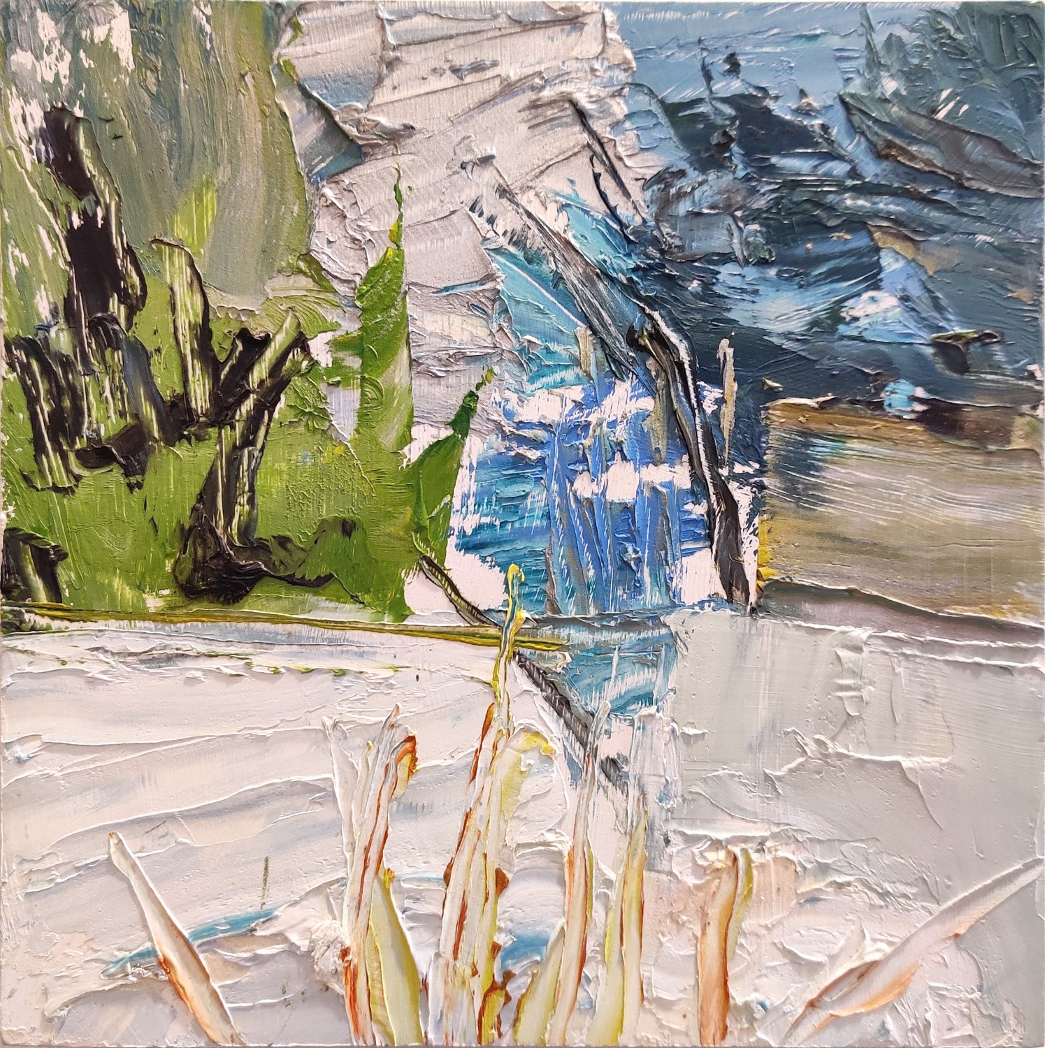
Oil on panel, 8”x 8”, $200.